Machine learning models must strike a delicate balance: they need to be complex enough to capture patterns in the data but not so complex that they fail to generalize to new, unseen data. This balance is the essence of the bias-variance tradeoff, and understanding it is crucial for building effective models.
In this project, we’ll explore this tradeoff using Polynomial Regression on the California Housing dataset provided by scikit-learn. We’ll train models of varying complexity, analyze their performance, and learn how to detect underfitting and overfitting using error curves. By the end, you’ll have a clear understanding of how to choose the right model complexity for your data.
Step 1: Setting Up the Project
Before diving into the analysis, we need to import the necessary libraries and configure our environment. Here’s what each library does:
- NumPy and Pandas: For numerical operations and data manipulation.
- Matplotlib and Seaborn: For creating visualizations.
- Scikit-learn: For machine learning tools, including dataset loading, model training, and evaluation.
We also set a consistent style for our plots to make them more readable.
import numpy as np
import pandas as pd
import matplotlib.pyplot as plt
import seaborn as sns

from sklearn.datasets import fetch_california_housing
from sklearn.linear_model import LinearRegression
from sklearn.preprocessing import PolynomialFeatures, StandardScaler
from sklearn.pipeline import make_pipeline
from sklearn.model_selection import train_test_split
from sklearn.metrics import mean_squared_error

# Configure plot style
sns.set(style="whitegrid")
plt.rcParams["figure.figsize"] = (10, 6)Step 2: Loading and Preparing the Data
We’ll use the California Housing dataset, which contains information about housing prices in California districts. Each row represents a district, with features like median income (MedInc), house age (HouseAge), and location data. Our goal is to predict the median house value (MedHouseVal) based on a single feature: MedInc.
To follow along with this article, you can find the code implementation in a Jupyter Notebook in this GitHub repo.
Why Use a Single Feature?
Focusing on one feature simplifies visualization and makes it easier to observe how model complexity affects performance. Here’s how we load and preview the data:
# Load the dataset
dataset = fetch_california_housing(as_frame=True)
df = dataset.frame

# Preview the first few rows
df.head()You’ll see features like:
MedInc: Median income in the districtMedHouseVal: Median house value — our prediction target

Step 3: Splitting the Data
To evaluate our model’s performance, we split the data into two subsets:
- Training set (80%): Used to train the model.
- Validation set (20%): Used to assess how well the model generalizes to unseen data.
This split ensures that we can detect overfitting, when a model performs well on training data but poorly on new data.
# Extract features and target
X = df[['MedInc']].values
y = df['MedHouseVal'].values

# Split the data
X_train, X_val, y_train, y_val = train_test_split(X, y, test_size=0.2, random_state=42)Step 4: Training Polynomial Regression Models
What is Polynomial Regression?
Polynomial Regression extends Linear Regression by adding polynomial terms (e.g., squared or cubed features). For example:
- Degree 1: Linear relationship (\(y=a+bx\)).
- Degree 2: Quadratic relationship (\(y=a+bx+cx^{2}\)).
- Degree 3: Cubic relationship (\(y=a+bx+cx^{2}+dx^{3}\))
Higher degrees allow the model to fit more complex patterns, but they also increase the risk of overfitting.
Training Models of Increasing Complexity
We’ll train models with polynomial degrees ranging from 1 to 15. For each model, we’ll:
- Transform the features into polynomial terms.
- Scale the features (to ensure numerical stability).
- Fit a Linear Regression model.
- Calculate the Root Mean Squared Error (RMSE) for both training and validation sets.
Here’s the code:
def evaluate_polynomial_models(X_train, y_train, X_val, y_val, max_degree=15):
    """
    Trains and evaluates multiple polynomial regression models with increasing degrees,
    and returns their training and validation RMSE errors.

    This function is used to analyze how model complexity (polynomial degree) affects
    performance on training and validation datasets — useful for identifying underfitting
    and overfitting.

    Parameters:
    -----------
    X_train : np.ndarray
        Feature matrix for the training set (e.g., median income).
    y_train : np.ndarray
        Target values for the training set (e.g., house values).
    X_val : np.ndarray
        Feature matrix for the validation set.
    y_val : np.ndarray
        Target values for the validation set.
    max_degree : int, default=15
        The maximum polynomial degree to test.

    Returns:
    --------
    models : list
        List of trained scikit-learn pipeline models (one per degree).
    train_errors : list
        RMSE values for each model on the training data.
    val_errors : list
        RMSE values for each model on the validation data.
    """

    models = []         # Stores all trained models
    train_errors = []   # Stores RMSE for training set
    val_errors = []     # Stores RMSE for validation set

    # Loop through polynomial degrees from 1 to max_degree
    for degree in range(1, max_degree + 1):

        # Create a pipeline: Polynomial features → Standardization → Linear Regression
        model = make_pipeline(
            PolynomialFeatures(degree=degree, include_bias=False),
            StandardScaler(),
            LinearRegression()
        )

        # Fit the model to the training data
        model.fit(X_train, y_train)

        # Predict on both training and validation sets
        y_train_pred = model.predict(X_train)
        y_val_pred = model.predict(X_val)

        # Compute Root Mean Squared Error (RMSE) for both sets
        train_rmse = np.sqrt(mean_squared_error(y_train, y_train_pred))
        val_rmse = np.sqrt(mean_squared_error(y_val, y_val_pred))

        # Store model and corresponding errors
        models.append(model)
        train_errors.append(train_rmse)
        val_errors.append(val_rmse)

return models, train_errors, val_errorsStep 5: Plotting Learning Curves
After training the models, we plot the training and validation errors against the polynomial degree. This helps us visualize:
- Underfitting: High error on both training and validation sets (left side of the plot).
- Overfitting: Low training error but high validation error (right side of the plot).
- Optimal Model: The point where the validation error is minimized.
def plot_model_complexity(X_train, y_train, X_val, y_val, max_degree=15):
    """
    Plots training and validation RMSE for polynomial regression models
    of increasing complexity to visualize underfitting and overfitting.

    This function helps identify the ideal model complexity by comparing
    training error and validation error as the polynomial degree increases.
    A gap between the curves indicates overfitting, while high errors on both
    indicate underfitting.

    Parameters:
    -----------
    X_train : np.ndarray
        Feature matrix for the training set.
    y_train : np.ndarray
        Target values for the training set.
    X_val : np.ndarray
        Feature matrix for the validation set.
    y_val : np.ndarray
        Target values for the validation set.
    max_degree : int, default=15
        The highest polynomial degree to evaluate.

    Returns:
    --------
    None
        Displays a line plot comparing RMSEs for each model.
    """

    # Train and evaluate models of increasing polynomial degree
    _, train_errors, val_errors = evaluate_polynomial_models(
        X_train, y_train, X_val, y_val, max_degree
    )

    # Create a list of degrees from 1 to max_degree
    degrees = range(1, max_degree + 1)

    # Plot training RMSE as red circles
    plt.plot(degrees, train_errors, "r-o", label="Training RMSE")

    # Plot validation RMSE as blue circles
    plt.plot(degrees, val_errors, "b-o", label="Validation RMSE")

    # Add labels and title to the plot
    plt.xlabel("Model Complexity (Polynomial Degree)")
    plt.ylabel("Root Mean Squared Error (RMSE)")
    plt.title("Training vs Validation Error vs Model Complexity")

    # Add legend and grid for better readability
    plt.legend()
    plt.grid(True)

    # Show the plot
    plt.show()


# Plot training vs validation error for polynomial degrees 1 to 15
plot_model_complexity(X_train, y_train, X_val, y_val, max_degree=15)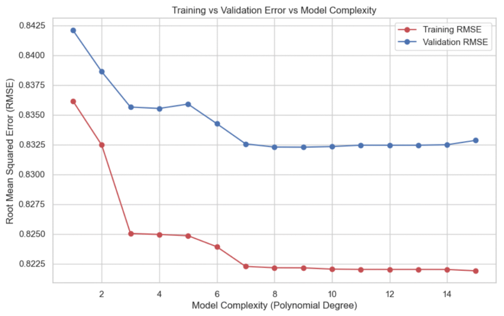
Interpreting the Plot
- Low Degrees (1-3): The model is too simple (underfitting). Both errors are high.
- Medium Degrees (4-9): The model captures the underlying trend well. Validation error is minimized.
- High Degrees (10-15): The model fits the training data too closely (overfitting). Validation error rises sharply.
This demonstrates the bias-variance trade-off in a very visual and intuitive way.
Step 6: Selecting and Visualizing the Best Model
From the plot, we identify the best model, the one with the lowest validation error. In this case, it’s the 9th-degree polynomial.
We then visualize the model’s predictions alongside the actual data points:
def visualize_best_model(X_train, y_train, X_val, y_val, max_degree=15):
    """
    Identifies and visualizes the best polynomial regression model (based on lowest
    validation RMSE) among a range of polynomial degrees.

    This function:
    - Evaluates models with increasing polynomial degrees
    - Selects the one with the lowest validation error
    - Plots its prediction curve against the actual training and validation data

    Parameters:
    -----------
    X_train : np.ndarray
        Training input features (e.g., median income).
    y_train : np.ndarray
        Training target values (e.g., house prices).
    X_val : np.ndarray
        Validation input features.
    y_val : np.ndarray
        Validation target values.
    max_degree : int, default=15
        The maximum polynomial degree to evaluate.

    Returns:
    --------
    None
        Displays a plot showing the best-fitting polynomial curve.
    """

    # Train and evaluate models from degree 1 to max_degree
    models, train_errors, val_errors = evaluate_polynomial_models(
        X_train, y_train, X_val, y_val, max_degree
    )

    # Identify the model with the lowest validation RMSE
    best_index = np.argmin(val_errors)
    best_model = models[best_index]
    best_degree = best_index + 1  # because index starts at 0

    # Print the best degree and its corresponding validation RMSE
    print(f"Best polynomial degree: {best_degree}")
    print(f"Validation RMSE at best degree: {val_errors[best_index]:.4f}")

    # Generate a smooth range of input values for curve plotting
    X_range = np.linspace(X_train.min(), X_train.max(), 300).reshape(-1, 1)

    # Predict house values using the best model over the smooth range
    y_pred_curve = best_model.predict(X_range)

    # Plot training and validation data as scatter points
    plt.scatter(X_train, y_train, color="red", alpha=0.5, label="Training Data")
    plt.scatter(X_val, y_val, color="blue", alpha=0.5, label="Validation Data")

    # Plot the prediction curve of the best model
    plt.plot(X_range, y_pred_curve, color="black", linewidth=2, label=f"Degree {best_degree} Fit")

    # Add labels and title for clarity
    plt.xlabel("Median Income")
    plt.ylabel("Median House Value")
    plt.title(f"Best Polynomial Fit (Degree {best_degree})")

    # Add legend and grid
    plt.legend()
    plt.grid(True)

    # Show the final plot
    plt.show()


# Visualize the best model
visualize_best_model(X_train, y_train, X_val, y_val, max_degree=15)- Best polynomial degree: 9
- Validation RMSE at best degree: 0.8323
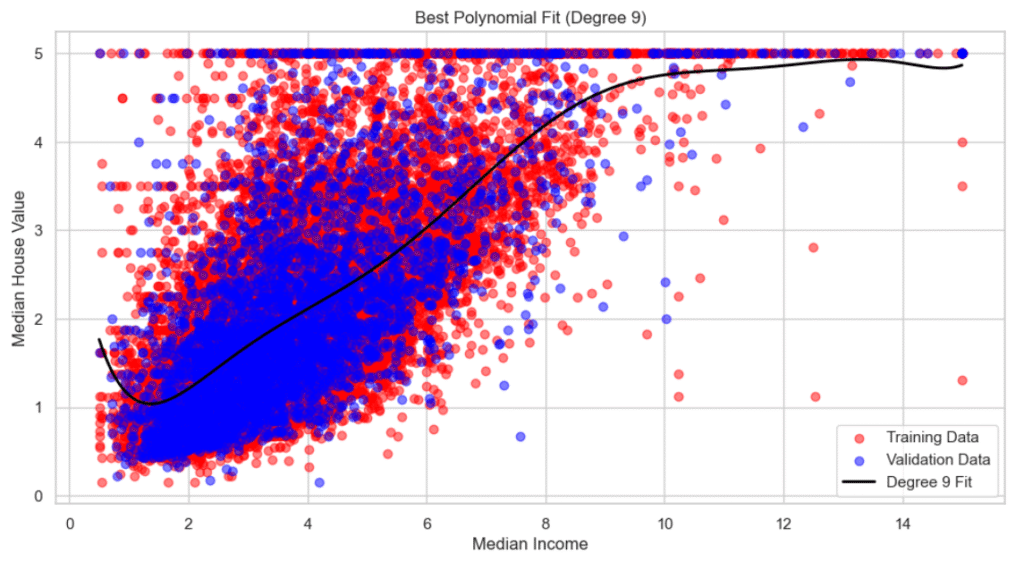
Observations
The 9th-degree polynomial captures the underlying trend without oscillating wildly (a sign of overfitting).
The curve fits the training data well while also generalizing to the validation data.
Final Thoughts: What We Learned
In this project, you built multiple polynomial regression models and learned how to:
- Detect underfitting and overfitting visually.
- Use training vs validation error to evaluate model performance.
- Select the best model based on RMSE (Root Mean Squared Error).
- Understand the importance of model complexity and generalization.
Key Takeaways
- Underfitting → Model too simple; high training and validation error.
- Good Fit → Validation error lowest; training error reasonable.
- Overfitting → Model too complex; training error low, validation error high.
Want to See the Full Code?
Check out the GitHub repository here: GitHub Repository Link

