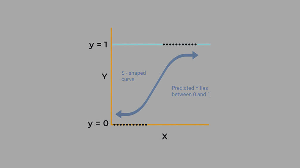
In this tutorial, we’ll explore how to build a heart disease prediction model using KNN with Scikit-Learn. The K-Nearest Neighbors (KNN) algorithm is one of the simplest yet powerful machine learning methods for classification tasks. By comparing a patient’s medical data with others in the dataset, KNN helps predict whether they are likely to have heart disease.
Heart disease remains one of the leading causes of death worldwide, and early detection can make a life-saving difference. In this project, we’ll use a real-world Heart Disease UCI dataset from Kaggle to apply KNN, evaluate its performance, and understand how factors like age, cholesterol, and chest pain type contribute to predictions.
By the end of this guide, you’ll not only understand how to implement KNN using Scikit-Learn but also gain insight into how distance-based algorithms make predictions in healthcare applications.
1. Importing Libraries
We begin by importing the essential Python libraries used for data handling, visualization, and model building.
- NumPy and Pandas handle numerical operations and data manipulation.
- Matplotlib and Seaborn help us visualize data patterns and relationships.
- Scikit-Learn provides tools for splitting data, scaling features, training the KNN model, and evaluating its performance.
# Data manipulation and analysis
import numpy as np
import pandas as pd
import matplotlib.pyplot as plt
import seaborn as sns

# Model building and evaluation
from sklearn.model_selection import train_test_split
from sklearn.metrics import accuracy_score, precision_score, recall_score, f1_score
from sklearn.preprocessing import OneHotEncoder, StandardScaler
from sklearn.neighbors import KNeighborsClassifier
from scipy.stats import f_oneway, chi2_contingency- This setup ensures we have all the tools needed to explore, visualize, and model our heart disease dataset efficiently.
2. Importing and Previewing the Dataset
We use the Heart Disease UCI dataset, a well-known dataset in healthcare analytics.
It includes medical attributes such as age, blood pressure, cholesterol, and ECG results that help predict the presence of heart disease.
Let’s load the dataset and preview its structure:
# Load the dataset
data = pd.read_csv("heart_disease_uci.csv")

# Preview a few rows
data.head()
After loading, we check the dataset’s structure to understand its composition:
# Check the general information
data.info()RangeIndex: 920 entries, 0 to 919
Data columns (total 16 columns):
# Column Non-Null Count Dtype
--- ------ -------------- -----
0 id 920 non-null int64
1 age 920 non-null int64
2 sex 920 non-null object
3 dataset 920 non-null object
4 cp 920 non-null object
5 trestbps 861 non-null float64
6 chol 890 non-null float64
7 fbs 830 non-null object
8 restecg 918 non-null object
9 thalch 865 non-null float64
10 exang 865 non-null object
11 oldpeak 858 non-null float64
12 slope 611 non-null object
13 ca 309 non-null float64
14 thal 434 non-null object
15 num 920 non-null int64
dtypes: float64(5), int64(3), object(8)
The dataset contains 920 patient records and 16 columns, including both numerical and categorical features. Some columns have missing values (e.g., trestbps, chol, ca, thal), which we’ll handle later during data cleaning.
Each row represents a patient, and the target variable num indicates heart disease severity:
0→ No heart disease1–4→ Varying levels of disease severity
This dataset is ideal for applying KNN with Scikit-Learn, as it allows us to classify patients based on medical measurements and patterns.
Statistical Overview of the Dataset
Before cleaning or modeling, it’s important to understand what the dataset looks like statistically. Let’s start by summarizing the numerical and categorical features to spot trends, patterns, and potential issues.
We use the .describe() function to get a quick statistical summary of all numerical columns.
# Statistical information of numerical variables
data.describe().Tcount mean std min 25% 50% 75% max
id 920.0 460.500000 265.725422 1.0 230.75 460.5 690.25 920.0
age 920.0 53.510870 9.424685 28.0 47.00 54.0 60.00 77.0
trestbps 861.0 132.132404 19.066070 0.0 120.00 130.0 140.00 200.0
chol 890.0 199.130337 110.780810 0.0 175.00 223.0 268.00 603.0
thalch 865.0 137.545665 25.926276 60.0 120.00 140.0 157.00 202.0
oldpeak 858.0 0.878788 1.091226 -2.6 0.00 0.5 1.50 6.2
ca 309.0 0.676375 0.935653 0.0 0.00 0.0 1.00 3.0
num 920.0 0.995652 1.142693 0.0 0.00 1.0 2.00 4.0
Age: The average age is around 53 years, mostly between 47 and 60 — a key demographic for heart disease.- Resting Blood Pressure (
trestbps): The mean of 132 mm Hg looks reasonable, but the minimum value of0is invalid and must be treated as missing. - Cholesterol (
chol): Average cholesterol is about 199 mg/dL, but again, the0values indicate missing data. - Max Heart Rate (
thalch): Most patients have heart rates between 120–157 bpm, common in exercise test results. - ST Depression (
oldpeak): Ranges from -2.6 to 6.2, showing diverse ECG responses to stress. - Number of Vessels (
ca): The mean is low (0.68), meaning many patients have minimal artery blockage. - Target (
num): Ranges from 0–4, representing disease severity. The mean near 1 suggests a balanced mix of healthy and affected individuals.
Overall, the dataset appears consistent but has biologically impossible values (like 0 in blood pressure or cholesterol) that will need fixing during data cleaning.
Now let’s explore the categorical columns to understand the distribution of non-numeric data.
# Statistical information of categorical variables
data.describe(include='object').Tcount unique top freq
sex 920 2 Male 726
dataset 920 4 Cleveland 304
cp 920 4 asymptomatic 496
fbs 830 2 False 692
restecg 918 3 normal 551
exang 865 2 False 528
slope 611 3 flat 345
thal 434 3 normal 196
- Sex: The dataset is 79% male, suggesting a gender imbalance.
- Dataset Source: Data comes from four hospitals, with Cleveland contributing the most records.
- Chest Pain Type (
cp): Nearly half the patients are asymptomatic, meaning they don’t feel pain despite having disease signs. - Fasting Blood Sugar (
fbs): Most patients (83%) have normal blood sugar, showing diabetes isn’t dominant in this sample. - Resting ECG (
restecg): Over half have normal readings, though abnormalities exist. - Exercise-Induced Angina (
exang): About 61% do not experience chest pain during exercise. - Slope of ST Segment (
slope): The flat slope is most common and often linked to heart issues. - Thalassemia Test (
thal): The “normal” result appears most frequently, but many entries are missing.
The dataset combines both clinical and test-based indicators of heart disease. While it provides valuable insight into patient health, it also contains missing and inconsistent values that we must clean before modeling.
3. Data Cleaning
Before we can train a model, we need to make sure our dataset is clean and consistent. Raw medical data often contains missing values, duplicates, or irrelevant columns. Cleaning helps improve model performance and reliability.
In this section, we’ll:
- Check for duplicate records.
- Handle missing values appropriately.
- Drop irrelevant columns.
3.1 Checking for Duplicates
Duplicate rows can bias model training by over-representing certain samples. We can quickly check for duplicates using Pandas’ .duplicated() method.
# Checking if there are any duplicate records
print(f'Duplicated Rows: {data.duplicated().sum()}')Duplicated Rows: 0
- Good news, there are no duplicate entries in this dataset.
3.2 Handling Missing Values
Missing values are common in medical datasets. They can occur due to incomplete patient records or differences between data collection centers.
We first replace invalid zeros (like in trestbps and chol) with NaN since zero blood pressure or cholesterol isn’t medically valid. We also mark empty strings in categorical columns as missing.
# Replace invalid zeros and blanks with NaN
num_missing_cols = ['trestbps', 'chol']
data[num_missing_cols] = data[num_missing_cols].replace(0, np.nan)

cat_cols = data.select_dtypes(include='object').columns
data[cat_cols] = data[cat_cols].replace(r'^\s*$', np.nan, regex=True)

# Check missing value summary
print(data.isnull().sum().to_frame(name='Missing Values').assign(Type=data.dtypes))Missing Values Type
id 0 int64
age 0 int64
sex 0 object
dataset 0 object
cp 0 object
trestbps 60 float64
chol 202 float64
fbs 90 object
restecg 2 object
thalch 55 float64
exang 55 object
oldpeak 62 float64
slope 309 object
ca 611 float64
thal 486 object
num 0 int64
- Several features have missing data, especially
ca,slope, andthal. These will be imputed using statistical measures.
Imputing Missing Values
We handle missing data differently based on the column type:
- Numerical columns: Fill missing values using the median, since it’s less sensitive to outliers.
- Categorical columns:
- If more than 30% of data is missing, we fill it with
"Unknown". - Otherwise, we use the mode (most frequent value).
- If more than 30% of data is missing, we fill it with
# Identify numeric and categorical columns
num_cols = data.select_dtypes(include='number').columns
cat_cols = data.select_dtypes(exclude='number').columns

# Fill numeric columns with median
for col in num_cols:
    if col == 'ca':
        data[col] = data[col].fillna(round(data[col].median()))
    else:
        data[col] = data[col].fillna(data[col].median())

# Fill categorical columns with mode or "Unknown"
for col in cat_cols:
    if data[col].isnull().mean() > 0.3:
        data[col] = data[col].fillna("Unknown")
    else:
data[col] = data[col].fillna(data[col].mode()[0])- After imputation, all columns are now complete and ready for modeling.
3.3 Dropping Irrelevant Columns
The id column is simply an identifier and carries no predictive value. We can safely drop it.
# Drop (id) as its just and identifier
data = data.drop(columns=['id'])At this point, our dataset is clean:
- No duplicate records.
- Missing values handled properly.
- Irrelevant columns removed.
This ensures that our model will learn from consistent, reliable data in the next stages.
4. Exploratory Data Analysis (EDA)
Once the dataset is cleaned and ready, the next step is to explore it visually and statistically.
Exploratory Data Analysis (EDA) helps us understand the patterns, trends, and relationships between different medical features.
This step is critical because it answers questions like:
- How are different features distributed?
- Which variables might influence heart disease the most?
- Are there outliers or imbalances in the data?
Through plots, summaries, and comparisons, we’ll uncover meaningful insights that will guide how we prepare features and design our KNN model.
4.1 Exploring the Target Variable
We’ll start by examining our target variable num, which represents the presence and severity of heart disease.
The num column takes values from 0 to 4, where:
0→ No heart disease1–4→ Increasing levels of disease severity
Let’s visualize its distribution.
# Plot Distribution of target
sns.countplot(data=data, x='num', palette='Set2')
plt.title("Distribution of Target (num)")
plt.xlabel('num')
plt.ylabel('Count')
plt.show()
We can also view the counts and percentages for each class:
data['num'].value_counts().to_frame(name='Count').assign(
Percent=lambda x: round((x['Count'] / x['Count'].sum()) * 100, 2))Count Percent
num
0 411 44.67
1 265 28.80
2 109 11.85
3 107 11.63
4 28 3.04
- 44.7% of patients have no heart disease (
num = 0). - 55.3% show some form of heart disease (
num > 0), mostly mild to moderate cases (num = 1–2). - There is a slight class imbalance, but it’s not severe enough to harm model training.
In short, our dataset represents a realistic medical scenario, most patients have some risk or presence of heart disease, while a smaller group remains healthy.
4.2 Univariate Analysis — Numerical Features
Now that we’ve looked at the target variable, let’s explore the numerical features in our dataset. This step helps us understand how each medical measurement behaves on its own, its distribution, spread, and presence of outliers.
Because KNN relies on distance-based calculations, extreme or skewed values can affect how the algorithm perceives “closeness” between patients. So, identifying such patterns early is key to building a reliable model.
Exploring the Distribution of Numerical Variables
We’ll visualize each numerical feature using a histogram and a boxplot side by side:
# Select numerical columns
num_cols = data.select_dtypes(include='number').columns.drop('num')

# Plot distributions of numerical variables
for col in num_cols:
    plt.figure(figsize=(14, 3))

    # Histogram
    plt.subplot(1, 2, 1)
    sns.histplot(data=data, x=col, kde=True)
    plt.title(f'Distribution of {col}')
    plt.xlabel(col)
    plt.ylabel("Count")

    # Boxplot
    plt.subplot(1, 2, 2)
    sns.boxplot(data=data, y=col, color='lightgreen')
    plt.title(f'Boxplot of {col}')

    plt.tight_layout()
    plt.show()


- Most variables follow expected clinical trends.
- Age and maximum heart rate (
thalch) show roughly symmetric distributions. - Resting blood pressure (
trestbps) and cholesterol (chol) display wider ranges with noticeable high-end outliers. - ST depression (
oldpeak) and number of vessels (ca) are right-skewed — most patients have lower readings with a few extreme cases. - Overall, these patterns reflect natural medical variability across patients, not data errors.
Detecting Outliers and Skewness
Next, we used the Interquartile Range (IQR) method to detect outliers and check for skewness:
# Check for outliers and skew
for col in num_cols:
    q1 = data[col].quantile(0.25)
    q3 = data[col].quantile(0.75)
    iqr = q3 - q1
    lower = q1 - iqr * 1.5
    upper = q3 + iqr * 1.5
    outliers = data[(data[col] < lower) | (data[col] > upper)][col]

    print(f'=== {col} ===')
    print(f'Outliers: {len(outliers)}')
print(f'Skew: {data[col].skew()}')=== age === Outliers: 0 Skew: -0.195993861608106 === trestbps === Outliers: 27 Skew: 0.675591653030119
=== thalch ===
Outliers: 2
Skew: -0.2350174024294091

=== oldpeak ===
Outliers: 16
Skew: 1.1347025952263665
=== ca ===
Outliers: 128
Skew: 2.965211622084169

=== chol ===
Outliers: 47
Skew: 1.572905326744683
- Outliers appear in
trestbps,chol,oldpeak, andca, mostly on the higher end. - These likely represent patients with high blood pressure, elevated cholesterol, or more severe heart conditions, clinically valid extremes.
- The skewness results confirm mild right-skew in blood pressure, cholesterol, and ST depression, while
cais strongly skewed due to most patients having few or no blocked vessels. - Since these variations are medically meaningful, we’ll retain all outliers for further analysis instead of removing them.
Next, we’ll explore how these numerical features relate to the presence of heart disease.
4.3 Bivariate Analysis — Numerical Variables vs Target
Now that we understand each numeric feature on its own, let’s see how these medical indicators relate to heart disease severity.
In this section, we’ll compare each numerical feature against the target variable (num), which represents the stage of heart disease (0–4).
This helps identify which patient metrics change consistently as heart disease becomes more severe. Strong relationships here often point to useful predictors for our KNN model.
Visualizing Relationships Between Numerical Features and Disease Severity
We can visualize these relationships using bar plots (to compare averages) and box plots (to show spread and overlap):
# Plot numerical variables vs target
for col in num_cols:
    plt.figure(figsize=(14, 3))

    # Bar plot
    plt.subplot(1, 2, 1)
    sns.barplot(data=data, x='num', y=col, palette='Set2', estimator='mean', ci=False)
    plt.title(f'Distribution of {col} vs num')
    plt.xlabel('num')
    plt.ylabel(col)

    # Boxplot
    plt.subplot(1, 2, 2)
    sns.boxplot(data=data, x='num', y=col, color='lightgreen')
    plt.title(f'Boxplot of {col} vs num')

    plt.tight_layout()
    plt.show()


- Age: The average age increases steadily as disease severity rises, showing that older patients are more likely to have heart disease.
- Resting Blood Pressure (
trestbps): There’s a gradual upward trend with disease progression, suggesting that hypertensive patients are at higher risk. - Cholesterol (
chol): Levels are high across all groups but do not show strong variation, implying that cholesterol alone may not fully explain disease presence here. - Maximum Heart Rate (
thalch): Decreases clearly as disease severity increases. Patients with serious heart conditions typically achieve lower heart rates under stress. - ST Depression (
oldpeak): Rises sharply with higher disease levels, a strong indicator of abnormal ECG responses during exercise. - Number of Major Vessels (
ca): Increases steadily with disease severity, reflecting more arterial blockages in advanced heart disease.
Together, these patterns suggest that age, blood pressure, exercise response, and coronary blockage are strongly tied to heart disease severity.
Statistical Significance Testing
To confirm whether these differences are statistically meaningful, we use a one-way ANOVA test. This test checks if the average value of each numerical feature varies significantly across the five disease categories.
# Statistical significance testing
for col in num_cols:
    groups = [groups[col] for _, groups in data.groupby('num')]
    f_stat, p_value = f_oneway(*groups)
    print(f'=== {col} ===')
    print(f'f-stat: {f_stat:.4f}, p-value: {p_value}')
    print(f'Null Hypothesis (Ho): {col} is the same across heart disease.')
    decision = "Reject null hypothesis." if p_value < 0.05 else "Fail to reject null hypothesis."
print(f'Decision: {decision}')=== age ===
f-stat: 31.2261, p-value: 2.1062091183092783e-24
Null Hypothesis (Ho): age is the same across heart disease.
Decision: Reject null hypothesis.
=== trestbps ===
f-stat: 4.1064, p-value: 0.002644648135897837
Null Hypothesis (Ho): trestbps is the same across heart disease.
Decision: Reject null hypothesis.
=== chol ===
f-stat: 2.3366, p-value: 0.05381629783022461
Null Hypothesis (Ho): chol is the same across heart disease.
Decision: Fail to reject null hypothesis.
=== thalch ===
f-stat: 42.1412, p-value: 1.8297325834062407e-32
Null Hypothesis (Ho): thalch is the same across heart disease.
Decision: Reject null hypothesis.
=== oldpeak ===
f-stat: 49.9764, p-value: 4.549122808950497e-38
Null Hypothesis (Ho): oldpeak is the same across heart disease.
Decision: Reject null hypothesis.
=== ca ===
f-stat: 18.3136, p-value: 1.7405740611858642e-14
Null Hypothesis (Ho): ca is the same across heart disease.
Decision: Reject null hypothesis.
- Features like age, blood pressure, maximum heart rate, ST depression, and number of vessels (
ca) all show significant variation across heart disease stages. - Cholesterol, on the other hand, does not differ significantly between groups in this dataset.
- These findings validate that most physiological features hold predictive power and can help our KNN model distinguish between healthy and diseased patients.
Next, we’ll analyze how the categorical features behave and whether they also carry predictive patterns related to heart disease.
4.5 Univariate Analysis — Categorical Features
Next, we explore the categorical features to understand how often each category appears in the dataset.
This step is important because uneven category distributions can bias the model or weaken certain feature signals.
By analyzing features like sex, chest pain type (cp), fasting blood sugar (fbs), and exercise-induced angina (exang), we can spot dominant patterns and potential risk factors for heart disease.
Visualizing Categorical Distributions
We can visualize each categorical variable using Seaborn’s countplot to see how the categories are represented:
# Select categorical columns
cat_cols = data.select_dtypes(exclude='number').columns

# Plot categorical distributions
n_cols = 3
n_rows = math.ceil(len(cat_cols) / n_cols)
plt.figure(figsize=(6 * n_cols, 4 * n_rows))

for i, col in enumerate(cat_cols, 1):
    plt.subplot(n_rows, n_cols, i)
    sns.countplot(data=data, x=col, palette='Set2')
    plt.title(f'Distribution of {col}', fontsize=16)
    plt.xlabel(col, fontsize=16)
    plt.ylabel('Count', fontsize=16)
plt.tight_layout()
plt.subplots_adjust(hspace=0.4)
plt.show()
- Sex: The dataset is male-dominated (≈79%), which may cause the model to learn male-specific heart disease patterns more strongly.
- Dataset Origin: Most records come from Cleveland (33%) and Hungary (32%), while Switzerland and VA Long Beach contribute fewer samples, suggesting a mixed population base.
- Chest Pain Type (
cp): Over half (≈54%) of patients reported asymptomatic chest pain, a sign often linked to silent or severe heart conditions. Typical angina cases are rare (≈5%). - Fasting Blood Sugar (
fbs): About 15% of patients have high fasting blood sugar, showing that diabetes is present but not widespread in this dataset. - Resting ECG (
restecg): Roughly 60% of patients show normal ECG readings, while left ventricular hypertrophy and ST-T abnormalities share the rest almost evenly. - Exercise-Induced Angina (
exang): About 63% of patients do not experience angina during exercise, meaning many cases are not triggered by physical activity. - Slope: The flat slope (≈38%) dominates, which is medically associated with ischemic heart disease. However, about a third of entries are unknown, making careful handling necessary.
- Thalassemia (
thal): Over half of the records (≈53%) are unknown, while most known results are normal or reversible defects, both relevant to cardiac diagnosis.
The categorical exploration shows that while the dataset captures diverse cardiac and demographic traits, several features, especially slope and thal, contain a high proportion of missing or unknown values.
These patterns emphasize the need for proper encoding and missing-value strategies before moving to model training.
4.6 Bivariate Analysis — Categorical Variables vs Target
Now that we’ve examined each categorical feature individually, let’s explore how they relate to the target variable (num), which represents heart disease severity from 0 (no disease) to 4 (most severe).
This analysis helps us uncover which patient characteristics, such as chest pain type, ECG results, or sex, are most strongly associated with heart disease. Identifying these relationships early helps us understand what features the KNN model will likely find most informative.
Visualizing Categorical Features Against the Target
To see how each categorical variable distributes across the heart disease classes, we can use Seaborn’s countplot with the hue parameter set to num:
# Plot category distribution across target (num)
n_cols = 3
n_rows = math.ceil(len(cat_cols) / n_cols)
plt.figure(figsize=(6 * n_cols, 4 * n_rows))

for i, col in enumerate(cat_cols, 1):
    plt.subplot(n_rows, n_cols, i)
    sns.countplot(data=data, x=col, hue='num', palette='Set2')
    plt.title(f'Distribution of {col} vs num', fontsize=16)
    plt.xlabel(col, fontsize=16)
    plt.ylabel('Count', fontsize=16)
plt.tight_layout()
plt.subplots_adjust(hspace=0.4)
plt.show()
To complement the visuals, we calculate the proportion of each disease level within each category:
# Calculate category distribution across target (num)
for col in cat_cols:
    cross_table = pd.crosstab(data[col], data['num'], normalize="index").round(2)
    print(f'=== {col} ===')
print(cross_table)=== sex === num 0 1 2 3 4 sex Female 0.74 0.15 0.05 0.04 0.01 Male 0.37 0.32 0.14 0.14 0.04 === dataset === num 0 1 2 3 4 dataset Cleveland 0.54 0.18 0.12 0.12 0.04 Hungary 0.64 0.36 0.00 0.00 0.00 Switzerland 0.07 0.39 0.26 0.24 0.04 VA Long Beach 0.26 0.28 0.20 0.21 0.05 === restecg === num 0 1 2 3 4 restecg lv hypertrophy 0.44 0.24 0.12 0.14 0.07 normal 0.48 0.31 0.10 0.09 0.01 st-t abnormality 0.34 0.27 0.18 0.17 0.04 === slope === num 0 1 2 3 4 slope Unknown 0.62 0.22 0.06 0.08 0.01 downsloping 0.22 0.24 0.22 0.21 0.11 flat 0.23 0.42 0.17 0.15 0.04 upsloping 0.62 0.19 0.09 0.08 0.01
=== cp ===
num                 0     1     2     3     4
cp
asymptomatic     0.21  0.40  0.18  0.17  0.05
atypical angina  0.86  0.11  0.01  0.02  0.00
non-anginal      0.64  0.18  0.07  0.09  0.02
typical angina   0.57  0.26  0.09  0.07  0.02

=== fbs ===
num       0     1     2    3     4
fbs
False  0.47  0.29  0.11  0.1  0.03
True   0.32  0.28  0.17  0.2  0.04

=== exang ===
num       0     1     2     3     4
exang
False  0.61  0.21  0.09  0.07  0.02
True   0.16  0.43  0.17  0.19  0.04

=== thal ===
num                   0     1     2     3     4
thal
Unknown            0.46  0.33  0.09  0.09  0.02
fixed defect       0.24  0.28  0.26  0.15  0.07
normal             0.70  0.15  0.07  0.06  0.01
reversable defect  0.20  0.33  0.19  0.22  0.06
- Sex: Males show higher proportions across all heart disease categories, while most females fall under the non-disease group (
num = 0). - Dataset Origin: Cleveland and Hungary patients tend to have lower disease severity, while Switzerland and VA Long Beach data contain more severe cases (
num ≥ 2). - Chest Pain Type (
cp): Asymptomatic chest pain is common among those with heart disease, while atypical and non-anginal pain are mostly seen in healthier patients. - Fasting Blood Sugar (
fbs): Patients with high fasting blood sugar (True) are more likely to have higher disease severity. - Resting ECG (
restecg): Abnormal ECG patterns, especially ST-T abnormalities and left ventricular hypertrophy, are prevalent among patients with heart disease. - Exercise-Induced Angina (
exang): Those who experience angina during exercise (True) show a stronger presence of heart disease, making this a key predictive feature. - Slope: Patients with flat or downsloping ST segments are more often diagnosed with heart disease compared to upsloping patterns, which are generally healthier.
- Thalassemia (
thal): Reversible and fixed defects in thalassemia are common among diseased patients, while a normal thal result aligns with non-disease cases.
This analysis clearly shows that several categorical features, particularly sex, chest pain type, exercise-induced angina, slope, and thal, have strong relationships with heart disease severity.
These features carry significant predictive value and will likely contribute meaningfully to our KNN classification model.
Statistical Significance of Categorical Features
To statistically verify the relationships observed between categorical features and heart disease severity, we use the Chi-square test of independence.
This test helps determine whether the distribution of heart disease categories (num) is independent of each categorical feature (like sex, cp, or thal).
# Statistical significance testing
for col in cat_cols:
    cross_table = pd.crosstab(data[col], data['num'])
    stats, p_value, _, _ = chi2_contingency(cross_table)
    print(f'=== {col} ===')
    print(f'Stats: {stats:.4f}, P-Value: {p_value}')
    print(f'Null Hypothesis (Ho): {col} has no relations with heart disease.')
    decision = "Reject the null hypothesis." if p_value < 0.05 else "Fail to reject the null hypothesis."
print(f'Decision: {decision}')=== sex ===
Stats: 87.7295, P-Value: 3.996551117702751e-18
Null Hypothesis (Ho): sex has no relations with heart disease.
Decision: Reject the null hypothesis.
=== dataset ===
Stats: 257.0015, P-Value: 4.7344983780753835e-48
Null Hypothesis (Ho): dataset has no relations with heart disease.
Decision: Reject the null hypothesis.
=== cp ===
Stats: 272.0407, P-Value: 3.4048663230325624e-51
Null Hypothesis (Ho): cp has no relations with heart disease.
Decision: Reject the null hypothesis.
=== fbs ===
Stats: 18.1117, P-Value: 0.0011735999765530689
Null Hypothesis (Ho): fbs has no relations with heart disease.
Decision: Reject the null hypothesis.
=== restecg ===
Stats: 39.5953, P-Value: 3.8104547840523323e-06
Null Hypothesis (Ho): restecg has no relations with heart disease.
Decision: Reject the null hypothesis.
=== exang ===
Stats: 174.1887, P-Value: 1.3193441828978815e-36
Null Hypothesis (Ho): exang has no relations with heart disease.
Decision: Reject the null hypothesis.
=== slope ===
Stats: 164.0328, P-Value: 7.907136980149763e-29
Null Hypothesis (Ho): slope has no relations with heart disease.
Decision: Reject the null hypothesis.
=== thal ===
Stats: 135.8130, P-Value: 4.184448968914207e-23
Null Hypothesis (Ho): thal has no relations with heart disease.
Decision: Reject the null hypothesis.
- All categorical features returned p-values below 0.05, meaning we reject the null hypothesis for each.
This confirms that variables such as sex, chest pain type (cp), fasting blood sugar (fbs), exercise-induced angina (exang), slope, and thal are all significantly associated with heart disease presence or severity. - These findings reinforce the earlier visual analysis, showing that these features will likely serve as strong predictors for our KNN heart disease classification model.
5. Feature Encoding
Before training our model, we need to convert categorical variables into numerical values, since the K-Nearest Neighbors (KNN) algorithm operates on distance calculations between numeric features.
Our dataset contains several categorical variables, such as sex, cp, thal, and slope, that represent patient characteristics or diagnostic results in text form. These must be encoded properly to preserve their meaning while making them usable for machine learning.
We apply a combination of binary, ordinal, and one-hot encoding, depending on the nature of each variable:
data_encoded = data.copy()

# Binary encoding
binary_cols = ['sex', 'fbs', 'exang']
rep_dict = {'Male': 1, 'Female': 0, True: 1, False: 0}
data_encoded[binary_cols] = data_encoded[binary_cols].replace(rep_dict)

# Ordinal encoding
cp_mapping = {
    'typical angina': 0,
    'atypical angina': 1,
    'non-anginal': 2,
    'asymptomatic': 3
}

slope_mapping = {
    'upsloping': 0,
    'flat': 1,
    'downsloping': 2,
    'Unknown': 3
}

thal_mapping = {
    'normal': 0,
    'fixed defect': 1,
    'reversable defect': 2,
    'Unknown': 3
}

data_encoded['cp'] = data_encoded['cp'].replace(cp_mapping)
data_encoded['slope'] = data_encoded['slope'].replace(slope_mapping)
data_encoded['thal'] = data_encoded['thal'].replace(thal_mapping)

# Nominal encoding
ohe = OneHotEncoder()
for col in ['dataset', 'restecg']:
    matrix = ohe.fit_transform(data_encoded[[col]]).toarray()
    categories = ohe.get_feature_names_out([col])
    data_encoded[categories] = matrix.astype(int)
    data_encoded = data_encoded.drop(columns=[col])

data_encoded.head()
Binary Encoding:
Used for features with two categories, like sex (Male/Female), fbs (True/False), and exang (True/False).
These were directly replaced with 0 and 1 for simplicity.
Ordinal Encoding:
Used for ordered categories that reflect progression or severity, such as:
cp(Chest Pain Type): from typical angina (0) to asymptomatic (3).slope(ST segment slope): from upsloping (0) to Unknown (3).thal(Thalassemia Result): from normal (0) to Unknown (3).
The assigned numbers preserve the natural order among categories.
One-Hot Encoding:
Used for nominal (unordered) variables such as dataset and restecg.
This creates binary indicator columns (e.g., dataset_Cleveland, dataset_Hungary, etc.) that allow the model to distinguish between categories without implying any order.
After encoding, the dataset is now fully numeric and model-ready, ensuring all categorical information is represented in a form suitable for KNN distance-based learning.
6. Implementing K-Nearest Neighbors (KNN)
With the dataset fully cleaned and encoded, we’re now ready to build our predictive model using the KNN algorithm.
KNN is a supervised, distance-based classification method that predicts the class of a data point based on the majority label of its nearest neighbors. Because it relies on measuring distances between points, feature scaling is essential to ensure that no variable dominates due to differences in scale.
In this section, we’ll prepare the data, train a base KNN model, and evaluate its initial performance.
Step 1. Data Preparation
Before training, we convert the target variable (num) into a binary format, where:
0→ No heart disease1→ Presence of heart disease
This simplifies the task into a binary classification problem.
# Convert target to binary
data_encoded['num'] = data_encoded['num'].apply(lambda x: 1 if x > 0 else 0)

# Separate features from target
X = data_encoded.drop(columns=['num'])
y = data_encoded['num']

# Split train and test data
X_train, X_test, y_train, y_test = train_test_split(
    X, y, test_size=0.2, stratify=y, random_state=42
)

# Scale features
scaler = StandardScaler()
X_train_scaled = scaler.fit_transform(X_train)
X_test_scaled = scaler.transform(X_test)- We split the dataset into 80% training and 20% testing sets, ensuring class balance with
stratify=y. - Standardized all features using
StandardScaler, which centers features around zero mean and unit variance, crucial for distance-based algorithms like KNN.
Step 2. Train the Base Model
We start with the default setting of k = 5, meaning each prediction is based on the five nearest neighbors in the feature space.
# Initialize and train KNN model with default k=5
knn = KNeighborsClassifier(n_neighbors=5)
knn.fit(X_train_scaled, y_train)

# Make predictions
y_pred = knn.predict(X_test_scaled)
print(f'y_pred: {y_pred[:20]}')y_pred: [0 1 1 1 1 1 0 1 0 1 0 0 0 0 1 1 0 1 0 1]
- The model successfully predicts the heart disease classes for the test set, producing binary outputs (0 or 1).
Step 3. Model Evaluation
We’ll evaluate the model using standard classification metrics: Accuracy, Precision, Recall, and F1 Score.
# Evaluation helper function
def evaluate_model(y_true, y_pred):
    print(f'Accuracy: {round(accuracy_score(y_true, y_pred), 4)}')
    print(f'Precision: {round(precision_score(y_true, y_pred, average="macro"), 4)}')
    print(f'Recall: {round(recall_score(y_true, y_pred, average="macro"), 4)}')
    print(f'F1 Score: {round(f1_score(y_true, y_pred, average="macro"), 4)}')

evaluate_model(y_test, y_pred)Accuracy: 0.8152
Precision: 0.8142
Recall: 0.8106
F1 Score: 0.812
The baseline KNN model (k = 5) delivers a balanced and reliable performance:
- Accuracy: 81.5% — Correctly classifies about four out of five test cases.
- Precision: 81.4% — Predictions for heart disease are mostly accurate.
- Recall: 81.1% — The model captures most true heart disease cases.
- F1 Score: 81.2% — Strong balance between precision and recall.
This establishes a solid baseline performance, demonstrating that KNN is already effective at detecting heart disease from patient attributes.
In the next section, we’ll tune the number of neighbors (k) to explore whether model performance can be optimized further.
Step 4. Hyperparameter Tuning — Finding the Optimal K
After building the baseline KNN model, the next step is to tune the hyperparameter “K”, the number of nearest neighbors used to make predictions.
Choosing the right value of K is essential because it directly controls the bias–variance trade-off:
- Too small a K can cause overfitting, making the model sensitive to noise.
- Too large a K can lead to underfitting, oversmoothing the decision boundaries.
To find the best balance, we tested values of K ranging from 1 to 50 and recorded the F1-score for each.
# Test values for K
max_k = 50
f1_scores = []

for k in range(1, max_k + 1):
    knn = KNeighborsClassifier(n_neighbors=k)
    knn.fit(X_train_scaled, y_train)
    preds = knn.predict(X_test_scaled)
    score = f1_score(y_test, preds, average='macro')
    f1_scores.append((k, score))

f1_results = pd.DataFrame(f1_scores, columns=['K', 'F1 Scores']).set_index('K')
f1_results.head(10)F1 Scores
K
1 0.752799
2 0.760615
3 0.802009
4 0.797568
5 0.812019
6 0.796746
7 0.823077
8 0.823565
9 0.828847
10 0.823565
We observed that:
- F1-scores ranged between 0.75 and 0.85 across all
Kvalues tested. - The best scores (~0.85) were achieved around K = 14–16, indicating this range gives the optimal trade-off between bias and variance.
Smaller values of K (1–3) tend to overfit, as they rely too heavily on local patterns and noise.
Larger values (beyond 20) underfit, as they oversmooth the decision boundary by averaging too many neighbors.
This experiment highlights how tuning hyperparameters can significantly impact the performance of a distance-based algorithm like KNN.
Visualizing the Results
To better understand how the model behaves as K increases, we can plot the F1-score trend.
# Plot F1-Score vs K using
plt.figure(figsize=(10, 6))
sns.lineplot(data=f1_results, x='K', y='F1 Scores')
plt.title("KNN Model Performance Across Different K Values", fontsize=16, fontweight='bold')
plt.xlabel("Number of Neighbors (K)", fontsize=14)
plt.ylabel("F1 Score (Macro)", fontsize=14)
plt.tight_layout()
plt.show()
The line plot clearly shows how the F1-score evolves as K increases:
- Performance improves steadily from low
Kvalues and stabilizes around K = 13–16. - Beyond K ≈ 20, the curve flattens, meaning additional neighbors bring little or no improvement.
- Very small K values (1–3) are unstable due to overfitting, while very large ones (>25) smooth out important distinctions between classes.
This behavior confirms that:
- K = 13–16 provides the best predictive performance.
- The model achieves a strong F1-score (~0.85), indicating balanced precision and recall.
- KNN performs optimally when it captures local relationships without becoming overly sensitive to noise.
In summary, fine-tuning K not only enhances accuracy but also improves the model’s stability and generalization, a crucial step before deploying KNN for real-world medical predictions.
Conclusion
In this project, we built a K-Nearest Neighbors (KNN) model using Scikit-Learn to predict heart disease based on medical and demographic data.
We began by cleaning and exploring the dataset, identifying missing values, encoding categorical features, and understanding how different clinical indicators relate to heart disease. Through Exploratory Data Analysis (EDA), we discovered strong relationships between several features (such as chest pain type, exercise-induced angina, and ST depression) and heart disease presence.
After feature encoding and scaling, we trained a baseline KNN model, achieving an accuracy of 81.5% and an F1-score of 0.812. These initial results already indicated that KNN could effectively distinguish between healthy and diseased patients.
By performing hyperparameter tuning, we explored different K values to improve model performance. The results showed that the model performed best with K values between 13 and 16, reaching an F1-score of about 0.85, a strong improvement over the baseline.
Key Takeaways
- Data quality matters: Cleaning missing and inconsistent data significantly improved model reliability.
- EDA guides feature understanding: Visualizing distributions and relationships helped reveal patterns that drive heart disease risk.
- Scaling is essential for KNN: Since KNN depends on distance calculations, feature standardization was crucial for balanced performance.
- Hyperparameter tuning boosts results: Adjusting the number of neighbors helped the model generalize better and avoid overfitting.
Final Thoughts
This project demonstrated how KNN with Scikit-Learn can be applied to real-world health data to support disease risk prediction. Although simple and intuitive, KNN performed competitively when properly tuned and preprocessed.
In practical scenarios, this approach can serve as a baseline model for medical prediction tasks, providing a foundation for further exploration using more advanced algorithms such as Random Forest, XGBoost, or Neural Networks.
By following a structured workflow, data preparation, EDA, encoding, model training, and tuning, we not only built an effective classifier but also strengthened our understanding of the complete machine learning pipeline.
Next Steps:
In future iterations, we could explore:
- Feature selection to remove redundant predictors
- Cross-validation for more robust performance estimation
- Comparison with other classification algorithms
By continuing to refine and compare models, we can move closer to building a reliable, data-driven system for early heart disease detection, a step that could have real impact in preventive healthcare.