Exploratory Data Analysis (EDA) can help solve a critical business problem: customer churn. Imagine you’re the CEO of a telecom company. Every month, some customers leave your service, a costly problem since acquiring new customers is often more expensive than retaining existing ones. But with EDA, we can predict who might leave and why.
That’s exactly what we’ll explore in this project! Using a real-world dataset from a telecom company, we’ll analyze customer behavior, identify patterns, and uncover the key factors that drive churn. By the end, you’ll understand how data science can help businesses reduce churn and improve customer retention.
To follow along with this article, you can find the full code on this GitHub Repo.
The Dataset
We’ll use the Telco Customer Churn Dataset from Kaggle, which includes:
- Customer demographics (e.g., gender, senior citizen status).
- Service details (e.g., internet service, phone service).
- Billing information (e.g., monthly charges, contract type).
- Churn status (whether the customer left the company).
Our goal is to clean, explore, and analyze this data to answer:
- What factors are most strongly associated with churn?
- Can we predict which customers are at risk of leaving?
Step 1: Setting Up the Tools
Before diving into the data, we need the right tools. Here’s what we’ll use:
- Pandas: For loading and manipulating data (like a supercharged Excel).
- NumPy: For numerical operations.
- Matplotlib/Seaborn: For creating visualizations (graphs and charts).
- SciPy: For statistical tests.
import warnings  # Ignore annoying warnings

import pandas as pd  # Data manipulation
import numpy as np   # Numerical operations
import matplotlib.pyplot as plt  # Basic plotting
import seaborn as sns  # Fancy statistical plots
from scipy import stats  # Hypothesis testing

warnings.filterwarnings('ignore')

# Set plot styles
sns.set(style='whitegrid')
plt.rcParams['figure.figsize'] = (10, 6) # Default figure sizeExplanation:
- We import libraries and configure settings (like plot size) for consistency.
warnings.filterwarnings('ignore')suppresses minor warnings to keep our outputs clean.
Step 2: Loading and Understanding the Data
As data scientists, a large part of our work is understanding the data before we can make any predictions. Loading and summarizing the data is the first step in this journey. It helps us see what kind of information we have, spot missing or unusual values, and get a feel for how the data is structured.
By carefully inspecting the dataset, we can catch potential issues early, decide what needs cleaning, and plan how to explore the data. This step is essential because any mistakes or overlooked problems here can affect the results of all our analysis and models later on.
In this section, we will:
- Load the dataset and display a few rows to get a quick glimpse.
- Check the size and structure of the dataset.
- Look for missing values, duplicates, and basic statistics.
Doing this gives us a solid foundation for the rest of the project, ensuring our analysis is accurate and reliable.
2.1. Load and Preview the Dataset
Before we start analyzing, we first need to load the dataset into our workspace and take a quick look. Previewing a few rows helps us understand what kind of information each column holds and gives an initial feel for the data.
data = pd.read_csv('WA_Fn-UseC_-Telco-Customer-Churn.csv')
data.head()  # Show the first 5 rows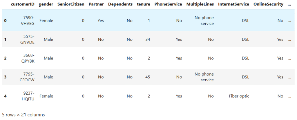
Observations:
- Each row represents a customer.
- Columns include
gender,MonthlyCharges,Contract, and the target variableChurn(Yes/No).
2.2. Check the Shape of the Dataset
Knowing the dataset’s shape tells us how many rows and columns it has. This helps us understand the dataset’s size and structure before diving deeper.
print("Shape:", data.shape) # (7043 rows, 21 columns)Key Insight:
- The dataset has 7,043 customers(rows) and 21 features(columns).
2.3 Check the Dataset Information
It’s helpful to peek under the hood. Checking the dataset information shows the type of each column, whether it’s numbers or text, and how many non-missing values each has. This gives us a quick sense of what needs cleaning or conversion, and which features we can use for analysis.
data.info()RangeIndex: 7043 entries, 0 to 7042
Data columns (total 21 columns):
# Column Non-Null Count Dtype
--- ------ -------------- -----
0 customerID 7043 non-null object
1 gender 7043 non-null object
2 SeniorCitizen 7043 non-null int64
3 Partner 7043 non-null object
4 Dependents 7043 non-null object
5 tenure 7043 non-null int64
6 PhoneService 7043 non-null object
7 MultipleLines 7043 non-null object
8 InternetService 7043 non-null object
9 OnlineSecurity 7043 non-null object
10 OnlineBackup 7043 non-null object
11 DeviceProtection 7043 non-null object
12 TechSupport 7043 non-null object
13 StreamingTV 7043 non-null object
14 StreamingMovies 7043 non-null object
15 Contract 7043 non-null object
16 PaperlessBilling 7043 non-null object
17 PaymentMethod 7043 non-null object
18 MonthlyCharges 7043 non-null float64
19 TotalCharges 7043 non-null object
20 Churn 7043 non-null object
dtypes: float64(1), int64(2), object(18)
memory usage: 1.1+ MB
Shows column types (numbers or text).
- Helps identify potential issues like non-numeric data e.g
TotalChargesshould be of a number type.
2.4. Check for Missing Data
Even the cleanest-looking dataset can hide missing values. Checking for missing data helps us find gaps that could cause errors later. By identifying which columns have missing values and how many, we can plan how to fill or remove them, ensuring our analysis and models are accurate and reliable.
TotalCharges being in the wrong data type could potentially hide missing values because empty strings are not detected as missing values.
So, they do need to be explicitly detected and handled, just like real NaN. We will start by checking these on the categorical columns, then proceed to check for null or missing values.
# Filter the categorical columns values
categorical_columns = data.select_dtypes(include='object').columns

# Replace empty or whitespace-only strings with np.nan in all object columns
data[categorical_columns] = data[categorical_columns].replace(r'^\s*$', np.nan, regex=True)

# Check missing values
data.isnull().sum().to_frame(name='Missing Values').query('`Missing Values` > 0')Missing Values
TotalCharges 11
Since we have established that TotalCharges has missing values, we will start by fixing its data type to be of a numerical type. Then fill in the missing values with the median.
# Convert TotalCharges from object to numeric values
data['TotalCharges'] = pd.to_numeric(data['TotalCharges'], errors='coerce')

# Fill missing values in the 'TotalCharges' column with median
median_total_charges = data['TotalCharges'].median()
data['TotalCharges'] = data['TotalCharges'].fillna(median_total_charges)Why the median?
The median is less affected by extreme values than the mean, making it a robust choice for filling missing data.
2.5. Check for Duplicate Rows
Sometimes datasets have repeated rows due to data entry errors or merging issues. Duplicates can skew analysis and make results misleading. Checking for duplicates helps us identify and remove them, ensuring each customer or record is counted only once for accurate insights.
print("Duplicates:", data.duplicated().sum())Duplicated Values: 0
2.6. Check statistics
Before diving deeper, it’s helpful to look at basic statistics of numerical columns. This gives us a quick sense of averages, spreads, and unusual values. By checking statistics like mean, median, min, max, and quartiles, we can spot outliers, errors, or surprising patterns that might need attention during cleaning or analysis.
data.describe().TSeniorCitizen tenure MonthlyCharges
count 7043.000000 7043.000000 7043.000000
mean 0.162147 32.371149 64.761692
std 0.368612 24.559481 30.090047
min 0.000000 0.000000 18.250000
25% 0.000000 9.000000 35.500000
50% 0.000000 29.000000 70.350000
75% 0.000000 55.000000 89.850000
max 1.000000 72.000000 118.750000
Key Observations:
SeniorCitizenis a binary variable, where ~16.2% of customers are senior citizens.tenurehas a wide spread, ranging from 0 to 72 months, indicating variability in customer lifespans.MonthlyChargesandTotalChargesare both right-skewed, with some high-paying customers pulling the max values up.- The 75th percentile of
TotalChargesis around 3,786, but the maximum charges are over 8,600, suggesting a small group of long-term, high-value customers.
These statistics help establish baselines for deeper analysis and are important for understanding feature distributions prior to modeling or hypothesis testing.
Step 3: Cleaning the Data
Data cleaning is where our raw dataset starts its transformation into something truly useful. As data scientists, we know that real-world data is rarely perfect. It often comes with missing values, duplicates, inconsistent formatting, or outliers that can skew our analysis.
In this stage, our goal is to polish and prepare the data so it accurately represents reality. We’ll fill or remove missing values, fix inconsistencies, and ensure that each column is in the correct format for analysis. Think of it like prepping ingredients before cooking. If you skip this part, no matter how skilled you are with the recipe (your machine learning model), the final dish will suffer.
A well-cleaned dataset not only makes analysis easier but also ensures more reliable insights and predictions, which is the heart of data science.
3.1. Standardizing Categorical Values
Sometimes, our dataset likes to be a little dramatic with its wording. For example, instead of simply saying “No,” it might say things like “No internet service” or “No phone service.” While these phrases are technically accurate, for our purposes they mean the exact same thing: No.
If we leave these inconsistencies as they are, they can throw off our analysis and confuse our encoding process later. By standardizing these values to a clean, consistent “No,” we make life easier for both us and our future machine learning model. Think of it as teaching the dataset to use its “indoor voice” so everyone understands it clearly.
#Check for inconsistencies
for col in categorical_columns:
    print(f"--- {col} ---")
print(data[col].unique(), '\n')--- customerID ---
['7590-VHVEG' '5575-GNVDE' '3668-QPYBK' ... '4801-JZAZL' '8361-LTMKD'
'3186-AJIEK']
--- gender ---
['Female' 'Male']
--- Partner ---
['Yes' 'No']
--- Dependents ---
['No' 'Yes']
--- PhoneService ---
['No' 'Yes']
--- MultipleLines ---
['No phone service' 'No' 'Yes']
--- InternetService ---
['DSL' 'Fiber optic' 'No']
--- OnlineSecurity ---
['No' 'Yes' 'No internet service']
--- OnlineBackup ---
['Yes' 'No' 'No internet service']
--- DeviceProtection ---
['No' 'Yes' 'No internet service']
--- TechSupport ---
['No' 'Yes' 'No internet service']
--- StreamingTV ---
['No' 'Yes' 'No internet service']
--- StreamingMovies ---
['No' 'Yes' 'No internet service']
--- Contract ---
['Month-to-month' 'One year' 'Two year']
--- PaperlessBilling ---
['Yes' 'No']
--- PaymentMethod ---
['Electronic check' 'Mailed check' 'Bank transfer (automatic)'
'Credit card (automatic)']
--- Churn ---
['No' 'Yes']
# Columns that have 'No internet service'
no_internet_services_cols = [col for col in categorical_cols if 'No internet service' in data[col].unique().tolist()]

# Replace 'No internet service' with 'No'
data[no_internet_services_cols] = data[no_internet_services_cols].replace('No internet service', 'No')

# Column 'MultipleLines' replace 'No phone service' with 'No'
data['MultipleLines'] = data['MultipleLines'].replace('No phone service', 'No')3.2. Dropping Unnecessary Columns
Some data don’t add real value to our analysis or predictions. For example, certain columns might simply act as identifiers, offering no meaningful insight into customer behavior. If we keep them, they can add unnecessary noise, make our models more complex than they need to be, and even slow things down. So, we need to drop such columns.
# Let's drop the 'customerID' column
data.drop(columns=['customerID'], axis=1, inplace=True)Step 4: Exploratory Data Analysis (EDA)
Now that our dataset is cleaned and in good shape, it’s time to roll up our sleeves and get to know it on a deeper level. EDA is like the “getting to know you” stage in a relationship with your data; you’re looking for patterns, trends, and quirks that will help guide the rest of your project.
In this step, we’ll explore the dataset visually and statistically to uncover insights that raw tables alone can’t show. We’ll examine how different features interact, spot potential outliers, and identify relationships that might influence customer churn.
EDA is important because it helps us:
- Understand the underlying structure of the data.
- Validate assumptions before modeling.
- Discover hidden patterns that could be crucial for prediction.
- Decide which features are worth keeping, transforming, or discarding.
By the end of this stage, we won’t just have numbers, we’ll have a story forming about our customers and their behavior.
4.1 Distribution of the Target Variable (Churn)
Before diving into all the other features, let’s first look at our main character, Churn. Seeing how many customers stayed versus those who left gives us a sense of the challenge ahead. If most customers stayed, we might be dealing with an imbalanced dataset, which can influence how we approach modeling later.
# Visualize the distribution of the target variable 'Churn'
plt.figure(figsize=(6, 4))
sns.countplot(data=data, x='Churn', palette='Set2')
plt.title('Churn Distribution')
plt.xlabel('Churn')
plt.ylabel('No. of Customers')
plt.grid(axis='y', linestyle='--', alpha=0.75)
plt.show()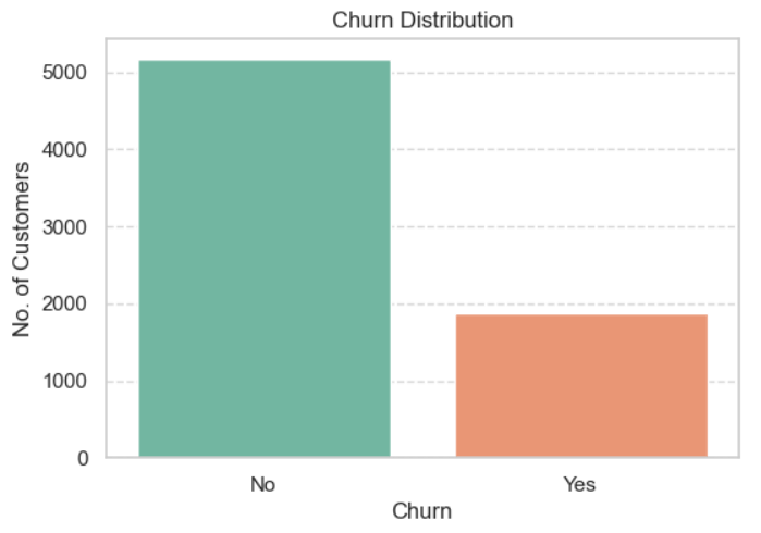
# Churn count and percentage
data['Churn'].value_counts().to_frame(name='Count').assign(
Percent=lambda x: round((x['Count'] / x['Count'].sum()) * 100, 2))Count Percent
Churn
No 5174 73.46
Yes 1869 26.54
Observations:
- Out of the total customers, 73.46% did not churn, while 26.54% did churn.
- This tells us the dataset is imbalanced. The “No Churn” class is almost 3 times bigger than the “Yes Churn” class.
4.2. Univariate Analysis of Numerical Features
Now that we’ve met our target variable, let’s turn our attention to the numerical features. By exploring each one individually, we can uncover their general shape, are they normally distributed, skewed, or full of outliers? This step helps us spot patterns, potential data quality issues, and hints about which features might play a big role in predicting churn.
Let’s extract the numerical columns from our dataset:
# Define numerical columns
numerical_columns = data.select_dtypes(include='number').columns

# Remove 'SeniorCitizen' since this is just a binary 0/1 values
numerical_columns = numerical_columns.drop(['SeniorCitizen'])

print(f'Numerical Columns: {numerical_columns.to_list()}')Numerical Columns: ['tenure', 'MonthlyCharges', 'TotalCharges']
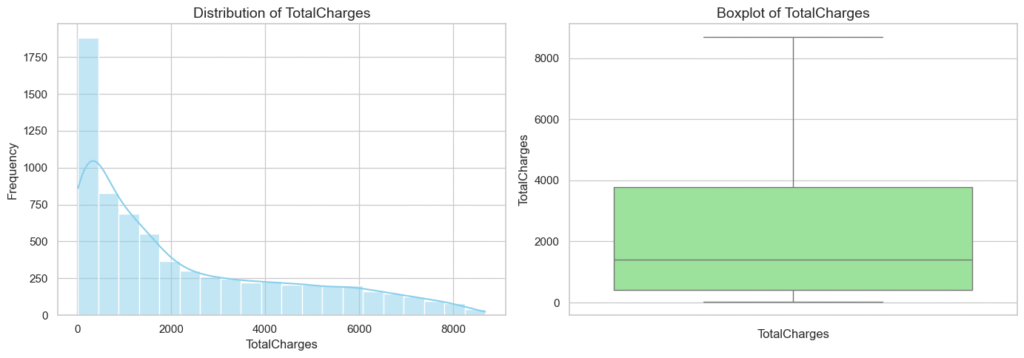
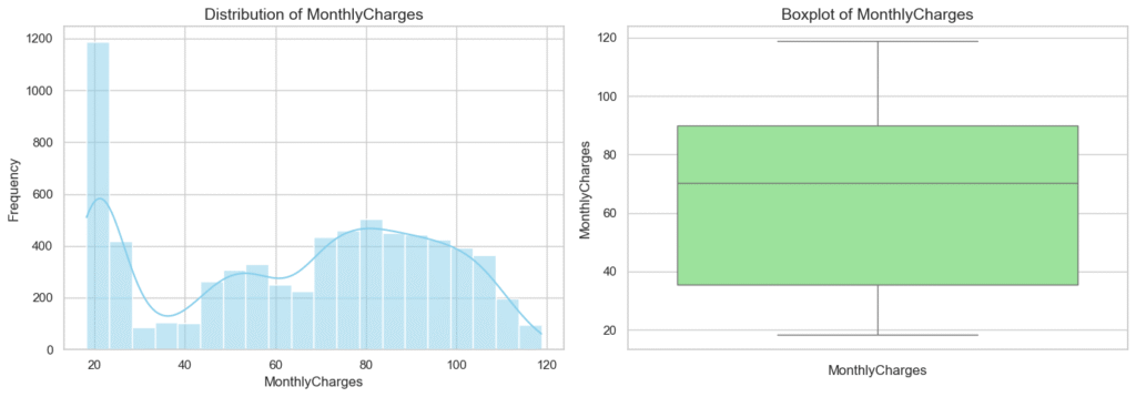
Let’s visualize the distribution of these columns using histograms and box plots.
# Create histograms and box plots for each numeric column
for col in numerical_columns:
    plt.figure(figsize=(14, 5))

    # Histogram
    plt.subplot(1, 2, 1)
    sns.histplot(data[col], bins=20, kde=True, color='skyblue')
    plt.title(f"Distribution of {col}", fontsize=14)
    plt.xlabel(col)
    plt.ylabel('Frequency')

    # Box plot
    plt.subplot(1, 2, 2)
    sns.boxplot(data[col], color='lightgreen')
    plt.title(f"Boxplot of {col}", fontsize=14)
    plt.xlabel(col)

    plt.tight_layout()
    plt.show()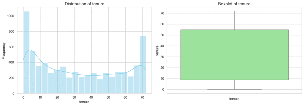
# Checking for Outliers and Skew
for col in numerical_columns:
    q1 = data[col].quantile(0.25)
    q3 = data[col].quantile(0.75)
    iqr = q3 - q1
    lower = q1 - iqr * 1.5
    upper = q3 + iqr * 1.5
    outliers = data[(data[col] < lower) | (data[col] > upper)][col]
    print(f'--- {col} ---')
    print(f'Outliers: {len(outliers)}')
print(f'Skew: {data[col].skew()}', '\n')--- tenure ---
Outliers: 0
Skew: 0.2395397495619829
--- MonthlyCharges ---
Outliers: 0
Skew: -0.22052443394398033
--- TotalCharges ---
Outliers: 0
Skew: 0.9637890936414893
Observations:
tenure
- Most customers have short tenures (<10 months).
- Distribution is slightly right-skewed (skew = 0.24).
- Boxplot shows a longer upper whisker with a few mild outliers.
- Indicates a large base of new customers, with fewer long-term ones.
MonthlyCharges
- Distribution is fairly symmetric, with a slight left skew (skew = -0.22).
- Majority of customers pay between $60–$90.
- Median = $70.35.
- A few outliers exist at the higher end (> $100).
- Suggests pricing tiers/segments, but no extreme distortions.
TotalCharges
- Distribution is clearly right-skewed (skew = 0.96).
- Most customers are clustered around lower totals, with a few paying very high amounts.
- Boxplot shows a long upper whisker and high-value outliers.
- Pattern is expected since
TotalCharges=MonthlyCharges×tenure.
Overall Insights
- No extreme anomalies detected, but skewness is present (especially in
TotalCharges). tenurereflects churn dynamics — many short-term customers vs. few long-term loyal ones.MonthlyChargesappears balanced, aligning with structured pricing plans.TotalChargesmay require log transformation before modeling to reduce skew.- Findings will guide feature scaling, outlier handling, and model choice in later stages.
4.3. Univariate Analysis of Categorical Variables
Next, we’ll zoom in on the categorical features, things like gender, contract type, and payment method. Looking at their distributions helps us see how customers are spread across different categories and whether certain groups seem more churn-prone. It’s a simple step, but it often reveals surprisingly strong signals hiding in plain sight.
# Set up the grid
n_cols = 3
n_rows = (len(categorical_columns) + n_cols - 1) // n_cols  # Compute number of rows needed
plt.figure(figsize=(n_cols * 6, n_rows * 4))

# Loop through each categorical variable and create a bar plot
for i, col in enumerate(categorical_columns, 1):
    plt.subplot(n_rows, n_cols, i)
    sns.countplot(data=data, x=col, palette='Set2', order=data[col].value_counts().index)
    plt.title(f"Distribution of {col}", fontsize=14)
    plt.xticks(rotation=45)
    plt.tight_layout()

plt.show()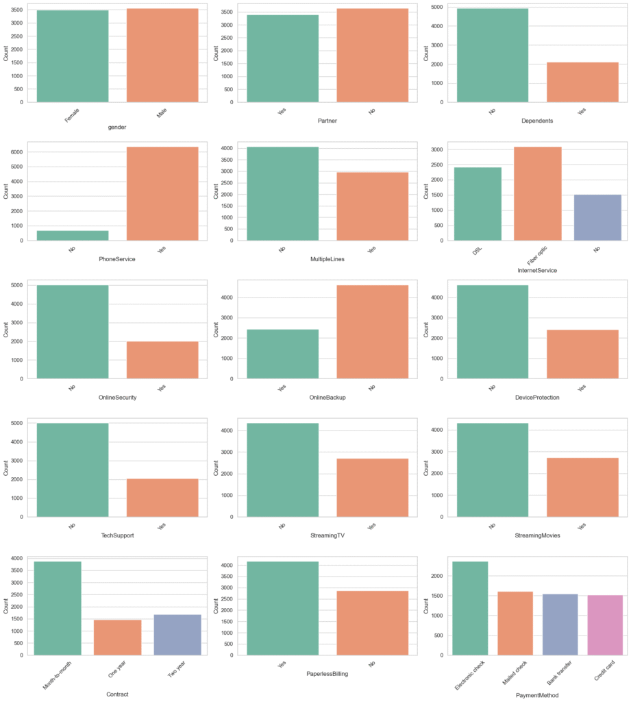
Observations:
- The bar plots gave us a quick snapshot of our customer base.
- We saw that the dataset is fairly balanced by gender, but most customers do not have dependents and many are without partners.
- Phone service is common, and about half of those users have multiple lines.
- Fiber optic and DSL dominate internet usage, while many skip extra services like online security and tech support.
- Streaming services are used by a good portion of customers, though slightly fewer than half.
- Most people choose month-to-month contracts, suggesting they prefer flexibility over long-term commitments.
- Paperless billing is popular, and electronic checks lead payment preferences, with automatic payment methods seeing moderate use.
- Finally, most customers stayed, but almost 1 in 4 left—meaning churn is a real issue and the data is imbalanced.
4.4. Bivariate Analysis of Numerical Variables vs. Target (Churn)
Now that we’ve explored our numerical features on their own, it’s time to see how they relate to the very thing we care about most, Churn. This is where patterns begin to emerge. By comparing each numerical variable with churn, we can spot early warning signs, like whether shorter tenure or higher monthly charges might be nudging customers toward leaving. Think of this step as connecting the dots between what customers look like and whether they stay or go.
# Create box plots for each numerical column against the target 'Churn'
plt.figure(figsize=(18, 5))

for i, col in enumerate(numerical_columns, 1):
    plt.subplot(1, 3, i)
    sns.boxplot(data=data, x='Churn', y=col)
    plt.title(f"Boxplot of {col}", fontsize=14)

plt.tight_layout()
plt.show()
Summary
- These patterns provide strong evidence that short tenure and higher monthly charges are associated with customer churn.
- These features could be especially useful predictors in a machine learning model and may also guide business strategies like targeted retention offers for new high-paying customers.
4.5. Bivariate Analysis of Categorical Variable vs. Target (Churn)
Numbers tell one side of the churn story, but categories, like contract type, payment method, or internet service, often reveal the why behind it. In this step, we’ll break down each categorical feature by churn status to see which groups are more likely to leave. This helps us spot trends that numbers alone might hide, like whether month-to-month customers are quietly leading the exodus.
# Set up plot
n_cols = 2
n_rows = math.ceil(len(categorical_cols) / n_cols)
plt.figure(figsize=(6 * n_cols, 4 * n_rows))

# Plot variables on count plot
for i, col in enumerate(categorical_cols, 1):
    plt.subplot(n_rows, n_cols, i)
    sns.countplot(data=data, x=col, hue='Churn', palette='Set2')
    plt.title(f'{col} vs Churn', fontsize=16)
    plt.xlabel(col, fontsize=14)
    plt.ylabel('Count', fontsize=14)
    plt.xticks(rotation=45)

plt.subplots_adjust(hspace=0.8, wspace=0.2)
plt.tight_layout()
plt.show()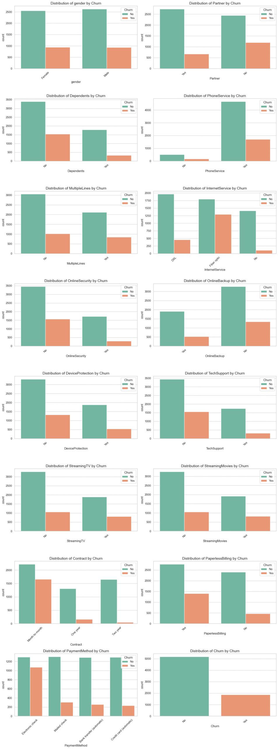
Summary
Several categorical variables reveal strong relationships with churn:
Contract,PaymentMethod, andInternetServiceare especially informative.- Features related to support services (
OnlineSecurity,TechSupport) suggest that lack of added value may push users away. - We’ll explore these further in modeling and hypothesis testing stages.
4.6. Multivariate Analysis
So far, we’ve looked at features in isolation, either on their own or paired with churn. But real customer behavior is rarely driven by just one factor at a time. In this step, we’ll combine multiple variables to uncover patterns that only emerge when features interact, giving us a fuller picture of what drives customers to stay or go.
We’ll use a correlation matrix to assess linear relationships between numerical features.
# Correlation matrix heatmap for numerical features
plt.figure(figsize=(8, 5))

# Calculate correlation matrix
correlation_matrix = data[numerical_columns].corr()

# Plot Heatmap
sns.heatmap(correlation_matrix, annot=True, cmap='coolwarm', fmt=".2f", linewidths=0.5)
plt.title('Correlation Matrix of Numerical Features', fontsize=14)
plt.show()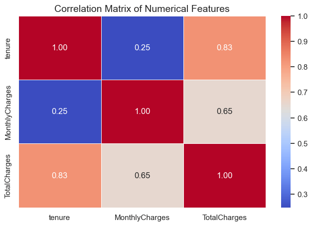
Summary
- The correlation analysis shows that
tenureandTotalChargesare strongly related (0.83), reflecting the natural accumulation of charges over time. MonthlyChargesalso correlates moderately withTotalCharges(0.65), while its link to tenure is weak (0.25), suggesting monthly rates are largely independent of customer longevity.- Overall,
TotalChargesis essentially a combination oftenureandMonthlyCharges, so it may be partially redundant for modeling, though no severe multicollinearity issues are present.
Step 5: Feature Engineering
Now that we’ve explored our dataset and uncovered key patterns, it’s time to shape our data into a form that’s ready for modeling. Feature Engineering is where we transform raw information into meaningful features that help our model make better predictions.
In this step, we’ll create new variables, modify existing ones, and encode categorical data so that machine learning algorithms can understand it. Think of it as giving our model the best possible toolkit to work with.
Feature engineering is important because it can:
- Improve model accuracy by adding more relevant information.
- Reduce noise and irrelevant details.
- Make different types of data usable for algorithms.
By the end of this stage, we’ll have a clean, well-structured dataset with features that are not just machine-readable, but also optimized for predictive power.
5.1. Encoding Categorical Variables
When working with machine learning models, numbers are the language they understand, but our dataset still has plenty of words in it. Encoding categorical variables is like translating those words into a numerical form so our algorithms can make sense of them. In this step, we’ll turn features like gender or contract type into meaningful numbers without losing the information they carry. It’s a small change in appearance, but a big step toward making our data model-ready.
5.1.1. Binary Encoding of Yes/No Features
Some columns in our dataset are simple “yes” or “no” answers—almost like light switches that are either on or off. Binary encoding flips these answers into 1s and 0s, giving our models a clear signal without overcomplicating things. It’s quick, tidy, and perfect for features like Partner or Dependents, where the story is already black and white.
# List of binary categorical columns to encode
binary_cols = [
    'Partner', 'Dependents', 'PhoneService', 'PaperlessBilling', 'Churn',
    'OnlineSecurity', 'OnlineBackup', 'DeviceProtection',
    'TechSupport', 'StreamingTV', 'StreamingMovies'
]

# Apply binary encoding
for col in binary_cols:
    encoded_data = data.copy()
encoded_data[col] = encoded_data[col].map({'Yes': 1, 'No': 0})5.1.2 Encoding Remaining Categorical Features
Not all categorical features are as simple as “yes” or “no.” Some have multiple categories—like InternetService with options such as DSL, Fiber optic, or None. For these, we can’t just flip a switch to 1 or 0. Instead, we use techniques like one-hot encoding, which creates a separate column for each category, marking it with a 1 if it’s present and 0 otherwise.
It’s like giving each category its own name tag so the model can clearly tell them apart without assuming one is “greater” than the other.
# Exclude already encoded binary columns
remaining_cat_cols = [col for col in categorical_columns if col not in binary_cols]

# Perform one-hot encoding using Pandas 'get_dummies()'
encoded_cols = pd.get_dummies(encoded_data[remaining_cat_cols], drop_first=True)

# Convert boolean columns to integer (0/1)
data_encoded = data_encoded.astype(int)

# Display the encoded data first few rows
data_encoded.head()
5.2 Creating New Features
Sometimes the data tells a richer story when we combine what we already have into something new. Creating new features, often called feature creation or feature construction, is like adding fresh ingredients to a recipe to enhance the flavor.
For example, we might combine tenure and MonthlyCharges to estimate TotalCharges, or group contract lengths into “short-term” vs. “long-term” commitments. These new features can highlight hidden patterns, making it easier for our model to pick up on signals that the raw data alone might not reveal.
5.2.1 Creating the TotalServices feature
Instead of looking at PhoneService, InternetService, StreamingTV, and others individually, we can bundle them into a single TotalServices feature. This gives us a quick snapshot of a customer’s engagement level, someone using six services is clearly more invested than someone with just one.
From a churn prediction standpoint, this matters because customers with more services might be either more loyal (harder to leave) or more at risk if they feel they’re paying too much. By creating this feature, we give our model a clearer way to capture that relationship.
# List the services columns
services_columns = ['OnlineSecurity', 'OnlineBackup', 'DeviceProtection', 'TechSupport', 'StreamingTV', 'StreamingMovies']

# Create a copy of the encoded data
data_engineered = data_encoded.copy()

# Create the 'TotalServices' feature
data_engineered['TotalServices'] = data_engineered[services_columns].sum(axis=1)

# Display first few rows services columns and the new 'TotalServices' to confirm
data_engineered[services_columns + ['TotalServices']].head()
5.2.2 Creating the tenure_group feature
Here, we’re taking the continuous tenure variable (how many months a customer has been with the company) and grouping it into ranges, like “New,” “Established,” or “Long-term.”
Why? Because raw month counts might not tell the whole story, humans tend to think in stages rather than exact numbers. Grouping tenure helps us spot patterns, like whether most churn happens early in the relationship or after several years.
This transformation also makes it easier for some models to work with tenure-related patterns, especially when combined with categorical analysis later on.
# Create a new categorical column 'tenure_group' based on tenure ranges
data_engineered['tenure_group'] = pd.cut(
    data_engineered['tenure'],
    bins=[-1, 12, 24, 48, 72],  # Define bin edges in months
    labels=['0-1 year', '1-2 years', '2-4 years', '4-6 years']  # Labels for each bin
)

data_engineered[['tenure', 'tenure_group']].head()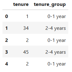
5.2.3 Creating the AverageChargesPerService Feature
Here, we’re adding a new metric that takes a customer’s MonthlyCharges and divides it by the number of services they subscribe to.
\(AverageChargesPerService = \frac{MonthlyCharges}{TotalServices}\)
The idea is to get a clearer sense of how much each service is costing them on average. A high AverageChargesPerService might indicate premium or niche services, while a lower value could suggest bundled or discounted packages.
This feature can help us uncover whether customers paying more per service are more likely to churn, giving the model another useful perspective on customer behavior.
# Create 'AverageChargesPerService' feature
data_engineered['AverageChargesPerService'] = data_engineered.apply(lambda row: row['MonthlyCharges'] / row['TotalServices'] if row['TotalServices'] > 0 else 0, axis=1)

# Verify the new column
data_engineered[['MonthlyCharges', 'TotalServices', 'AverageChargesPerService']].head()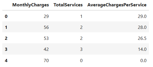
5.2.4. Creating the HasMultipleServices Feature
Here, we’re creating a simple flag that tells us whether a customer subscribes to more than one service.
\(HasMultipleServices = \left\{ \begin{array}{cl}
1, &\text{if } TotalServices > 1\\
0, &\text{otherwise}
\end{array} \right.\)
Why? Because customers with multiple services are often more “locked in” and might be less likely to churn, think of it as having more ties that bind them to the company. On the other hand, it could also mean higher bills, which might prompt some to leave.
By turning this into a clear Yes/No feature, we provide our model with an easy way to determine if having multiple services plays a role in retention or churn.
# Create 'HasMultipleServices' feature
data_engineered['HasMultipleServices'] = (data_engineered['TotalServices'] > 1).astype(int)

# Preview the new features
data_engineered[['TotalServices', 'HasMultipleServices']].head()Step 6: Mini-EDA on Newly Engineered Features
Now that we’ve rolled up our sleeves and crafted some fresh new features, it’s time to give them a quick check-up before sending them into battle.
This “mini-EDA” is like a sneak peek, making sure our engineered features actually make sense, behave as expected, and add value to the dataset. We’ll look at their distributions, see how they relate to churn, and check if they’re capturing the patterns we hoped they would.
Doing this step is important because not all engineered features turn out to be useful (or even logical) once we see them in action. A quick analysis helps us spot duds early, confirm promising patterns, and refine any features that need a little extra polish.
6.1. Encode tenure_group as ordinal integers
Since tenure_group represents a natural order of customer loyalty over time, we’ll give each group a corresponding number. This way, our models can understand that “12–24 months” comes after “0–12 months” instead of treating them as unrelated categories.
# Mapping for tenure buckets -> ordinal integers
tenure_map = {
    '0-1 year': 0,
    '1-2 years': 1,
    '2-4 years': 2,
    '4-6 years': 3,
}

# Create the encoded column (will be NaN where tenure_group is missing or unexpected)
data_engineered['tenure_group_encoded'] = data_engineered['tenure_group'].map(tenure_map)

# Let's convert 'tenure_group_encoded' to type integer
data_engineered['tenure_group_encoded'] = data_engineered['tenure_group_encoded'].astype(int)

# Preview the encoding
data_engineered[['tenure_group', 'tenure_group_encoded']].head()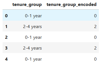
6.2. Descriptive statistics for the new features
Before we move forward, let’s take a quick pulse check on our newly engineered features. By looking at their descriptive statistics, we can spot any unexpected values, strange distributions, or interesting trends, basically making sure our new creations are behaving as intended.
# Descriptive stats for the numerical engineered features
numerical_engineered_features = [
    'TotalServices', 'AverageChargesPerService', 'HasMultipleServices', 'tenure_group_encoded'
]

data_engineered[numerical_engineered_features].describe()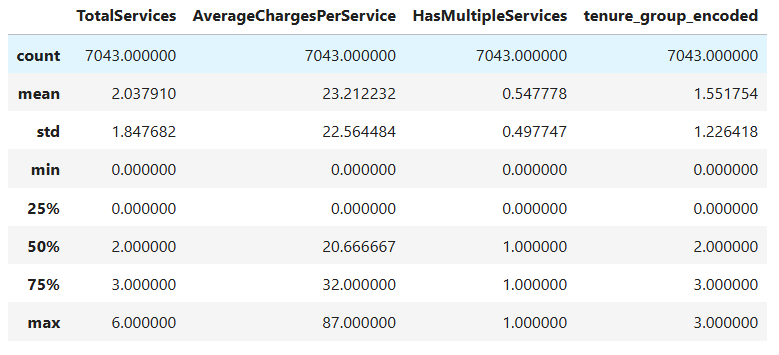
6.3. Visual checks (countplots & histogram)
Now it’s time to give our new features a visual health check. Using countplots and histograms, we can quickly see how these variables are distributed and whether any unusual patterns pop up. It’s like holding them up to the light to spot hidden quirks before we move on.
plt.figure(figsize=(12, 10))

# 1. TotalServices countplot
plt.subplot(2, 2, 1)
order_ts = sorted(data_engineered['TotalServices'].dropna().unique())
sns.countplot(x='TotalServices', data=data_engineered, order=order_ts, palette='Set2')
plt.title('Count of TotalServices (number of services per customer)')
plt.xlabel('TotalServices (0 = none, up to 6)')
plt.ylabel('Count')

# 2. AverageChargesPerService distribution
plt.subplot(2, 2, 2)
sns.histplot(data_engineered['AverageChargesPerService'].replace(0, np.nan).dropna(), bins=30, kde=True)
# Note: replace(0, np.nan) is optional — zeros represent customers with no services
plt.title('Distribution of AverageChargesPerService')
plt.xlabel('AverageChargesPerService')
plt.ylabel('Frequency')

# 3. HasMultipleServices (binary)
plt.subplot(2, 2, 3)
sns.countplot(x='HasMultipleServices', data=data_engineered, palette='Set2')
plt.title('HasMultipleServices (0 = <=1 service, 1 = >1 service)')
plt.xlabel('HasMultipleServices')
plt.ylabel('Count')

# 4. tenure_group_encoded counts with readable labels
plt.subplot(2, 2, 4)
order_tg = [0, 1, 2, 3]
sns.countplot(x='tenure_group_encoded', data=data_engineered, order=order_tg, palette='Set2')
plt.title('Tenure groups (encoded)')
plt.xlabel('tenure_group_encoded')
plt.xticks(ticks=[0, 1, 2, 3], labels=['0-1y', '1-2y', '2-4y', '4-6y'])
plt.ylabel('Count')

plt.tight_layout()
plt.show()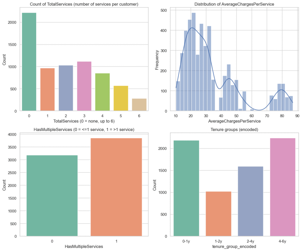
Mini-EDA Summary for Newly Engineered Features
TotalServices– Almost a third of customers (31.5%) have no services at all, with steadily fewer customers as the number of services rises. This pattern hints that bundling services might help with retention.HasMultipleServices– A slight majority (54.8%) have more than one service, suggesting they may be more committed and less likely to churn.tenure_group_encoded– Two big groups stand out: very new customers (0–1 year) and long-term customers (4–6 years), aligning with typical churn patterns where newcomers leave more often.AverageChargesPerService– Many customers pay nothing (no active services), while active ones spend a median of ~$20 per service, with a small set of high spenders who might behave differently.
Overall – These features capture behavior, lifecycle stage, and spending patterns, giving us promising variables to test for their impact on churn.
6.4. Correlation heatmap including engineered features
Let’s see how our newly engineered features mingle with the rest of the dataset. By adding them to a correlation heatmap, we can spot fresh relationships, confirm if they bring unique value, or catch any signs of redundancy early on.
# Columns to include in correlation check
corr_cols = [
    'tenure', 'MonthlyCharges', 'TotalCharges',
    'TotalServices', 'AverageChargesPerService', 'HasMultipleServices',
    'tenure_group_encoded', 'Churn'
]

# Compute correlation matrix (drop rows with missing values among these columns)
corr_df = data_engineered[corr_cols].dropna()  # dropna to avoid issues
corr_matrix = corr_df.corr()

plt.figure(figsize=(9, 7))
sns.heatmap(corr_matrix, annot=True, fmt=".2f", cmap='coolwarm', center=0, linewidths=.5)
plt.title('Correlation matrix including engineered features')
plt.show()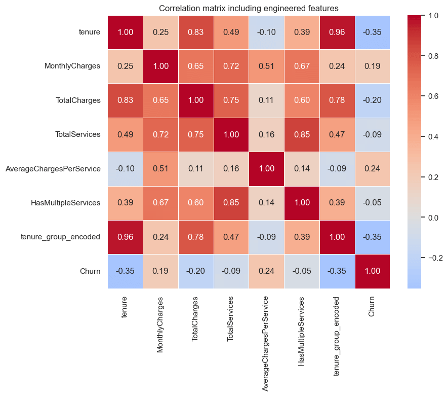
Correlation Insights – Engineered Features Included
Tenure&Churn(–0.35) – Moderate negative link: the longer a customer stays, the less likely they are to churn. A classic loyalty effect.Tenure Group Encoded&Churn(–0.35) – Mirrors the raw tenure relationship, confirming our grouping didn’t lose the churn signal.MonthlyCharges&Churn(+0.19) – Slight upward trend: higher bills are loosely tied to higher churn, hinting at some price sensitivity.AverageChargesPerService&Churn(+0.24) – Weak-to-moderate link: paying more per service seems connected to higher churn risk, especially for customers with few services.TotalCharges&Churn(–0.20) – Weak negative tie: big spenders (often long-tenured) churn less.TotalServices(–0.09) &HasMultipleServices(–0.05) – Barely negative, suggesting service bundling offers only a small retention boost here.
Notable inter-feature relationships
Tenure↔Tenure Group Encoded(0.96) – Almost identical; expected.TotalServices↔HasMultipleServices(0.85) – Strong link; the flag is basically a simpler version of service count.MonthlyCharges↔TotalServices(0.72) – More services generally mean higher bills.
Bottom line – Tenure-related measures remain the strongest churn indicators, with spending patterns coming next. Service counts may add value when paired with other features, but on their own they’re weaker predictors.
Step 7: Hypothesis Testing
Now that we’ve explored our data and engineered new features, it’s time to turn our observations into testable ideas. Hypotheses are essentially our educated guesses, what we expect to be true about the factors driving churn.
By stating these upfront, we create a clear plan for what to investigate, making our analysis more focused and purposeful. Hypotheses help us:
- Stay on track and avoid aimless exploration
- Test assumptions with actual evidence
- Connect data insights to real-world reasoning
By the end of this step, we’ll have a set of clear, testable statements that guide the rest of our analysis and help us understand whether our assumptions hold true.
7.1 Hypothesis 1: MonthlyCharges vs Churn – (t-Test)
Our first hunch is that customers who churn might be paying higher monthly charges than those who stay. To check this, we’ll compare the average monthly bill between the two groups using a t-test. If the difference is significant, it could mean pricing plays a role in whether customers stick around.
Question: Are average monthly charges different between customers who churned and those who did not?
Hypotheses (two-sided):
- H₀: μ_churn = μ_no_churn (mean MonthlyCharges are equal)
- H₁: μ_churn ≠ μ_no_churn (means differ)
Test choice & assumptions:
- We’ll perform an independent samples t-test.
- If both groups have similar spread (variance), we use the standard t-test.
- If spreads differ, we use Welch’s t-test, which is more reliable.
- Significance level: α = 0.05.
We will:
- Prepare data and get group stats.
- Run Levene’s test (H₀: variances equal).
- If Levene p < α → use Welch’s t-test (equal_var=False).
Else → use standard t-test (equal_var=True). - Report t-statistic, p-value, 95% CI for mean difference, and an effect-size (Cohen’s d).
7.1.1. Prepare Data & Descriptive Stats
Before running the t-test, we’ll first get our data in order. This means filtering out any missing values, splitting customers into “churned” and “stayed” groups.
# Keep only relevant columns
df_h1 = data_engineered[['MonthlyCharges', 'Churn']]

# Split 'MonthlyCharges' into yes and no groups (0/1) groups
group_churn = df_h1[df_h1['Churn'] == 1]['MonthlyCharges'].astype(float)
group_no_churn = df_h1[df_h1['Churn'] == 0]['MonthlyCharges'].astype(float)7.1.2. Levene’s Test for Equal Variances
Before we compare the means, we need to check if both groups have similar variance (spread of values). Levene’s test helps us do exactly that. If the variances are equal, we can use the standard version of the t-test; if not, we’ll adjust our approach to avoid misleading results.
# Levene's test for equality of variances
lev_stat, lev_p = stats.levene(group_churn, group_no_churn, center='median')  # center='median' is robust

print("--- Levene's test for equal variances ---")
print(f"stat = {lev_stat:.4f}, p = {lev_p:.4f}")

alpha = 0.05
if lev_p < alpha:
    print(f"p < {alpha} → variances appear different (reject H0). We'll use Welch's t-test (equal_var=False).")
    equal_var_flag = False
else:
    print(
        f"p >= {alpha} → no evidence variances differ (fail to reject H0). We can use standard t-test (equal_var=True).")
equal_var_flag = True--- Levene's test for equal variances ---
stat = 362.1557, p = 0.0000
p < 0.05 → variances appear different (reject H0). We'll use Welch's t-test (equal_var=False).
7.1.3. Run the t-test (Standard or Welch based on Levene)
Now that we know whether the group variances are equal, we can run the appropriate t-test. If Levene’s test said the variances are similar, we’ll use the standard version. If not, we’ll switch to Welch’s t-test, which is better when spreads differ. Either way, this will tell us if the difference in average monthly charges between churned and non-churned customers is statistically significant.
# Run the appropriate t-test
t_stat, p_value = stats.ttest_ind(group_churn, group_no_churn, equal_var=equal_var_flag, nan_policy='omit')

print("--- Independent samples t-test result ---")
print(f"t-statistic = {t_stat:.4f}")
print(f"p-value     = {p_value:.6f}")
print(f"test used   = {'standard t-test (equal var assumed)' if equal_var_flag else 'Welch t-test (unequal var)'}")
print("--- Decision ---")
if p_value < alpha:
    print(f"p-value < {alpha} → Reject H₀: there is a statistically significant difference in MonthlyCharges.")
else:
print(f"p-value >= {alpha} → Fail to reject H₀: no statistical evidence of a difference in MonthlyCharges.")--- Independent samples t-test result ---
t-statistic = 18.4150
p-value = 0.000000
test used = Welch t-test (unequal var)
--- Decision ---
p-value < 0.05 → Reject H₀: there is a statistically significant difference in MonthlyCharges.
Summary – Hypothesis Test 1: MonthlyCharges vs Churn
- Customers who churned paid, on average, more per month than those who stayed. The difference is not due to random chance, it’s statistically significant.
- Business takeaway: Higher monthly charges appear linked to higher churn rates. This suggests pricing pressure may be pushing customers away. Possible strategies could include:
- targeted retention discounts,
- added perks for premium tiers, or
- reviewing value for high-cost plans.
7.2. Hypothesis 2: Contract Type vs Churn – (Chi-square Test)
Now we shift our focus from monthly spending to contract type, to see if the length or flexibility of a customer’s plan relates to their likelihood of leaving. Using a Chi-square test, we’ll check whether churn rates differ significantly between customers on month-to-month, one-year, or two-year contracts. If a relationship exists, it could reveal how commitment levels influence retention.
Question: Is churn associated with contract type?
Hypotheses (two-sided):
- H₀:
Churnis independent of Contract type (no association). - H₁:
Churnis not independent of Contract type (there is an association). - Significance level: α = 0.05.
7.2.1. Prepare data & contingency table
First, we’ll tidy up the data so that contract type and churn status are ready for comparison. Then, we’ll create a contingency table, a simple grid that shows how many customers fall into each combination of contract type and churn outcome. This gives us a clear snapshot before running the Chi-square test.
# Select only relevant columns
df_h2 = data[['Contract', 'Churn']]

# Build contingency table: rows = Contract, cols = Churn
contingency = pd.crosstab(df_h2['Contract'], df_h2['Churn'], margins=False)

# Run chi-square test
chi2, p, dof, expected = stats.chi2_contingency(contingency)

# Print test stats
print("Chi-square statistic:", round(chi2, 4))
print("p-value:", p)
print("Degrees of freedom:", dof)

print("--- Decision ---")
if p_value < alpha:
    print(f"p-value < {alpha} → Reject H₀: Churn is related to Contract type.")
else:
print(f"p-value >= {alpha} → Fail to reject H₀: No evidence of relationship between Churn and Contract type.")Chi-square statistic: 1184.5966
p-value: 0.0000
Degrees of freedom: 2
--- Decision ---
p-value < 0.05 → Reject H₀: Churn is related to Contract type.
Summary – Hypothesis Test 2: Contract Type vs Churn
A Chi-square test was performed to examine the relationship between Churn and Contract type. The results showed a Chi-square statistic of 1184.60 with 2 degrees of freedom, and a p-value < 0.05. Since the p-value is below the significance threshold, we reject the null hypothesis and conclude that Churn is significantly related to Contract type.
7.3 Hypothesis 3: (TechSupport vs Churn) — Two-Proportion z-Test
Here, we’re looking at whether the churn rate differs meaningfully between customers who have tech support and those who don’t. It’s a straightforward way to check if providing (or not providing) this service is linked to customer retention. By running a two-proportion z-test, we can see if any observed difference in churn rates is statistically significant or just random noise, and that can guide whether tech support should be a bigger part of our retention strategy.
Question: Is the proportion of churn different between customers with and without TechSupport?
Hypotheses (two-sided):
- H₀: p_with = p_without (churn proportion is equal for both groups)
- H₁: p_with ≠ p_without (churn proportion differs between the two groups)
Test choice & assumptions:
- We’ll use a two-proportion z-test because:
- Outcome variable
Churnis binary (0 = No, 1 = Yes). - Group variable
TechSupporthas exactly two categories (Yes/No). - We want to compare proportions across the two groups.
- Outcome variable
- Requirements:
- Each group’s sample size should be large enough for the normal approximation to be valid (rule of thumb: np ≥ 5 and n(1–p) ≥ 5 for each group).
- Significance level: α = 0.05.
We will:
- Prepare data by ensuring Churn is coded as 0/1 and selecting TechSupport groups.
- Count churn cases and total customers in each group.
- Calculate proportions for each group.
- Calculate the pooled proportion and standard error.
- Compute the z-statistic and p-value (two-tailed).
- Interpret results and check if we reject the null hypothesis.
7.3.1 Prepare Data
In this step, we set up the data needed for our two-proportion z-test. That means:
- Filtering and grouping customers based on whether they have
TechSupport(“Yes” or “No”). - Counting churn events in each group so we know exactly how many customers left versus stayed.
- Calculating churn proportions for both groups, which will give us the baseline comparison we’re testing.
By the end of this step, we’ll have a clean contingency-style summary that shows churn counts and rates for customers with and without tech support, ready for statistical testing.
# Separate the two groups: With and Without Tech Support
group_with = data[data['TechSupport'] == 1]
group_without = data[data['TechSupport'] == 0]

n1 = len(group_with)     # total in group 1
n2 = len(group_without)  # total in group 2

x1 = group_with['Churn'].sum()     # churn count in group 1
x2 = group_without['Churn'].sum()  # churn count in group 2

n1, x1, n2, x2(2044, np.int64(310), 4999, np.int64(1559))
7.3.2 Calculate Sample Proportions
Now that we’ve separated customers into TechSupport: Yes and TechSupport: No groups, the next step is to figure out what proportion of each group actually churned.
We do this by dividing the number of churned customers in each group by the total number of customers in that group.
This gives us two key numbers:
- The churn rate for customers with tech support.
- The churn rate for customers without tech support.
These proportions are the heart of our two-proportion z-test, they let us see, in percentage terms, how much more (or less) likely customers without tech support are to leave compared to those who have it.
p1 = x1 / n1
p2 = x2 / n2

print(f"Proportion churn WITH Tech Support: {p1:.4f}")
print(f"Proportion churn WITHOUT Tech Support: {p2:.4f}")Proportion churn WITH Tech Support: 0.1517 Proportion churn WITHOUT Tech Support: 0.3119
7.3.3 Calculate Sample Proportions
Rather than just staring at totals, we’ll break churn down into proportions for each group, those with tech support and those without. This lets us compare churn risk on equal footing, regardless of how many customers are in each group. If the “no tech support” group’s proportion is noticeably higher, it’s an early clue that lack of support could be linked to higher churn, something worth digging into before we even run the formal test.
# Pooled proportion
p_pool = (x1 + x2) / (n1 + n2)

# Standard error of the difference in proportions
se = sqrt(p_pool * (1 - p_pool) * (1/n1 + 1/n2))

p_pool, se(np.float64(0.2653698707936959), 0.011591963489004459)
7.3.4 Compute z-Statistic and p-Value
Now that we know the churn proportions for each group, it’s time to see if the gap between them is just random noise or a real, statistically significant difference.
We’ll use the two-proportion z-test to crunch the numbers, the z-statistic measures how far apart the proportions are in standard error units, and the p-value tells us the likelihood of seeing such a gap by chance.
If that p-value is small enough (below our threshold), we can confidently say that tech support availability is linked to differences in churn rates.
# z statistic
z_stat = (p1 - p2) / se

# Two-tailed p-value
p_value = 2 * (1 - stats.norm.cdf(abs(z_stat)))

z_stat, p_value(np.float64(-13.81983022448171), np.float64(0.0))
7.3.5 Decision
With the p-value in hand, we can finally make the call. If it’s below our chosen significance level, we reject the null hypothesis and conclude that churn rates truly differ between customers with and without tech support. If not, we keep the null and chalk up any difference to chance. This step is where all the number crunching pays off, turning statistical output into a clear “yes, there’s a link” or “no, there isn’t.”
alpha = 0.05
if p_value < alpha:
    decision = "Reject H₀ — Statistically significant difference in churn proportions."
else:
    decision = "Fail to reject H₀ — No statistically significant difference."

print(f"Z = {z_stat:.4f}, p = {p_value:.4f} → {decision}")Z = -13.8198, p = 0.0000 → Reject H₀ — Statistically significant difference in churn proportions.
Summary — Hypothesis 3: Tech Support vs Churn
Our analysis shows a clear link between tech support availability and customer churn. Customers without tech support churn at about 31%, which is roughly double the 15% churn rate of those who have it.
The two-proportion z-test confirmed this difference is statistically significant (z = -13.82, p < 0.0001), so we can confidently reject the idea that the gap is due to chance.
Business implication:
Lack of tech support appears to be a major churn risk factor. Offering or actively promoting tech support—especially to high-risk groups—could be an effective retention strategy.
Big picture:
Combined with earlier findings on contract length and monthly charges, it’s clear that churn is strongly associated with:
- Higher monthly costs
- Shorter contracts
- No tech support
Targeting these factors could meaningfully reduce churn and improve customer lifetime value.
Step 8: Conclusion & Next Steps
We analyzed the Telco Customer Churn dataset to uncover key drivers of churn. After cleaning the data, exploring patterns, engineering new features, and running statistical tests, three clear insights emerged:
- Contract Type is the biggest churn predictor — month-to-month customers churn far more than those with longer contracts.
- Higher Monthly Charges are linked to higher churn.
- Lack of Tech Support doubles churn rates, suggesting a major retention opportunity.
Next Steps
- Modeling: Build and evaluate churn prediction models (Logistic Regression, Random Forest, XGBoost) using ROC-AUC and feature importance to validate drivers.
- Business Actions: Target high-risk customers with contract upgrade incentives, service bundles, and tech support offers.
- Future Analysis: Incorporate behavioral data, run survival analysis, and track churn trends to measure impact over time.
Final Thought
By blending statistical rigor with clear insights, we turned churn data into practical strategies — an approach that can guide retention efforts in any subscription-based business.

