Machine learning can seem daunting at first, but with the right approach, even beginners can build powerful models. In this article, we’ll walk through a complete Titanic Survival Prediction project using Decision Trees, explaining every step in detail—from loading the data to evaluating the final model. By the end, you’ll understand not just how to implement the model, but also why each step is necessary.
Introduction to the Problem
The sinking of the Titanic in 1912 remains one of the most tragic maritime disasters in history. The dataset we’ll use contains information about passengers, including their age, sex, ticket class, and whether they survived. Our goal is to predict survival based on these features using a Decision Tree Classifier.
Why Decision Trees?
- Interpretability: Unlike “black-box” models like neural networks, decision trees are easy to visualize and understand.
- No strict assumptions: They don’t require data to be normally distributed or linearly separable.
- Handles mixed data types: Works well with both numerical and categorical features.
To follow along with this article, you can find the code implementation in a Jupyter Notebook in this GitHub repo.
Step 1: Setting Up the Environment
Before diving into the data, we need to import the necessary libraries. These tools will help us manipulate data, visualize trends, and train our model.
# Basic Libraries
import pandas as pd
import numpy as np

# Visualization Libraries
import matplotlib.pyplot as plt
import seaborn as sns
from sklearn.tree import plot_tree

# Scikit-learn Utilities
from sklearn.model_selection import train_test_split
from sklearn.tree import DecisionTreeClassifier
from sklearn.metrics import (accuracy_score, classification_report, confusion_matrix)

# Encoding & Preprocessing
from sklearn.preprocessing import LabelEncoder

# Suppress warnings to keep the output clean
import warnings
warnings.filterwarnings('ignore')

# Set Seaborn style for better-looking plots
sns.set(style="whitegrid")Explanation of Libraries
- Pandas (
pd): Helps load and manipulate structured data (e.g., CSV files). - NumPy (
np): Essential for numerical computations (e.g., filling missing values with the median). - Matplotlib & Seaborn: Used for plotting trends (e.g., survival rates by gender).
- Scikit-learn: Provides tools for:
- Splitting data (
train_test_split). - Training decision trees (
DecisionTreeClassifier). - Evaluating performance (
accuracy_score,classification_report).
- Splitting data (
- LabelEncoder: Converts text labels (e.g., “male”/”female”) into numbers (0/1) so the model can process them.
Step 2: Loading and Exploring the Data
2.1 Loading the Dataset
We start by loading the Titanic dataset from a CSV file into a Pandas DataFrame.
# Read the CSV file into a DataFrame
df = pd.read_csv('titanic-dataset.csv')

# Display the first 5 rows to understand the structure
df.head()
Key Observations:
Survived:0= No,1= Yes.Pclass: Ticket class (1= 1st class,2= 2nd class,3= 3rd class).Sex,Age,Fare, andEmbarked(port of boarding) are likely useful predictors.
2.2 Explore the Data
We also inspect basic info and look for missing values:
2.2.1 Checking the dataset shape
# Check the number of rows and columns
print("Dataset shape (rows, columns):", df.shape)Dataset shape (rows, columns): (891, 12)
2.2.2 Information about the dataset
# Show summary information about the dataset
df.info()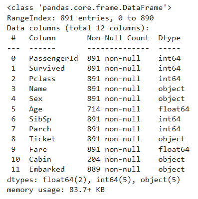
2.2.3 Check for missing values.
df.isnull().sum()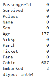
Key Observations:
Agehas 177 missing valuesCabinhas 687 missing values — over 77% of entries!Embarkedhas 2 missing values- Categorical columns:
Sex,Embarked,Pclass
Step 3: Visual Data Exploration
Visualizations reveal patterns quickly and help us uncover relationships between different features and the likelihood of survival.
3.1 Survival Rate by Sex
# Bar plot: Survival rate for each gender
plt.figure(figsize=(6, 4))
sns.barplot(x='Sex', y='Survived', data=df)
plt.title("Survival Rate by Sex")
plt.ylabel("Survival Rate")
plt.show()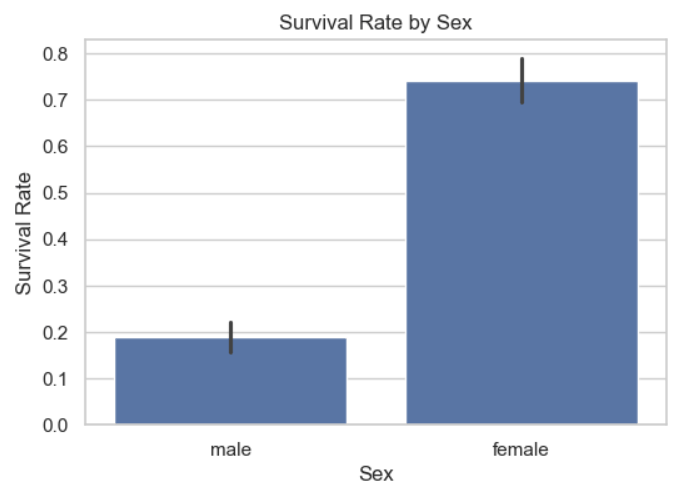
Key Insight:
- Women (
female) had a much higher survival rate (~74%) than men (male) (~19%). - This suggests
Sexwill be a strong predictor in our model.
3.2 Survival Rate by Passenger Class
# Bar plot: Survival by passenger class (1st, 2nd, 3rd)
plt.figure(figsize=(6, 4))
sns.barplot(x='Pclass', y='Survived', data=df)
plt.title("Survival Rate by Passenger Class")
plt.ylabel("Survival Rate")
plt.xlabel("Passenger Class")
plt.show()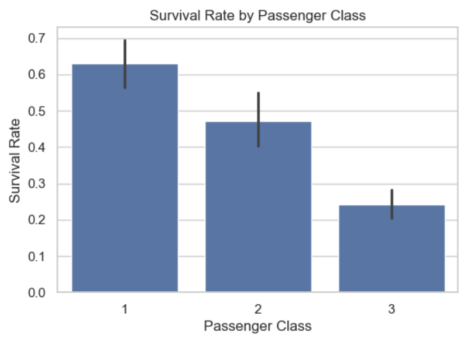
Key Insight:
- 1st-class passengers had the highest survival rate (~63%), while 3rd-class had the lowest (~24%).
- This aligns with historical accounts that higher-class passengers had priority access to lifeboats.
3.3 Age Distribution by Survival
# Histogram: Age distribution separated by survival
plt.figure(figsize=(8, 5))
sns.histplot(data=df, x='Age', hue='Survived', multiple='stack', kde=False, bins=30)
plt.title("Age Distribution by Survival")
plt.xlabel("Age")
plt.ylabel("Number of Passengers")
plt.show()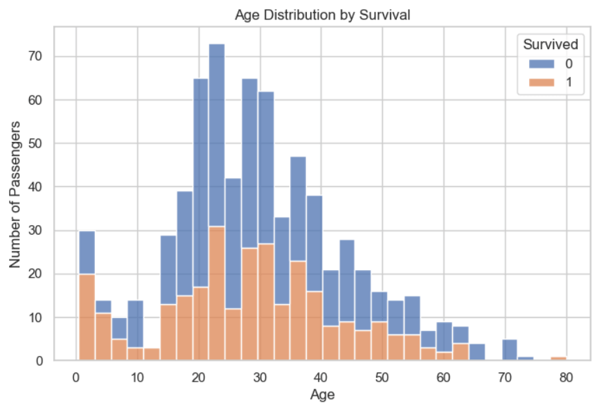
Key Insight:
- Children (Age < 10) had a higher survival rate (“women and children first” policy).
- We could engineer an
is_childfeature later to improve predictions.
Step 4: Data Preprocessing
4.1 Handling Missing Values
# Fill missing 'Age' with median
df['Age'].fillna(df['Age'].median(), inplace=True)

# Drop 'Cabin' (too many missing values)
df.drop(columns=['Cabin'], inplace=True)

# Drop rows with missing 'Embarked' (only 2 rows)
df.dropna(subset=['Embarked'], inplace=True)4.2 Encoding Categorical Variables
Machine learning models require numerical inputs, so we convert text categories to numbers.
le_sex = LabelEncoder()
le_embarked = LabelEncoder()

df['Sex'] = le_sex.fit_transform(df['Sex'])  # male = 1, female = 0
df['Embarked'] = le_embarked.fit_transform(df['Embarked']) # S = 2, C = 0, Q = 14.3 Dropping Irrelevant Columns
Columns like Name and Ticket don’t help predict survival, so we remove them.
df.drop(columns=['Name', 'Ticket', 'PassengerId'], inplace=True)4.4 Splitting Data into Features (X) and Target (y)
X = df.drop('Survived', axis=1)  # Features (all columns except 'Survived')
y = df['Survived'] # Target (what we want to predict)Step 5: Training the Decision Tree Model
5.1 Splitting Data into Training and Test Sets
We use 80% of the data for training and 20% for testing.
X_train, X_test, y_train, y_test = train_test_split(X, y, test_size=0.2, random_state=42)5.2 Training the Model
We use entropy (information gain) to decide how the tree splits the data.
clf = DecisionTreeClassifier(criterion='entropy', random_state=42)
clf.fit(X_train, y_train)5.3 Visualizing the Tree (First 3 Levels)
By limiting to max_depth=3, we can see a high-level overview without overwhelming detail.
# Plot only the top 3 levels of the tree for readability
plt.figure(figsize=(35, 12))

plot_tree(
    clf,
    feature_names=X.columns,
    class_names=["Not Survived", "Survived"],
    filled=True,
    rounded=True,
    fontsize=16,
    max_depth=3  # Only show the top 3 levels
)

plt.title("Top Levels of Decision Tree (max_depth=3 for display only)")
plt.show()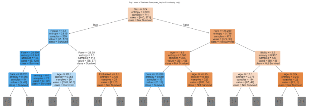
Interpretation:
- The first split is on
Sex(most important feature). - Subsequent splits use
Pclass,Fare, andAge.
Step 6: Evaluating the Model
6.1 Making Predictions
y_pred = clf.predict(X_test)6.2 Performance Metrics
print("Accuracy:", accuracy_score(y_test, y_pred))
print(classification_report(y_test, y_pred))
print("Confusion Matrix:", confusion_matrix(y_test, y_pred))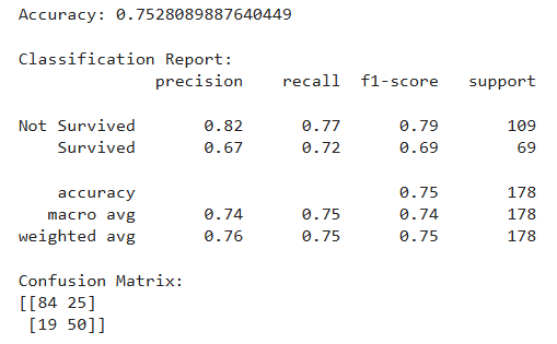
Key Takeaways:
- Accuracy: 75.3% (decent but can improve).
- Precision for “
Survived“: 67% (when the model predicts survival, it’s correct 67% of the time). - Recall for “
Survived“: 72% (it captures 72% of actual survivors).
Step 7: Improving the Model with Pruning
Decision trees can overfit (memorize training data but fail on new data). Pruning restricts tree depth to improve generalization.
7.1 Training a Pruned Tree (max_depth=3)
clf_pruned = DecisionTreeClassifier(criterion='entropy', max_depth=3, random_state=42)
clf_pruned.fit(X_train, y_train)7.2 Evaluating the Pruned Model
# Predict on test data
y_pred_pruned = clf_pruned.predict(X_test)

# Evaluate pruned model
print("Accuracy (Pruned Tree):", accuracy_score(y_test, y_pred_pruned))
print("Classification Report (Pruned Tree):")
print(classification_report(y_test, y_pred_pruned, target_names=["Not Survived", "Survived"]))

print("Confusion Matrix (Pruned Tree):")
print(confusion_matrix(y_test, y_pred_pruned))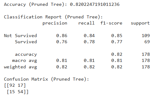
Result:
- Accuracy: 82.0% — higher than unpruned
- Balanced precision & recall
- Simpler and more generalizable model
7.3 Visualize Pruned Tree
# Plot the pruned tree
plt.figure(figsize=(17, 7))
plot_tree(
    clf_pruned,
    feature_names=X.columns,
    class_names=["Not Survived", "Survived"],
    filled=True,
    rounded=True,
    fontsize=12
)
plt.title("Pruned Decision Tree (max_depth=3)")
plt.show()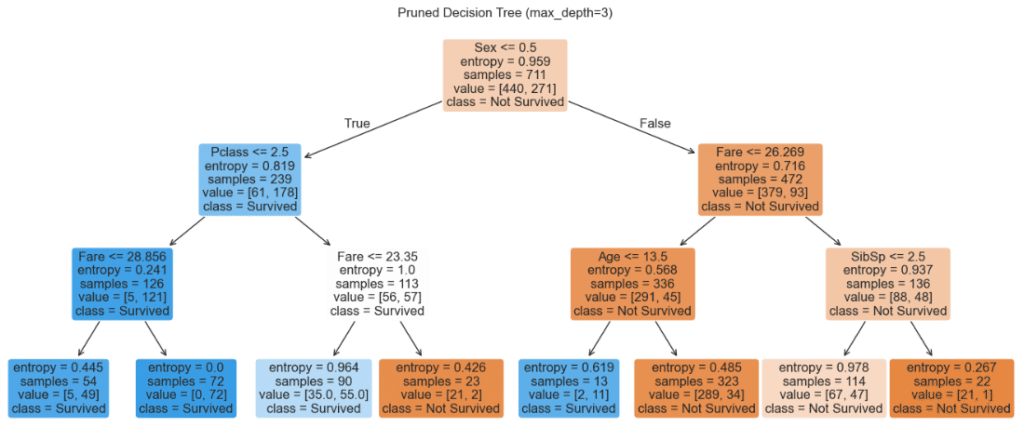
Final Thoughts
This project demonstrated a full ML pipeline:
- Data exploration and visualization
- Data cleaning and preparation
- Training and evaluating decision trees
- Preventing overfitting using pruning
Conclusion
This project walked through a complete machine learning workflow—from raw data to a tuned model. Decision trees are a great starting point because of their simplicity and interpretability. By following these steps, you’ve learned how to preprocess data, train a model, and evaluate its performance. Keep experimenting, and happy modeling!
Want to See the Full Code?
Check out the GitHub repository here: GitHub Repository Link

