Machine learning models often feel like black boxes. You give them data, and they give you answers. But how do they really decide? That’s what we’ll learn in this project by building a decision tree from scratch using NumPy.
This project takes you behind the scenes of one of the most popular algorithms in machine learning. You’ll understand how a decision tree makes choices, splits data, and predicts outcomes. By the end, you won’t just use decision trees, you’ll know how they work.
We’ll use a real-world dataset and go step-by-step: from cleaning the data, to defining entropy, to growing the tree. No shortcuts. No magic functions. Just math, logic, and clean Python code.
What Is a Decision Tree?
A decision tree is a model that predicts an outcome by learning simple “if-else” rules from data. Imagine you’re a doctor deciding if a patient has a certain condition. You might ask:
- Is the blood pressure high?
- Is the glucose level above normal?
- How old is the patient?
Each question splits the data into smaller parts until a decision is reached. That’s exactly how a decision tree works. It keeps splitting data based on features that best separate the outcomes.
Project Goal
Our goal is to build a decision tree from scratch using NumPy only. We’ll:
- Calculate entropy (a measure of disorder).
- Use information gain to find the best feature to split on.
- Recursively build a tree structure for classification.
- Evaluate the model’s accuracy on test data.
By writing every line ourselves, we’ll understand how libraries like Scikit-Learn work behind the scenes.
Dataset Overview
We’ll use a Breast Cancer Survival dataset from SEER. Each record represents one patient and includes medical details collected during diagnosis. The goal is to predict whether a patient survived five years after diagnosis or not.
The dataset contains several clinical and demographic features such as:
- Age – the patient’s age at diagnosis
- Tumor size – the measured size of the tumor
- Lymph node status – number of positive regional lymph nodes
- Estrogen and progesterone status – hormone receptor test results
- Cancer stage (T, N, A) – describes tumor spread and severity
The target variable is binary:
1→ The patient survived five years after diagnosis0→ The patient did not survive five years
Our job is to train a decision tree from scratch that can learn patterns from these features and predict survival outcomes for new patients.
Before that, we’ll clean the data and prepare it for modeling.
1. Importing Libraries
Before we start exploring and modeling our data, we need to import a few essential Python libraries. Each library plays a specific role in data analysis and machine learning.
Here’s what we’ll use:
- NumPy – for numerical computations and handling arrays efficiently.
- Pandas – for loading and manipulating tabular data.
- Matplotlib and Seaborn – for visualizing trends, distributions, and relationships in the dataset.
- Scikit-learn – for splitting the data, evaluating performance, and comparing our custom model.
- SciPy – for performing statistical tests such as Levene’s test and t-tests.
These tools form the foundation for almost every data science project.
# Data manipulation
import numpy as np
import pandas as pd

# Data visualization
import matplotlib.pyplot as plt
import seaborn as sns

# Data modeling
from sklearn.model_selection import train_test_split
from sklearn.metrics import accuracy_score, confusion_matrix, classification_report
from scipy.stats import levene, ttest_ind, chi2_contingency2. Importing and Previewing the Dataset
Now that our libraries are ready, let’s bring in the dataset.
We’ll use a breast cancer dataset that contains information about patients’ age, tumor characteristics, hormone status, lymph node involvement, and survival outcomes. Each record represents a single patient. Our goal is to predict whether a patient survived for five years or more after being diagnosed.
Let’s load and inspect the data:
# Load dataset
data = pd.read_csv('Breast_Cancer.csv')

# Preview a few rows
data.head()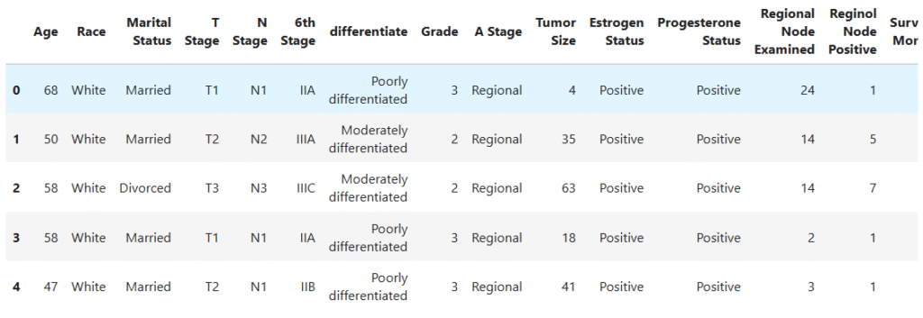
Let’s also check the structure of the dataset:
data.info()RangeIndex: 4024 entries, 0 to 4023
Data columns (total 16 columns):
# Column Non-Null Count Dtype
--- ------ -------------- -----
0 Age 4024 non-null int64
1 Race 4024 non-null object
2 Marital Status 4024 non-null object
3 T Stage 4024 non-null object
4 N Stage 4024 non-null object
5 6th Stage 4024 non-null object
6 differentiate 4024 non-null object
7 Grade 4024 non-null object
8 A Stage 4024 non-null object
9 Tumor Size 4024 non-null int64
10 Estrogen Status 4024 non-null object
11 Progesterone Status 4024 non-null object
12 Regional Node Examined 4024 non-null int64
13 Reginol Node Positive 4024 non-null int64
14 Survival Months 4024 non-null int64
15 Status 4024 non-null object
dtypes: int64(5), object(11)
This command tells us about the number of rows, columns, and data types.
Key Insights
- The dataset has 4,024 records and 16 columns.
- It includes both numerical and categorical features.
- Columns like
Age,Tumor Size, andSurvival Monthsare numerical, while features likeRace,T Stage, andEstrogen Statusare categorical. - The target variable will be based on
Survival Months, patients who lived 60 months or more will be labeled as survived, and those who didn’t will be labeled as not survived. - The dataset is complete, with no missing values, which gives us a clean starting point for analysis.
3. Feature Engineering: Creating the Target Variable
Before we start exploring patterns in the data, we first need to define what we’re trying to predict.
Our dataset includes two columns that describe patient outcomes:
Survival Months– how long a patient lived after diagnosisStatus– whether the patient was alive or not at the end of the follow-up period
In cancer research, a 5-year survival rate is a common benchmark for measuring treatment success. So, we’ll create a new column called Survived 5 Years to represent this outcome.
If a patient lived 60 months or more, we label them as 1 (Survived). Otherwise, we label them as 0 (Did Not Survive).
Here’s how we do it in code:
# Add target variable
data['Survived 5 Years'] = np.where(data['Survival Months'] >= 60, 1, 0)

# Drop unnecessary columns to avoid data leakage
data = data.drop(columns=['Survival Months', 'Status'])We remove Survival Months and Status because they directly reveal the outcome we’re predicting. Keeping them would cause data leakage, which means the model could “cheat” by learning from information that wouldn’t be available in real scenarios.
After this step, our dataset now has a clear target variable (Survived 5 Years) that we’ll use for prediction. Next, we’ll move on to explore the data and prepare it for modeling.
4. Exploratory Data Analysis (EDA)
Before we build our model, we need to understand our data.
Exploratory Data Analysis (EDA) helps us see patterns, spot imbalances, and get a feel for what the dataset looks like. It’s like taking a quick medical check-up before starting treatment.
4.1. Distribution of the Target Variable (Survived 5 Years)
We start by checking how many patients survived 5 years after diagnosis and how many did not.
sns.countplot(data=data, x='Survived 5 Years', palette='Set2')
plt.title("Distribution of who Survived 5 Years")
plt.xlabel("Survived 5 years → 0: Did not Survive,  1: Survived")
plt.ylabel("Count")
plt.show()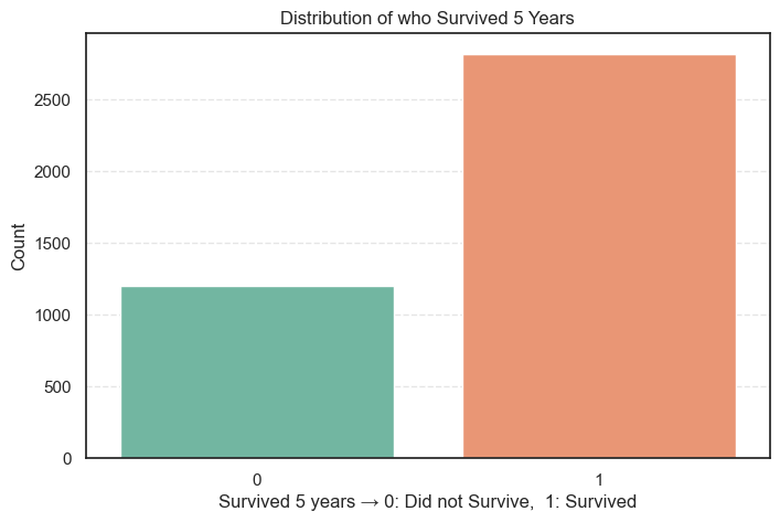
Let’s also compute the distribution in numbers so that we can have a better analytical view.
# Get the distribution counts
data["Survived 5 Years"].value_counts().to_frame(name='Count').assign(
Percent=lambda x: round((x['Count'] / x['Count'].sum()) * 100, 2))Count Percent
Survived 5 Years
1 2821 70.1
0 1203 29.9
What We Learn
- About 70% of patients lived for 5 years or more after diagnosis.
- Around 30% did not survive that long.
- The dataset is moderately imbalanced since we have more survivors than non-survivors.
- This imbalance isn’t too severe, but we’ll keep it in mind when training the model. Accuracy alone might not tell the full story, so we’ll also check metrics like precision, recall, and F1-score later.
The good survival rate suggests that many patients in this dataset received early diagnoses or effective treatment.
4.2. Univariate Analysis of Categorical Variables
Now that we understand the survival distribution, let’s look at each categorical feature in our dataset. This helps us see how the data is spread across groups like race, tumor stage, and hormone status.
We’ll plot the distribution of each categorical column to get a quick visual overview.
# Select categorical columns
cat_cols = data.select_dtypes(include='object').columns.tolist()

# Make differentiate to be last for better visualization
cat_cols.remove('differentiate')
cat_cols.append('differentiate')

# Plot distributions
plt.figure(figsize=(18, 16))
for i, col in enumerate(cat_cols, 1):
    plt.subplot(4, 3, i)
    sns.countplot(data=data, x=col, palette='Set2')
    plt.title(f"Distribution of {col}", fontsize=15)
    plt.xlabel(col)
    plt.ylabel("Count", fontsize=15)
    if col == 'differentiate':
        plt.xticks(rotation=45)
plt.subplots_adjust(hspace=0.4)
plt.show()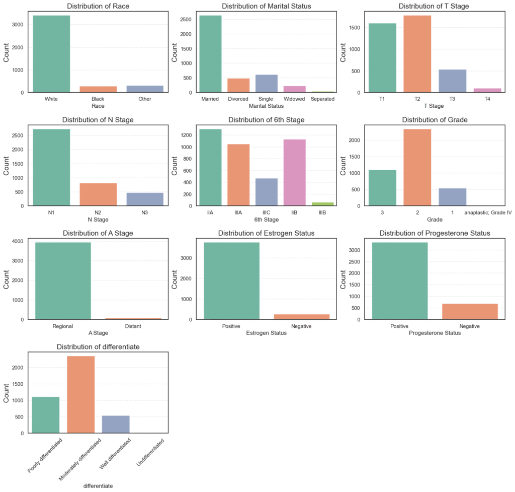
Then, we calculate the percentage of each category:
for col in cat_cols:
    counts = data[col].value_counts().to_frame(name='Count').assign(
        Percent=lambda x: round((x['Count'] / x['Count'].sum()) * 100, 2))
    print(f'=== {col} ===')
    print(counts)
=== Race ===
       Count  Percent
Race
White   3413    84.82
Other    320     7.95
Black    291     7.23

=== Marital Status ===
                Count  Percent
Marital Status
Married          2643    65.68
Single            615    15.28
Divorced          486    12.08
Widowed           235     5.84
Separated          45     1.12

=== T Stage  ===
          Count  Percent
T Stage
T2         1786    44.38
T1         1603    39.84
T3          533    13.25
T4          102     2.53

=== N Stage ===
         Count  Percent
N Stage
N1        2732    67.89
N2         820    20.38
N3         472    11.73

=== 6th Stage ===
           Count  Percent
6th Stage
IIA         1305    32.43
IIB         1130    28.08
IIIA        1050    26.09
IIIC         472    11.73
IIIB          67     1.67
=== Grade ===
                       Count  Percent
Grade
2                       2351    58.42
3                       1111    27.61
1                        543    13.49
 anaplastic; Grade IV     19     0.47

=== A Stage ===
          Count  Percent
A Stage
Regional   3932    97.71
Distant      92     2.29

=== Estrogen Status ===
                 Count  Percent
Estrogen Status
Positive          3755    93.32
Negative           269     6.68

=== Progesterone Status ===
                     Count  Percent
Progesterone Status
Positive              3326    82.65
Negative               698    17.35

=== differentiate ===
                           Count  Percent
differentiate
Moderately differentiated   2351    58.42
Poorly differentiated       1111    27.61
Well differentiated          543    13.49
Undifferentiated              19     0.47
What the Data Shows
- Race: Most patients are White (84.8%), with Black (7.2%) and Other (7.9%) groups being smaller. The data is racially imbalanced, dominated by White patients.
- Marital Status: The majority are Married (65.7%), while Single (15.3%), Divorced (12.1%), and Widowed (5.8%) follow. Marital status might affect survival due to social or emotional support.
- T Stage: Most tumors are T1 or T2, meaning smaller tumor sizes. Only 2.5% of cases are T4, which indicates large, advanced tumors.
- N Stage: About 68% of patients fall under N1, showing limited lymph node spread. Fewer patients are in N2 and N3 stages.
- 6th Stage (Overall Stage): Stages IIA, IIB, and IIIA make up most of the data. This means most patients have early-to-mid stage cancer, not late-stage disease.
- Grade and Differentiation:
- The largest group is Moderately differentiated (58.4%), or Grade 2, showing moderate tumor aggressiveness.
- Poorly differentiated (27.6%) and Well differentiated (13.5%) follow.
- Anaplastic Grade IV tumors are rare at 0.5%.
- A Stage: Nearly all patients (97.7%) are Regional, meaning cancer spread to nearby lymph nodes but not distant organs.
- Hormone Receptor Status:
- Estrogen Positive: 93.3%
- Progesterone Positive: 82.7%
This indicates that most patients have hormone-sensitive tumors, which tend to respond better to treatment.
The dataset mainly represents middle-stage, hormone-positive breast cancer patients with moderate tumor grades and regional spread. These traits likely contribute to the high 5-year survival rate we observed earlier.
4.3. Bivariate Analysis of Categorical Variables vs Target (Survived 5 Years)
After exploring the individual characteristics of each categorical variable, the next step is to understand how these variables relate to our target variable, survival beyond 5 years.
This type of analysis helps reveal which clinical and demographic factors might influence a patient’s long-term survival outcomes. To do this, we visualize the average survival rate for each category across key variables like tumor stage, grade, and hormone receptor status.
# Plot average survival by variable
plt.figure(figsize=(18, 16))
for i, col in enumerate(cat_cols, 1):
    plt.subplot(4, 3, i)
    sns.barplot(data=data, x=col, y='Survived 5 Years', palette='Set2', ci=False, estimator='mean')
    plt.title(f"Survival Rate by {col}", fontsize=15)
    plt.xlabel(col)
    plt.ylabel("Average Survival (5 Years)")
    if col == 'differentiate':
        plt.xticks(rotation=45)
plt.subplots_adjust(hspace=0.4)
plt.show()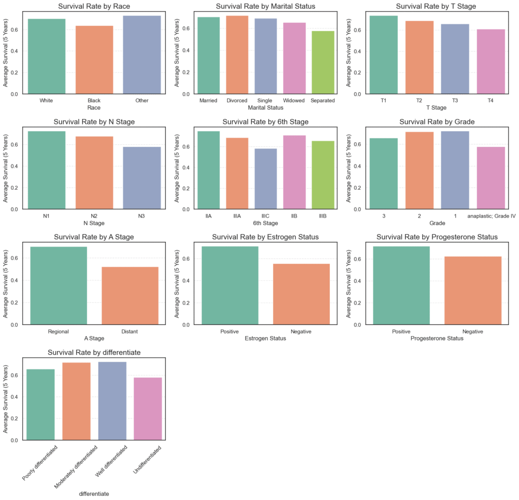
We also calculate the mean survival rate for each category numerically for easier interpretation.
# Calculate average survival by variable
for col in cat_cols:
    mean_survival = data.groupby(col)['Survived 5 Years'].mean().to_frame(name='Mean')
    print(f'=== {col} ===')
    print(mean_survival)
=== Race ===
           Mean
Race
Black  0.639175
Other  0.731250
White  0.703487

=== Marital Status ===
                    Mean
Marital Status
Divorced        0.718107
Married         0.705638
Separated       0.577778
Single          0.694309
Widowed         0.655319

=== T Stage  ===
              Mean
T Stage
T1        0.736120
T2        0.688130
T3        0.656660
T4        0.607843

=== N Stage ===
             Mean
N Stage
N1       0.728038
N2       0.679268
N3       0.582627

=== 6th Stage ===
               Mean
6th Stage
IIA        0.750958
IIB        0.709735
IIIA       0.685714
IIIB       0.656716
IIIC       0.582627
=== Grade ===
                           Mean
Grade
 anaplastic; Grade IV  0.578947
1                      0.723757
2                      0.717142
3                      0.657966

=== A Stage ===
              Mean
A Stage
Distant   0.521739
Regional  0.705239

=== Estrogen Status ===
                     Mean
Estrogen Status
Negative         0.553903
Positive         0.711585

=== Progesterone Status ===
                         Mean
Progesterone Status
Negative             0.626074
Positive             0.716777

=== differentiate ===
                               Mean
differentiate
Moderately differentiated  0.717142
Poorly differentiated      0.657966
Undifferentiated           0.578947
Well differentiated        0.723757
Key Insights from the Bivariate Analysis
- Race:
Survival rates were relatively similar across racial groups, but White (70.3%) and Other (73.1%) patients showed slightly higher survival than Black patients (63.9%).
This difference may point toward underlying disparities in healthcare access or disease detection. - Marital Status:
Divorced (71.8%) and Married (70.6%) individuals demonstrated higher 5-year survival compared to Widowed (65.5%) or Separated (57.8%) patients.
This trend suggests that social and emotional support systems could positively impact recovery outcomes. - Tumor (T) Stage:
As expected, survival declines with increasing tumor size — from T1 (73.6%) to T4 (60.8%).
Smaller, localized tumors correspond to better prognosis, reflecting the importance of early diagnosis. - Node (N) Stage:
The number of affected lymph nodes also plays a key role. Survival drops from N1 (72.8%) to N3 (58.3%), confirming that greater lymph node involvement indicates more advanced disease and lower survival. - 6th Stage (Overall Cancer Stage):
Early-stage patients have significantly better outcomes — Stage IIA (75.1%) versus Stage IIIC (58.3%).
This reinforces the critical value of early detection and intervention in improving survival rates. - Grade and Differentiation:
Tumors that are well or moderately differentiated (~72%) have higher survival rates than poorly differentiated (65.8%) or undifferentiated (57.9%) ones.
Since differentiation indicates how closely cancer cells resemble normal cells, less aggressive tumors naturally show better outcomes. - A Stage (Extent of Spread):
Patients with regional tumors (70.5%) fared much better than those with distant metastasis (52.1%), clearly highlighting how metastatic spread drastically reduces survival chances. - Hormone Receptor Status:
- Estrogen-positive: 71.2% survival vs 55.4% for estrogen-negative.
- Progesterone-positive: 71.7% survival vs 62.6% for progesterone-negative.
Hormone receptor positivity is strongly associated with better prognosis, likely due to increased responsiveness to hormone-based therapies.
Overall Interpretation
This analysis reveals a consistent pattern:
- Patients with early-stage, smaller, well-differentiated, and hormone-receptor-positive tumors exhibit significantly higher 5-year survival rates.
- In contrast, those with advanced-stage disease, distant metastasis, or hormone receptor–negative tumors face considerably lower survival odds.
- These findings are in line with established clinical knowledge and reinforce how biological and pathological factors jointly shape long-term breast cancer outcomes.
4.4. Statistical Association of the Categorical Variables to the Target: Chi-Square Test
While visualizations provide useful insights into how categorical features relate to survival outcomes, it’s also important to statistically validate whether these relationships are significant or merely due to random chance.
We use the Chi-Square Test of Independence to check whether there’s a statistically significant association between each categorical variable and the target variable (Survived 5 Years).
The hypotheses for each test are:
- Null Hypothesis (H₀): There is no significant relationship between the variable and 5-year survival.
- Alternative Hypothesis (H₁): There is a significant relationship between the variable and 5-year survival.
We set a significance level (α) of 0.05. If the p-value < 0.05, we reject the null hypothesis, indicating a significant association.
alpha = 0.05
for col in cat_cols:
    cont_table = pd.crosstab(data[col], data['Survived 5 Years'])
    c_stat, p_value, _, _ = chi2_contingency(cont_table)
    print(f'=== {col} ===')
    print(f'Stats: {c_stat}, P-Value: {p_value}')
    print(f'Null Hypothesis (Ho): There is no relation between {col} and those who survived after 5 years.')
    decision = "Reject hypothesis." if p_value < alpha else "Fail to reject hypothesis."
print("Decision:", decision)=== Race ===
Stats: 6.8050193904269065, P-Value: 0.03328961823851946
Null Hypothesis (Ho): There is no relation between Race and those who survived after 5 years.
Decision: Reject hypothesis.
=== Marital Status ===
Stats: 6.681159982375642, P-Value: 0.15372776302583785
Null Hypothesis (Ho): There is no relation between Marital Status and those who survived after 5 years.
Decision: Fail to reject hypothesis.
=== T Stage ===
Stats: 20.068651598232357, P-Value: 0.00016427141114880962
Null Hypothesis (Ho): There is no relation between T Stage and those who survived after 5 years.
Decision: Reject hypothesis.
=== N Stage ===
Stats: 42.93428827031285, P-Value: 4.752671090245094e-10
Null Hypothesis (Ho): There is no relation between N Stage and those who survived after 5 years.
Decision: Reject hypothesis.
=== 6th Stage ===
Stats: 49.30617997295906, P-Value: 5.040095221861289e-10
Null Hypothesis (Ho): There is no relation between 6th Stage and those who survived after 5 years.
Decision: Reject hypothesis.
=== Grade ===
Stats: 15.43222189191435, P-Value: 0.0014821750270444256
Null Hypothesis (Ho): There is no relation between Grade and those who survived after 5 years.
Decision: Reject hypothesis.
=== A Stage ===
Stats: 13.580881271940374, P-Value: 0.00022850093386982646
Null Hypothesis (Ho): There is no relation between A Stage and those who survived after 5 years.
Decision: Reject hypothesis.
=== Estrogen Status ===
Stats: 29.031475104292973, P-Value: 7.121181712600972e-08
Null Hypothesis (Ho): There is no relation between Estrogen Status and those who survived after 5 years.
Decision: Reject hypothesis.
=== Progesterone Status ===
Stats: 22.21597090312089, P-Value: 2.436387072385704e-06
Null Hypothesis (Ho): There is no relation between Progesterone Status and those who survived after 5 years.
Decision: Reject hypothesis.
=== differentiate ===
Stats: 15.43222189191435, P-Value: 0.0014821750270444256
Null Hypothesis (Ho): There is no relation between differentiate and those who survived after 5 years.
Decision: Reject hypothesis.
4.5. Exploratory Data Analysis of Numerical Variables
After exploring the categorical features, we now turn our attention to the numerical variables in the dataset.
Understanding their distributions helps us detect outliers, assess normality, and identify potential data transformations that might be required before modeling.
In this dataset, the numerical variables are:
- Age
- Tumor Size (in millimeters)
- Regional Node Examined
- Reginol Node Positive
We’ll visualize each variable using histograms (to examine the distribution shape) and boxplots (to identify outliers).
# Select numerical columns
num_cols = data.drop(columns=['Survived 5 Years']).select_dtypes(include='number').columns

# Plot distribution of numerical variables
for col in num_cols:
    plt.figure(figsize=(14, 4))

    # Histogram
    plt.subplot(1, 2, 1)
    sns.histplot(data=data, x=col, kde=True)
    plt.title(f"Distribution of {col}", fontsize=15)
    plt.xlabel(col)
    plt.ylabel("Count")

    # Boxplot
    plt.subplot(1, 2, 2)
    sns.boxplot(data=data, y=col, color='lightblue')
    plt.title(f"Boxplot of {col}", fontsize=15)
    plt.ylabel(col)

plt.show()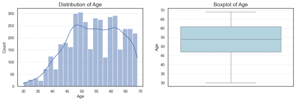
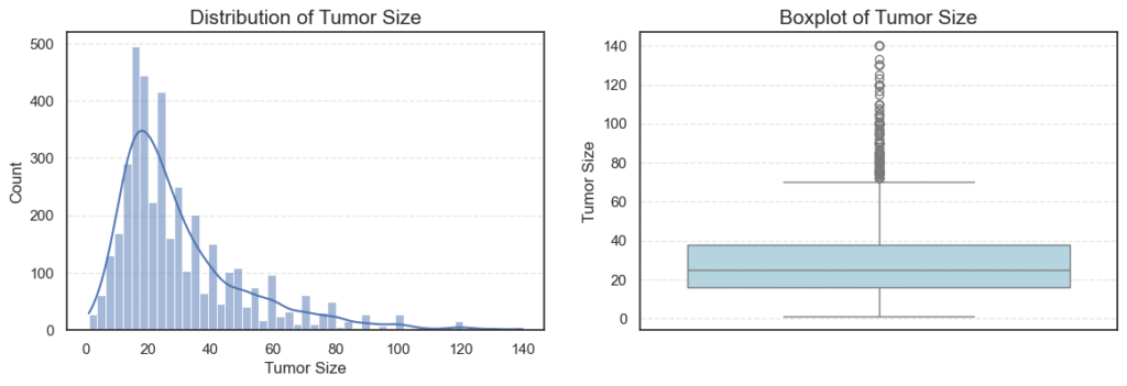
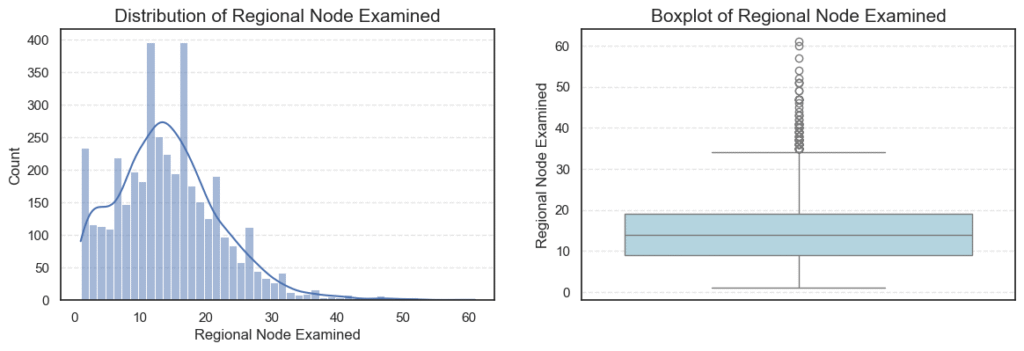
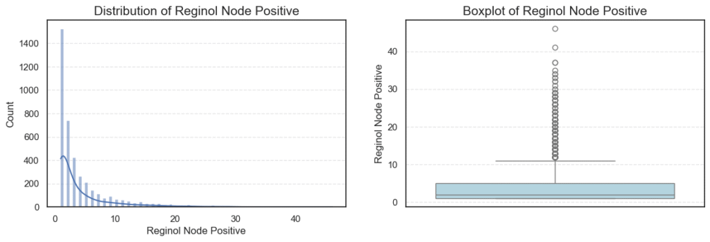
We can also examine summary statistics for these variables to get an overview of their central tendencies and variability:
# Statistical information of numerical variables
data[num_cols].describe().T
Outlier and Skewness Analysis
To quantitatively assess outliers and skewness, we apply the Interquartile Range (IQR) method and measure skewness, which indicates how symmetric (or asymmetric) a distribution is.
# Check for outliers and skewness
for col in num_cols:
    q1 = data[col].quantile(0.25)
    q3 = data[col].quantile(0.75)
    iqr = q3 - q1
    lower = q1 - iqr * 1.5
    upper = q3 + iqr * 1.5
    outliers = data[(data[col] < lower) | (data[col] > upper)][col]
    print(f'=== {col} ===')
    print('Outliers:', len(outliers))
print('Skew:', data[col].skew())=== Age === Outliers: 0 Skew: -0.2203727859678868 === Tumor Size === Outliers: 222 Skew: 1.7397498006705898
=== Regional Node Examined ===
Outliers: 72
Skew: 0.8292737694534275

=== Reginol Node Positive ===
Outliers: 344
Skew: 2.702535859800024
Key Insights
- Age:
Patient ages range from 30 to 69 years, with an average age of ~54 years.
The distribution is nearly symmetric (skew = -0.22) and contains no outliers, indicating a balanced spread across age groups. - Tumor Size:
Tumor sizes vary widely, with a mean of ~30 mm.
The distribution is heavily right-skewed (skew = 1.74), showing that while most patients have smaller tumors (below 40 mm), a small number have very large tumors (up to 140 mm) — appearing as high-end outliers on the boxplot.
This pattern is typical in oncology data, where aggressive or late-diagnosed cases form the extreme tail. - Regional Node Examined:
On average, about 14 lymph nodes were examined per patient, with a slight right-skew (skew = 0.83).
The presence of 72 outliers likely represents cases where surgeons performed more extensive lymph node evaluations — possibly due to suspected metastasis. - Reginol Node Positive:
This feature is highly skewed (skew = 2.70) and contains 344 outliers.
Most patients have 1–5 positive nodes, but a small subset exhibit very high positive counts (up to 46), indicating more advanced disease progression and poorer prognosis.
4.6. Bivariate Analysis: Understanding How Numerical Features Influence Survival
After exploring each numerical variable individually, the next step is to understand how these features relate to the target variable, whether a patient survived five years after diagnosis or not. This analysis helps us uncover which clinical measurements are most predictive of long-term survival.
To achieve this, we perform a bivariate analysis between each numerical variable and the target Survived 5 Years. We use boxplots for visual comparison and statistical tests (t-tests) to validate whether the observed differences are statistically significant.
# Plot numerical variables vs target
plt.figure(figsize=(14, 10))
for i, col in enumerate(num_cols, 1):
    plt.subplot(2, 2, i)
    sns.boxplot(data=data, x='Survived 5 Years', y=col, palette='Set2')
    plt.title(f"{col} vs Survived 5 Years", fontsize=12)
    plt.xlabel('Survived 5 Years')
    plt.ylabel(col)
plt.subplots_adjust(hspace=0.4)
plt.show()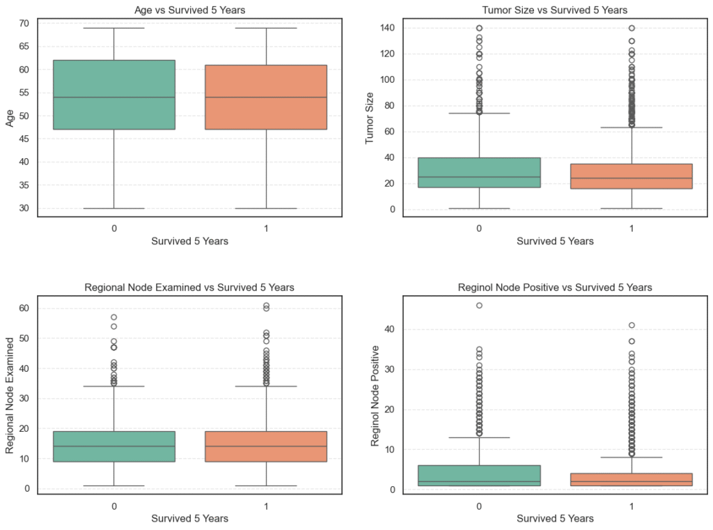
To support visual insights with data-driven evidence, we calculate the mean, median, and standard deviation for each feature, grouped by survival status:
# Compute statistical information of variable vs target
stats = data.groupby('Survived 5 Years')[num_cols].agg(['mean', 'median', 'std']).T
stats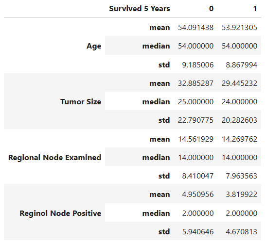
We further perform independent t-tests to determine whether these differences are statistically significant at a 95% confidence level (α = 0.05).
# T-Test
alpha = 0.05
for col in num_cols:
    survived = data[data["Survived 5 Years"] == 1][col]
    didnt_survive = data[data["Survived 5 Years"] == 0][col]
    _, lev_p = levene(survived, didnt_survive, center='median')
    equal_var = lev_p >= alpha
    t_stat, p_value = ttest_ind(survived, didnt_survive, equal_var=equal_var)
    print(f'=== {col} ===')
    print(f'Stats: {t_stat}, P Value: {p_value}')
    print(f'Null Hypothesis (Ho): Average {col} are the same with those who survived 5 years.')
    decision = "Reject null hypothesis." if p_value < alpha else "Fail to reject null hypothesis."
print('Decision:', decision)=== Age ===
Stats: -0.5511856397782932, P Value: 0.5815370399673709
Null Hypothesis (Ho): Average Age are the same with those who survived 5 years.
Decision: Fail to reject null hypothesis.
=== Tumor Size ===
Stats: -4.526390615743846, P Value: 6.34365713155091e-06
Null Hypothesis (Ho): Average Tumor Size are the same with those who survived 5 years.
Decision: Reject null hypothesis.
=== Regional Node Examined ===
Stats: -1.024831281625778, P Value: 0.3055574426164092
Null Hypothesis (Ho): Average Regional Node Examined are the same with those who survived 5 years.
Decision: Fail to reject null hypothesis.
=== Reginol Node Positive ===
Stats: -5.8744384731883015, P Value: 5.013101228450924e-09
Null Hypothesis (Ho): Average Reginol Node Positive are the same with those who survived 5 years.
Decision: Reject null hypothesis.
Key Observations
- Age:
Both survivors and non-survivors have nearly identical average ages (~54 years). The t-test (p = 0.58) shows no statistically significant difference, indicating that age is not a major determinant of five-year survival in this cohort. - Tumor Size:
Non-survivors tend to have larger tumors (mean ≈ 32.9 mm) compared to survivors (mean ≈ 29.4 mm). The t-test (p < 0.001) confirms this difference is statistically significant, suggesting smaller tumors are strongly associated with better survival outcomes. - Regional Node Examined:
The average number of regional nodes examined is roughly the same (~14) across both groups, and the t-test (p = 0.31) indicates no significant difference. This means the number of nodes examined during surgery doesn’t directly affect survival rates. - Reginol Node Positive:
Patients who did not survive had a higher number of positive lymph nodes (mean ≈ 4.95) compared to survivors (mean ≈ 3.82). The t-test (p < 0.001) shows this difference is statistically significant, indicating that a greater number of cancer-positive nodes correlates with poorer survival.
5. Feature Encoding: Preparing Categorical Variables for Modeling
Before feeding our dataset into a machine learning model, it’s essential to ensure that all features are numerical. Most machine learning algorithms, including Decision Trees, Random Forests, and Logistic Regression, require numeric input to compute distances, splits, and probabilities efficiently.
Our dataset contains several categorical variables such as Race, Marital Status, Tumor Stage, and Hormone Receptor Status. To make these variables suitable for modeling, we perform feature encoding the process of converting text labels into meaningful numeric representations.
Why Encoding Is Important
Categorical variables often contain text labels like "Married", "T1", or "Positive". While these values make sense to humans, machine learning algorithms cannot directly interpret them. Encoding allows us to:
- Convert textual data into a numeric format the model can process.
- Preserve the underlying meaning or order (when applicable).
- Prevent errors during training due to incompatible data types.
For example, in the column Estrogen Status, encoding "Positive" as 1 and "Negative" as 0 allows the model to understand and utilize this binary feature effectively.
Encoding Categorical Features
To perform encoding consistently across all categorical columns, we define a mapping dictionary that specifies how each category should be represented numerically. This ensures that each encoded value retains its logical meaning and order.
# Mapping dict
encoding_dict = {
    "Race": {'White': 1, 'Black': 2, 'Other': 3},
    "Marital Status": {'Married': 1, 'Divorced': 2, 'Single ': 3, 'Widowed': 4, 'Separated': 5},
    "T Stage ": {'T1': 1, 'T2': 2, 'T3': 3, 'T4': 4},
    "N Stage": {'N1': 1, 'N2': 2, 'N3': 3},
    "6th Stage": {'IIA': 1, 'IIIA': 2, 'IIIC': 3, 'IIB': 4, 'IIIB': 5},
    "Grade": {'3': 3, '2': 2, '1': 1, ' anaplastic; Grade IV': 4},
    "A Stage": {'Regional': 1, 'Distant': 2},
    "Estrogen Status": {'Positive': 1, 'Negative': 0},
    "Progesterone Status": {'Positive': 1, 'Negative': 0},
    "differentiate": {
        'Poorly differentiated': 1,
        'Moderately differentiated': 2,
        'Well differentiated': 3,
        'Undifferentiated': 0
    }
}

# Map to encoding
for col in cat_cols:
data[col] = data[col].replace(encoding_dict[col])How the Encoding Works
Each categorical column is replaced with its corresponding numeric values based on the mapping dictionary:
- Ordinal features (those with an inherent order, such as tumor stage or grade) are encoded numerically to preserve their hierarchy.
- Example:
"T1" → 1,"T2" → 2,"T3" → 3,"T4" → 4.
- Example:
- Nominal features (those without order, such as race or marital status) are simply mapped to integers without implying any ranking.
- Binary features like hormone receptor status are encoded as 0 or 1, making them directly interpretable by classification models.
This approach ensures that the dataset remains compact, interpretable, and compatible with all machine learning algorithms.
6. Implementing a Decision Tree from Scratch (Using NumPy)
Now that our dataset is fully preprocessed and ready, it’s time to dive into the most exciting part of the project building a Decision Tree from scratch using NumPy only.
This section takes us behind the scenes of how Decision Trees actually work from calculating entropy to splitting nodes recursively and making predictions on new data. By writing each step manually, we develop a strong intuition for what’s happening under the hood of models like DecisionTreeClassifier in scikit-learn.
Building a model from scratch also enhances interpretability, an especially vital requirement in the healthcare domain, where understanding why the model predicted that a patient might or might not survive beyond five years is just as important as the prediction itself.
Step 1. Defining Entropy: Measuring Uncertainty in the Data
Before a Decision Tree can decide where to split, it must first understand how mixed or impure the data at a node is. This concept is captured by a mathematical measure called entropy.
Entropy quantifies the degree of disorder or impurity in a dataset:
- If all patients in a node belong to the same class (for instance, everyone survived beyond five years), the node is pure, and entropy is 0.
- If patients are evenly split between survival and non-survival, the node is maximally impure, and entropy is 1.
The goal of the Decision Tree algorithm is to find splits that minimize entropy, in other words, to make the resulting child nodes as pure (or homogeneous) as possible.
Mathematical Definition of Entropy
Entropy for a given set \(S\) is calculated as:
\(H(S) = – \sum_{i=1}^{c} p_i \log_2(p_i)\)
where:
- \(c\) = number of classes (in our case, two — survived or not)
- \(p_i\) = proportion of samples belonging to class \(i\)
Let’s break this down:
- \(p_i \log_2(p_i)\) measures how much “information” is contributed by class \(i\).
- The negative sign ensures entropy is positive (since log probabilities are negative).
- The more evenly distributed the classes, the higher the entropy value.
Implementing Entropy in NumPy
Here’s how we can implement the entropy function using pure NumPy:
def entropy(y):
    """
    Calculate the entropy of a target variable.

    :param y: (array) Target variable (e.g., class labels).
    :return: (float) Entropy value representing the impurity of the node.
    """

    # Get unique class labels and their counts
    unique_classes, counts = np.unique(y, return_counts=True)

    # Compute probabilities of each class
    probabilities = counts / len(y)

    # Compute entropy using the formula: -sum(p * log2(p))
    entropy_value = -np.sum(probabilities * np.log2(probabilities + 1e-9))  # add epsilon to avoid log(0)

return entropy_valueIntuition Behind the Code
Let’s walk through what’s happening:
- Unique Classes and Counts:
The function first identifies all unique target classes (e.g.,0for did not survive,1for survived) and counts their occurrences. - Calculate Probabilities:
Each class count is divided by the total number of samples to get the probability pip_ipi. - Compute Entropy:
Using the formula \(– \sum_{i=1}^{c} p_i \log_2(p_i)\), we sum the uncertainty contributions from each class. A small value like1e-9is added to avoidlog(0)errors.
Example Interpretation
If a node contains:
- 90 patients who survived (
1) - 10 patients who did not (
0)
Then the entropy would be low (close to 0.47), indicating that the node is relatively pure — most patients belong to one class.
Conversely, a 50-50 split (50 survivors, 50 non-survivors) would yield an entropy near 1, representing maximum uncertainty.
Step 2. Calculating Information Gain
Once we’ve established how to measure entropy, the next crucial concept in building a Decision Tree is Information Gain.
Information Gain tells us how much uncertainty or impurity is reduced when we split the data based on a specific feature. In simpler terms, it quantifies how much “information” a particular feature provides about the target variable.
When constructing a Decision Tree, we test multiple features and possible split points — and the one with the highest Information Gain is chosen as the best feature to split on at that stage. This ensures that with every split, the data becomes more homogeneous with respect to the target label (in our case, whether a patient survived beyond 5 years).
Understanding the Formula
Mathematically, Information Gain is defined as:
\(\text{Information Gain} = \text{H(Parent)}- \sum_{i}\frac{N_{i}}{N}H(Child_{i})\)
Where:
- \(H(Parent)\) → Entropy of the parent node before splitting.
- \(H(Child_{i})\) → Entropy of each child node after splitting.
- \(\frac{N_{i}}{N}\) → Proportion of samples in the ithi^{th}ith child node.
In essence, Information Gain measures how much entropy (disorder) we remove by splitting the dataset on a particular feature. The greater the gain, the more useful that feature is in predicting our target.
Let’s now translate this concept into code.
def information_gain(parent, left_child, right_child):
    """
    Calculate Information Gain for a potential split in a decision tree.

    :param parent: (np.ndarray) Target values (y) of the parent node before the split.
    :param left_child: (np.ndarray) Target values (y) of the left child node after the split.
    :param right_child: (np.ndarray) Target values (y) of the right child node after the split.
    :return: (float) Information Gain from the split.
    """

    # Calculate the entropy of the parent node
    parent_entropy = entropy(parent)

    # Calculate the weighted average of the children’s entropy
    n_parent = len(parent)
    n_left, n_right = len(left_child), len(right_child)
    weighted_entropy = (n_left / n_parent) * entropy(left_child) + (n_right / n_parent) * entropy(right_child)

    # Information Gain = reduction in entropy
    gain = parent_entropy - weighted_entropy

return gainInterpreting the Function
Here’s how it works:
- Entropy of the parent node — represents the uncertainty before the split.
- Entropy of child nodes — measures the remaining uncertainty after splitting.
- Weighted average of child entropies — ensures the split impact is proportional to the size of each child node.
- Difference (Information Gain) — the reduction in entropy, indicating how much “order” or predictive power we gained from the split.
In the context of our breast cancer survival dataset, high information gain means a feature (like tumor size or cancer stage) effectively distinguishes between patients who survived 5 years and those who didn’t, making it a valuable predictor in our model.
Step 3. Selecting the Best Split
After understanding entropy and information gain, the next critical step in building a Decision Tree is to determine where to split the data.
In essence, the tree tries to answer this question at each node:
“Which feature and threshold will divide the data in a way that gives us the purest possible subsets?”
This process of selecting the best split ensures that the model learns meaningful decision rules that separate the classes effectively, in our case, distinguishing between patients who survived beyond five years and those who did not.
How the Best Split is Determined
Here’s how the algorithm works conceptually:
- Iterate through all features in the dataset.
- Test every possible split point (i.e., each unique value of the feature).
- Divide the dataset into two groups based on that threshold, one where the feature value is less than or equal to the threshold (left child), and another where it’s greater (right child).
- Calculate the information gain for each potential split.
- Select the feature and threshold that yield the highest information gain.
This ensures that at each step of the tree-building process, we make the most statistically beneficial split, reducing uncertainty as much as possible.
Implementation: Finding the Best Split
Let’s now translate this logic into a Python function using NumPy.
def best_split(X, y):
    """
    Finds the best feature and threshold to split the dataset based on maximum Information Gain.

    :param X: (numpy.ndarray) Feature matrix of shape (n_samples, n_features)
    :param y: (numpy.ndarray) Target vector of shape (n_samples,)
    :return: (tuple) best_feature, best_threshold, best_info_gain
    """

    n_samples, n_features = X.shape
    best_info_gain = -1
    best_feature = None
    best_threshold = None

    # Loop through all features
    for feature_idx in range(n_features):
        feature_values = X[:, feature_idx]
        thresholds = np.unique(feature_values)

        # Try every unique value as a potential split point
        for threshold in thresholds:
            left_mask = feature_values <= threshold
            right_mask = feature_values > threshold

            if len(y[left_mask]) == 0 or len(y[right_mask]) == 0:
                continue  # skip invalid splits

            # Compute information gain
            info_gain = information_gain(y, y[left_mask], y[right_mask])

            # Update best split if better info gain found
            if info_gain > best_info_gain:
                best_info_gain = info_gain
                best_feature = feature_idx
                best_threshold = threshold

return best_feature, best_threshold, best_info_gainInterpreting the Function
Let’s break down what’s happening here:
- Feature Loop: The algorithm checks every feature (e.g., Tumor Size, Grade, or N Stage).
- Threshold Testing: For each feature, it tests all unique values as possible cut-off points.
- Mask Creation: It separates samples into two groups, those that meet the condition (
≤ threshold) and those that don’t. - Information Gain Calculation: For each split, it measures how much “purity” is gained.
- Best Split Selection: Finally, it records the split that achieves the maximum reduction in entropy.
Step 4. Building the Decision Tree Recursively
Now that we’ve learned how to calculate entropy, measure information gain, and identify the best split, it’s time to bring everything together. We’ll now build the entire Decision Tree recursively.
This is the step where our model starts taking shape, growing from a single root node into a full-fledged tree that can make decisions.
The Idea Behind Recursive Tree Building
A Decision Tree grows by continuously dividing the dataset into smaller and more homogeneous subsets. The process follows a simple logic:
- Find the best split — choose the feature and threshold that maximize information gain.
- Partition the data into two subsets (left and right).
- Repeat the process for each subset until one of the stopping conditions is met:
- All samples in a node belong to the same class.
- The maximum tree depth has been reached.
- No further meaningful split can be found.
The beauty of recursion here is that the same function can handle both the root node and every sub-node of the tree, it just keeps calling itself until the base conditions are satisfied.
Implementation: Building the Decision Tree
Here’s the Python function that puts it all together:
def build_tree(X, y, depth=0, max_depth=5):
    """
    Recursively builds a Decision Tree based on Information Gain.

    :param X: (np.ndarray) Feature matrix.
    :param y: (np.ndarray) Target vector.
    :param depth: (int) Current depth of the tree (default is 0).
    :param max_depth: (int) Maximum depth allowed for the tree (default is 5).
    :return: (dict) Nested dictionary representing the Decision Tree.
    """

    # Get unique class labels and their counts
    classes, counts = np.unique(y, return_counts=True)

    # If all samples belong to one class or max depth reached, return leaf node
    if len(classes) == 1:
        return {'label': classes[0]}
    if depth >= max_depth:
        return {'label': classes[np.argmax(counts)]}

    # Find the best feature and threshold for splitting
    best_feature, best_threshold, best_info_gain = best_split(X, y)

    # If no useful split is found, return majority class as a leaf node
    if best_info_gain == 0 or best_feature is None:
        return {'label': classes[np.argmax(counts)]}

    # Split the data into left and right subsets
    left_mask = X[:, best_feature] <= best_threshold
    right_mask = ~left_mask

    # Recursively build the left and right branches
    left_subtree = build_tree(X[left_mask], y[left_mask], depth + 1, max_depth)
    right_subtree = build_tree(X[right_mask], y[right_mask], depth + 1, max_depth)

    # Return the current node
    return {
        'feature': best_feature,
        'threshold': best_threshold,
        'gain': best_info_gain,
        'left': left_subtree,
        'right': right_subtree
}How It Works
- Base Case:
If all the samples in a node belong to a single class, or the maximum allowed depth has been reached, the function returns a leaf node. This node contains the most common class label (e.g., 0 = did not survive 5 years, 1 = survived 5 years). - Recursive Case:
Otherwise, the function finds the best possible split using ourbest_split()function, then divides the data into left and right subsets.
Each of these subsets is then passed back into the samebuild_tree()function — allowing the tree to grow deeper, level by level. - Tree Representation:
The resulting tree is stored as a nested Python dictionary, with each node containing:feature: Index of the best feature used for the split.threshold: Value that defines the split boundary.gain: Information gain achieved by this split.leftandright: Subtrees created from the split.
Step 5. Making Predictions with the Decision Tree
Now that we’ve successfully built our Decision Tree from scratch, it’s time to put it to work making predictions on unseen data.
Prediction is where all the effort in building the tree pays off. The model takes a new patient’s data (such as tumor size, lymph node involvement, or hormone status) and uses the learned decision rules to determine whether that patient is likely to survive beyond 5 years after diagnosis.
How the Prediction Process Works
The prediction process is essentially a tree traversal moving from the root node down to a leaf node, based on feature values:
- Start at the root node.
This is the top of the tree where the first decision rule is applied (e.g., “Tumor Size ≤ 25 mm?”). - Compare the feature value to the threshold.
- If the condition is true, move to the left branch.
- If false, move to the right branch.
- Continue recursively until you reach a leaf node, which contains the final predicted class for example:
1→ Patient survived beyond 5 years.0→ Patient did not survive beyond 5 years.
This logic is repeated for each sample in the dataset, allowing us to predict outcomes for many patients at once.
Implementing the Prediction Functions
Here’s how we can implement this traversal process in Python using recursion:
def predict_sample(sample, tree):
    """
    Recursively predict the class for a single data sample.

    :param sample: (pd.Series or np.ndarray) A single data point
    :param tree: (dict or scalar) The trained decision tree structure
    :return: Predicted class label
    """
    # Base case: if leaf node, return the stored label directly
    if not isinstance(tree, dict):
        return tree

    # Check if current node is a leaf (it may be stored as {'label': value})
    if 'label' in tree:
        return tree['label']

    # Extract the feature index and threshold
    feature_index = tree['feature']
    threshold = tree['threshold']

    # Decide which branch to follow
    if sample[feature_index] <= threshold:
        return predict_sample(sample, tree['left'])
    else:
        return predict_sample(sample, tree['right'])
def predict(X, tree):
"""
Predict class labels for multiple samples using the trained decision tree.
:param X: (np.ndarray) 2D array of shape (n_samples, n_features) containing feature values.
:param tree: (dict) The trained decision tree.
:return: (np.ndarray) Array of predicted class labels.
"""
return np.array([predict_sample(sample, tree) for sample in X])Intuition Behind the Code
- The
predict_sample()function is recursive; it keeps calling itself until it reaches a leaf node. - The base case checks if the current node is a leaf, in which case it directly returns the stored class label.
- Otherwise, it evaluates the feature threshold and decides which subtree (left or right) to follow.
- The
predict()function then applies this logic to every row in the dataset to generate a full array of predictions.
Example in a Healthcare Context
Imagine a new patient’s record is fed into our model. The prediction process might look like this:
- Root Node: “Is Tumor Size ≤ 30 mm?” → Yes → Go left.
- Next Node: “Are Regional Nodes Positive ≤ 2?” → No → Go right.
- Leaf Node: Label = 0 (did not survive beyond 5 years).
Step 6. Training and Evaluating the Decision Tree
Now that we’ve built every component of our Decision Tree from entropy calculation to information gain, splitting, and prediction, it’s time to bring everything together and see how our model performs in predicting whether a cancer patient is likely to survive beyond 5 years after diagnosis.
In this stage, we’ll move from theory to practical evaluation by:
- Splitting the dataset into training and testing subsets.
This helps us assess how well the model generalizes to unseen data rather than memorizing the training examples. - Training the Decision Tree using the training set.
Here, our custom algorithm recursively selects the best feature and threshold at each node based on maximum information gain. - Making predictions on the test set.
We’ll use our previously implementedpredict()function to estimate survival outcomes for new, unseen patient data. - Evaluating the model’s performance using metrics like accuracy, confusion matrix, and classification report.
These metrics help us understand not just how many predictions are correct, but also how the model performs across both survival outcomes.
Training the Model
We first separate our dataset into features (X) and target labels (y).
In this case, our target column is “Survived 5 Years”, which indicates whether a patient lived beyond the 5-year threshold.
# Split the dataset into features and target
X = data.drop(columns=['Survived 5 Years']).values
y = data['Survived 5 Years'].values

# Divide the data into training and test sets
X_train, X_test, y_train, y_test = train_test_split(
    X, y, test_size=0.2, random_state=42, stratify=y
)

# Train the Decision Tree
tree = build_tree(X_train, y_train, max_depth=5)Here, we used 80% of the data for training and 20% for testing.
The stratify=y parameter ensures both sets maintain the same proportion of survivors and non-survivors, which is crucial for balanced evaluation.
Making Predictions
Once the tree is trained, we use it to make predictions on the test dataset:
# Make predictions on test set
y_pred = predict(X_test, tree)Evaluating Model Performance
Next, we measure how well the model performs using common classification metrics:
accuracy = accuracy_score(y_test, y_pred)
conf_matrix = confusion_matrix(y_test, y_pred)
class_report = classification_report(y_test, y_pred)

print(f"Accuracy: {accuracy:.4f}")
print("Confusion Matrix:", conf_matrix)
print("Classification Report:", class_report)Accuracy: 0.6944
Confusion Matrix:
[[ 21 220]
[ 26 538]]
Classification Report:
precision recall f1-score support
0 0.45 0.09 0.15 241
1 0.71 0.95 0.81 564
accuracy 0.69 805
macro avg 0.58 0.52 0.48 805
weighted avg 0.63 0.69 0.61 805
Model Evaluation Results
Our from-scratch Decision Tree achieved an overall accuracy of ≈ 69.4% on the test dataset.
While this may not seem high at first glance, it provides valuable insights into our model’s behavior:
- Strong performance for survivors (class 1)
The model achieved a recall of 0.95, meaning it correctly identified 95% of patients who survived beyond 5 years. - Weak performance for non-survivors (class 0)
The recall of 0.09 indicates that the model struggled to identify patients who did not survive, possibly due to class imbalance in the dataset. - Overall F1-score of 0.61
This suggests moderate performance — good for a baseline model built entirely from scratch without optimization.
Conclusion
In this project, we set out to build a Decision Tree classifier entirely from scratch using NumPy, with the goal of predicting whether a cancer patient is likely to survive beyond 5 years after diagnosis. What began as a simple dataset exploration evolved into a powerful exercise in understanding how machine learning models think, learn, and decide.
Through each step, we peeled back the layers of abstraction that libraries like Scikit-learn often hide from computing entropy and information gain, to selecting the best splits, recursively constructing the tree, and finally making predictions on unseen patient data. By implementing these mechanics ourselves, we gained a deep, intuitive understanding of how Decision Trees learn to partition data and minimize uncertainty.
Our final model achieved an accuracy of about 69.4%, correctly identifying most patients who survived beyond the 5-year mark. While performance on the non-survivor class was weaker, likely due to class imbalance and limited feature representation, this baseline serves as an important foundation for future improvements.
From a technical perspective, this project showcased how core ML algorithms can be built step-by-step without relying on prebuilt libraries, an essential skill for anyone serious about mastering Machine Learning. Beyond just getting predictions, we learned why the algorithm makes them, which is at the heart of Machine Learning.

