In this project, we use logistic regression with scikit-learn to predict whether a patient will show up for their medical appointment. It’s a simple but powerful example of how machine learning can help improve healthcare services.
Hospitals often face a common problem: patients who book appointments but never show up. These missed visits waste time, delay care, and cost money. By learning patterns from past appointments, we can predict who is more likely to miss theirs.
This project walks through every step:
- cleaning and preparing real appointment data,
- exploring key factors that affect attendance,
- building and training a logistic regression model,
- and finally, testing how well it predicts outcomes.
It’s beginner-friendly, practical, and shows how machine learning can be used to solve real problems in healthcare using scikit-learn, one of the most popular Python libraries for data science.
You can also find the complete Jupyter Notebook for this project on GitHub.
1. Importing the Libraries
Before working with the dataset, we start by importing all the Python libraries we’ll need. Each library plays a specific role in the machine learning workflow, from data handling to visualization and modeling.
# Data manipulation and analysis
import pandas as pd
import numpy as np

# Visualization
import matplotlib.pyplot as plt
import seaborn as sns

# Model building and evaluation
from sklearn.model_selection import train_test_split
from sklearn.preprocessing import StandardScaler
from sklearn.linear_model import LogisticRegression, LogisticRegressionCV
from sklearn.metrics import (
    accuracy_score, precision_score, recall_score, f1_score, roc_auc_score
)

# Statistical tests
from scipy.stats import ttest_ind, chi2_contingency, leveneHere’s what each of them helps us do:
- pandas and NumPy: for loading, exploring, and preparing data.
- matplotlib and seaborn: for visualizing trends and relationships.
- scikit-learn (sklearn): for splitting the data, scaling features, training models, and measuring performance.
- scipy.stats: for running basic statistical tests to compare variables.
These imports set up the foundation we’ll build on throughout the project.
2. Importing and Previewing the Dataset
Now that the libraries are ready, the next step is to load the dataset and take a first look at what we’re working with.
The dataset we’ll use is called “Healthcare Appointment Dataset”, available on Kaggle. It contains information about patient appointments, including demographics, health conditions, and whether or not they showed up.
We’ll start by loading it using pandas:
# Load the dataset
data = pd.read_csv("healthcare_noshows.csv")

# Preview the first few rows
data.head()
- The
.head()function displays the first five rows of the dataset. - This gives us a quick look at the structure, the columns, data types, and a few sample records.
We can also check for missing values or basic info:
# Quick overview of the dataset
data.info()RangeIndex: 106987 entries, 0 to 106986
Data columns (total 15 columns):
# Column Non-Null Count Dtype
--- ------ -------------- -----
0 PatientId 106987 non-null float64
1 AppointmentID 106987 non-null int64
2 Gender 106987 non-null object
3 ScheduledDay 106987 non-null object
4 AppointmentDay 106987 non-null object
5 Age 106987 non-null int64
6 Neighbourhood 106987 non-null object
7 Scholarship 106987 non-null bool
8 Hipertension 106987 non-null bool
9 Diabetes 106987 non-null bool
10 Alcoholism 106987 non-null bool
11 Handcap 106987 non-null bool
12 SMS_received 106987 non-null bool
13 Showed_up 106987 non-null bool
14 Date.diff 106987 non-null int64
dtypes: bool(7), float64(1), int64(3), object(4)
From the summary above, we can see that the dataset contains 106,987 records and 15 columns. The features include a mix of numerical, categorical, and boolean variables:
PatientIdandAppointmentIDuniquely identify each record.Gender,ScheduledDay,AppointmentDay, andNeighbourhoodare categorical or date-based fields.AgeandDate.diff- The remaining columns (like
Scholarship,Hipertension,Diabetes,Alcoholism,Handcap, andSMS_received) are boolean features representing patient conditions or actions. - The target variable is
Showed_up, which indicates whether a patient attended their appointment.
This gives us a clear picture of what type of data we’re working with before we begin cleaning and exploration.
3. Data Cleaning
Before building our model, we need to prepare the dataset for analysis. This process involves a few key steps:
- Removing duplicate records (if any).
- Checking for missing values.
- Dropping unnecessary columns.
- Correcting data types where needed.
- Checking for inconsistencies in column names and values.
By cleaning the data, we make sure it’s consistent, accurate, and ready for feature engineering.
3.1 Checking for Duplicates
We first check whether the dataset contains any duplicate records.
print(f'Duplicates: {data.duplicated().sum()}')Duplicates: 0
- There are no duplicate entries, which is a good sign.
3.2 Checking for Missing Values
Next, we check if there are any missing or null values in the dataset.
print(f'Missing Values: {data.isnull().sum().sum()}')Missing Values: 0
- No missing data means we can proceed without worrying about imputation or dropping records.
3.3 Dropping Unnecessary Columns
Some columns are identifiers and don’t contribute to prediction, such as PatientId and AppointmentID. We can safely remove them.
# Drop the identifier columns
data = data.drop(columns=['PatientId', 'AppointmentID'])3.4 Fixing Data Types
The columns AppointmentDay and ScheduledDay are stored as text (object type). We convert them to datetime format to make date-based analysis easier.
# Convert date columns
date_cols = ['AppointmentDay', 'ScheduledDay']
data[date_cols] = data[date_cols].apply(pd.to_datetime, dayfirst=True)3.5 Checking for Inconsistencies
We create a small utility function to inspect column types and unique values. This helps verify that categorical and boolean columns contain consistent entries.
# Utility function
def get_column_types(data: pd.DataFrame):
    """
    Identify and separate columns of a DataFrame by data type.

    Parameters
    ----------
    data : pd.DataFrame
        The input DataFrame.

    Returns
    -------
    dict
        A dictionary with:
        - 'numeric' : list of numeric columns
        - 'categorical' : list of object/category columns
        - 'datetime' : list of datetime columns
        - 'boolean' : list of boolean columns
    """
    column_types = {
        'numeric': data.select_dtypes(include=['int64', 'float64']).columns.tolist(),
        'categorical': data.select_dtypes(include=['object', 'category']).columns.tolist(),
        'datetime': data.select_dtypes(include=['datetime64']).columns.tolist(),
        'boolean': data.select_dtypes(include=['bool']).columns.tolist()
    }

return column_typesWe then use this function to check each categorical and boolean column:
# Retrieve categorical columns
column_types = get_column_types(data=data)
categorical_cols = column_types['categorical'] + column_types['boolean']

# Preview unique values
for col in categorical_cols:
    unique_values = data[col].unique()
    print(f'=== {col} ===')
print(unique_values, '\n')=== Gender === ['F' 'M'] === Scholarship === [False True] === Hipertension === [ True False]
=== Diabetes ===
[False  True]

=== Alcoholism ===
[False  True]

=== Showed_up ===
[ True False]
=== Handcap ===
[False  True]

=== SMS_received ===
[False  True]
- All categorical and boolean variables appear consistent.
- We only notice two column names that need correction (Hipertension, Handcap).
3.6 Renaming Columns
We rename the inconsistent column names for clarity.
# Rename columns
col_names_dict = {
    'Hipertension': 'Hypertension',
    'Handcap': 'Handicap'
}

data = data.rename(columns=col_names_dict)After this cleaning process, our dataset is consistent, well-formatted, and ready for Exploratory Data Analysis (EDA).
4. Exploratory Data Analysis (EDA)
Now that our data is clean, it’s time to explore it. EDA helps us understand the dataset, how different features behave, what patterns exist, and what factors might affect whether a patient shows up for their appointment.
We’ll start with the target variable, then move on to explore key features such as age, gender, medical conditions, and appointment timing. This step is crucial before training any model because it reveals insights that guide preprocessing and feature selection.
4.1 Target Variable Distribution
Our target variable is Showed_up, which tells us whether a patient attended their scheduled appointment. Here’s what each value means:
True→ The patient showed up.False→ The patient did not show up.
Understanding how these two classes are distributed is important. If one class heavily dominates, the model might become biased toward that class during training, a common issue known as class imbalance.
# Distribution of the target variable (Showed_up)
plt.figure(figsize=(6, 4))
sns.countplot(data=data, x='Showed_up', palette='Set2')
plt.title('Distribution of Target Variable (Showed_up)')
plt.xlabel("Showed_up")
plt.ylabel("Count")
plt.show()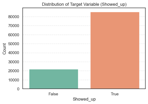
- The count plot shows that the dataset is imbalanced; most patients attended their appointments.
To confirm, let’s calculate the exact proportions.
# Count summary of the target variable (Showed_up)
data['Showed_up'].value_counts().to_frame(name='Count').assign(
Percent=lambda x: round((x['Count'] / x['Count'].sum()) * 100, 2))Count Percent
Showed_up
True 85307 79.74
False 21680 20.26
- So, about 80% of patients showed up for their appointments, while 20% did not.
- This imbalance means we’ll later need to use careful evaluation metrics, not just accuracy, to make sure our model performs well for both groups.
4.2 EDA on Numerical Variables
Next, we explore the numerical features in our dataset. This helps us understand how they are distributed, whether they contain unusual values, and how they might relate to the target variable.
We’ll focus on two numerical columns, Age and Date.diff, and check their distributions, outliers, and correlations.
4.2.1 Univariate Numerical Analysis
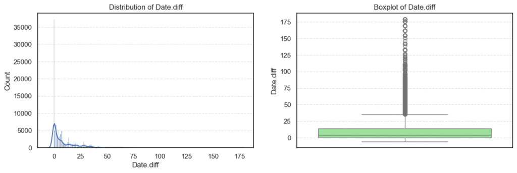
We start with univariate analysis, where each variable is studied individually. Histograms show how values are distributed, and boxplots help us spot outliers.
# Distribution of numerical variables
column_types = get_column_types(data=data)
numerical_cols = column_types['numeric']

for i, col in enumerate(numerical_cols, 1):
    plt.figure(figsize=(14, 4))

    # Histogram
    plt.subplot(1, 2, 1)
    sns.histplot(data=data, x=col, kde=True)
    plt.title(f'Distribution of {col}')

    # Boxplot
    plt.subplot(1, 2, 2)
    sns.boxplot(data=data, y=col, color='lightgreen')
    plt.title(f'Boxplot of {col}')
plt.show()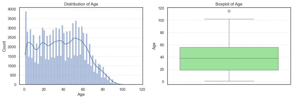
We then check some basic statistics:
data.describe(include=['int64', 'float64'])Age Date.diff
count 106987.000000 106987.000000
mean 38.316085 10.166721
std 22.466214 15.263508
min 1.000000 -6.000000
25% 19.000000 0.000000
50% 38.000000 4.000000
75% 56.000000 14.000000
max 115.000000 179.000000
- The
Agevariable ranges from 1 to 115 years. - That’s wide but realistic for a medical dataset.
- The median of 38 shows most patients are middle-aged adults.
- The
Date.diffcolumn ranges from -6 to 179, which is interesting because negative values mean some appointments were apparently booked after the appointment date, a clear data issue we’ll fix later.
Outliers and Skewness
We use the interquartile range (IQR) to find outliers and the skew() method to see if the data is symmetric or not.
for col in numerical_cols:
    q1 = data[col].quantile(0.25)
    q3 = data[col].quantile(0.75)
    iqr = q3 - q1
    lower = q1 - iqr * 1.5
    upper = q3 + iqr * 1.5
    outliers = data[(data[col] < lower) | (data[col] > upper)][col]
    print(f'=== {col} ===')
    print(f'Outliers: {len(outliers)}')
print(f'Skew: {data[col].skew()}', '\n')=== Age ===
Outliers: 5
Skew: 0.12164402331150703
=== Date.diff ===
Outliers: 6489
Skew: 2.6901608800185848
- The
Agevariable is clean, it has very few outliers (only 5) and is almost symmetric (skew ≈ 0.12). We can safely use it as it is. - On the other hand,
Date.diffhas many outliers (over 6,000) and is highly right-skewed (skew ≈ 2.69). This means most appointments are scheduled within a short period, but a few are booked very far in advance.
Correlation Between Numerical Variables
Finally, we check how these numerical variables relate to each other. This helps us avoid redundant information in modeling.
corr_mat = data[numerical_cols].corr()
plt.figure(figsize=(5, 3))
sns.heatmap(corr_mat, annot=True, cmap='coolwarm', fmt='.2f', linewidths=0.5)
plt.title('Collinearity of Numerical Variables')
plt.show()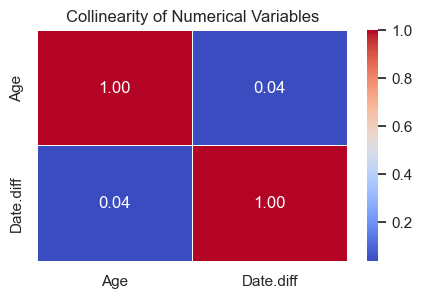
- The correlation heatmap shows no strong relationship between
AgeandDate.diff. - This means both variables capture different aspects of patient behavior, one reflects demographics, the other scheduling patterns, and both can be useful in the prediction model.
4.2.2 Numerical Variables vs Target (Showed_up)
After exploring each numerical feature on its own, we now check how these variables differ between patients who showed up and those who didn’t. This helps us see which numerical patterns may explain appointment attendance.
Mean Comparison by Target Group
We start by visualizing and comparing the average values of each numerical variable between the two groups (Showed_up = True or False).
# Plot mean of numerical variables vs Showed_up
plt.figure(figsize=(14, 4))
for i, col in enumerate(numerical_cols, 1):
    plt.subplot(1, 2, i)
    sns.barplot(data=data, x='Showed_up', y=col, palette='Set2', estimator='mean', ci=None)
    plt.title(f'Mean {col} vs Showed_up')
    plt.xlabel("Showed_up")
    plt.ylabel(col)
plt.show()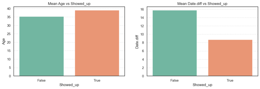
# Calculate mean of numerical variables vs Showed_up
for col in numerical_cols:
    mean_show_up = data.groupby('Showed_up')[col].mean().to_frame(name='Mean')
    print(f'=== {col} ===')
print(mean_show_up, '\n')=== Age ===
Mean
Showed_up
False 35.329151
True 39.075187
=== Date.diff ===
Mean
Showed_up
False 15.789299
True 8.737794
- Patients who showed up had an average age of 39 years, compared to 35 years for those who didn’t. This means older patients are slightly more likely to attend their appointments.
- For
Date.diff, those who missed appointments had an average waiting time of about 16 days, while those who attended waited only 9 days on average. Longer waiting times clearly make patients more likely to skip appointments.
Statistical Significance Testing
To confirm that these observed differences are not just random, we perform t-tests for both variables. We use Welch’s t-test when the variances differ between groups.
# T-Test
alpha = 0.05
for col in numerical_cols:
    showed_up = data[data['Showed_up'] == True][col]
    no_showed_up = data[data['Showed_up'] == False][col]

    _, lev_p = levene(showed_up, no_showed_up, center='median')
    equal_var = lev_p >= alpha
    t_stat, p_value = ttest_ind(showed_up, no_showed_up, equal_var=equal_var)

    print(f'=== {col} ===')
    print(f'T-Stat: {t_stat:.2f}, P-Value: {p_value:.4f}')

    test = 'Standard' if equal_var else 'Welch'
    print(f'Test: {test}')

    print(f'Null Hypothesis (Ho): Mean {col} is the same in showed up or no show.')
    decision = 'Reject Hypothesis' if p_value < alpha else 'Fail to reject hypothesis.'
print(f'Decision: {decision}', '\n')=== Age ===
T-Stat: 22.68, P-Value: 0.0000
Test: Welch
Null Hypothesis (Ho): Mean Age is the same in showed up or no show.
Decision: Reject Hypothesis
=== Date.diff ===
T-Stat: -57.16, P-Value: 0.0000
Test: Welch
Null Hypothesis (Ho): Mean Date.diff is the same in showed up or no show.
Decision: Reject Hypothesis
- Both
AgeandDate.diffhave p-values < 0.05, meaning the differences between the two groups are statistically significant. - The test confirms what we observed earlier, older patients are more likely to attend, while longer wait times make patients more likely to skip their appointments.
- These insights are strong indicators that both features should be kept for modeling.
4.3 EDA on Categorical Variables
Next, we explore the categorical features to see their distributions and how they might relate to whether patients showed up for their appointments. Understanding these variables helps reveal social or behavioral factors that affect attendance.
4.3.1 Univariate Categorical Analysis
We first check the frequency of each categorical variable to identify imbalances or dominant categories.
# Distribution of Categorical Variables
column_types = get_column_types(data=data)
categorical_cols = column_types['categorical'] + column_types['boolean']
categorical_cols.remove('Neighbourhood')
categorical_cols.remove('Showed_up')

n_cols = 3
n_rows = 3

plt.figure(figsize=(n_cols * 6, n_rows * 5))
for i, col in enumerate(categorical_cols, 1):
    plt.subplot(n_rows, n_cols, i)
    sns.countplot(data=data, x=col, palette='Set2')
    plt.title(f'Distribution of {col}')
    plt.xlabel(col)
    plt.ylabel('Count')
plt.subplots_adjust(wspace=0.3, hspace=0.3)
plt.show()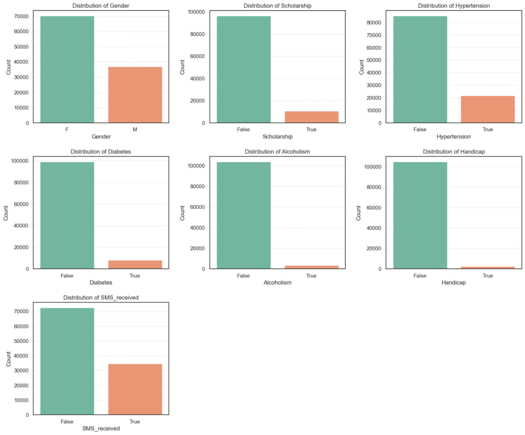
# Count summary of the categorical variables
for col in categorical_cols:
    counts = data[col].value_counts().to_frame(name='Count').assign(
        Percent=lambda x: round((x['Count'] / x['Count'].sum()) * 100, 2))

    print(f'=== {col} ===')
print(counts, '\n')=== Gender === Count Percent F 70118 65.54 M 36869 34.46 === Scholarship === Count Percent False 96178 89.9 True 10809 10.1 === Hypertension === Count Percent False 85186 79.62 True 21801 20.38
=== Diabetes ===
Count  Percent
False   99044    92.58
True     7943     7.42

=== Alcoholism ===
Count  Percent
False  103627    96.86
True     3360     3.14
=== SMS_received ===
Count  Percent
False   72402    67.67
True    34585    32.33

=== Handicap ===
Count  Percent
False  104747    97.91
True     2240     2.09
Analysis of Categorical Variables
We explored the categorical features to understand their frequency distributions and identify any imbalances or dominant categories.
- Gender: Majority of the patients are female 65.5%, while males make up 34.5%.
- Scholarship: Only 10.1% of patients are on a scholarship (likely indicating low-income support), showing a large imbalance.
- Hypertension: About 20.4% of patients have hypertension, while the majority 79.6% do not.
- Diabetes: Only 7.4% of patients have diabetes, indicating it’s a less common condition in this dataset.
- Alcoholism: Very few patients 3.1% reported alcoholism, suggesting it may not be a strong factor in attendance.
- Handicap: Only 2.1% of patients have some form of handicap, another minority group.
- SMS_received: Around 32.3% of patients received an SMS reminder, while 67.7% did not.
Key Insights:
- Most categorical features are highly imbalanced, with the “False” category dominating.
- The imbalance may affect model learning, so encoding and class weighting should be considered later.
- The
SMS_receivedvariable will be important to analyze against attendance, as reminders could influence show-up rates.
4.3.2 Categorical Variables vs Target (Showed_up)
After understanding the basic distributions of our categorical features, the next step is to see how these variables relate to appointment attendance (Showed_up).
We’ll visualize each category against the target and then use a Chi-Square test to determine which relationships are statistically significant.
# Plot categorical variables vs the target (Showed_up)
n_cols = 3
n_rows = 3

plt.figure(figsize=(n_cols * 6, n_rows * 5))
for i, col in enumerate(categorical_cols, 1):
    plt.subplot(n_rows, n_cols, i)
    sns.countplot(data=data, x=col, hue='Showed_up', palette='Set2')
    plt.title(f'{col} vs Showed_up')
    plt.xlabel(col)
    plt.ylabel('Count')
plt.subplots_adjust(wspace=0.3, hspace=0.3)
plt.show()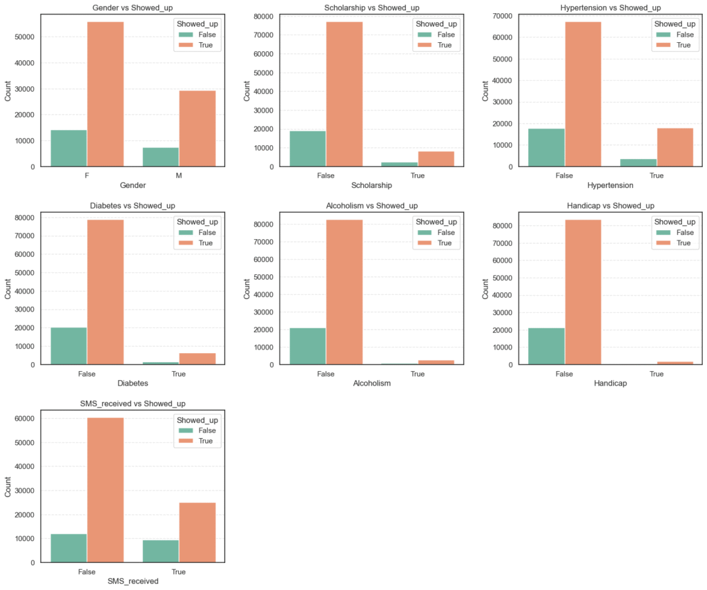
- These bar plots give a quick visual comparison of attendance rates across different categories (e.g., male vs. female, diabetic vs. non-diabetic, etc.).
- We can already see subtle variations, such as patients with
hypertensionordiabetesappearing more likely to show up, while those withscholarshipsorSMS remindersseem to have lower attendance.
# Percentage Distribution by Category
for col in categorical_cols:
    summary = data.groupby(col)['Showed_up'].value_counts(normalize=True).unstack() * 100
    print(f'=== {col} ===')
print(summary.round(2), '\n')=== Gender === Showed_up False True Gender F 20.36 79.64 M 20.08 79.92 === Scholarship === Showed_up False True Scholarship False 19.87 80.13 True 23.79 76.21 === Hypertension === Showed_up False True Hypertension False 21.02 78.98 True 17.30 82.70
=== Diabetes ===
Showed_up  False  True
Diabetes
False      20.45  79.55
True       18.00  82.00

=== Alcoholism ===
Showed_up   False  True
Alcoholism
False       20.27  79.73
True        20.15  79.85
=== Handicap ===
Showed_up  False  True
Handicap
False      20.31  79.69
True       18.17  81.83

=== SMS_received ===
Showed_up     False  True
SMS_received
False         16.73  83.27
True          27.67  72.33
From these observations, we can infer that:
Scholarship, Hypertension, Diabetes, Handicap,andSMS_receivedvariables exhibit meaningful behavioral differences.GenderandAlcoholismshow negligible impact on attendance.- The unexpected SMS reminder pattern is an interesting finding that warrants deeper statistical and model-based exploration later in the project.
5. Feature Engineering
After performing exploratory data analysis, the next critical step is Feature Engineering, transforming and creating new variables to make the dataset more suitable for modeling.
The main goal here is to improve the predictive power of our logistic regression model by ensuring all features are clean, relevant, and machine-readable.
This process involves converting categorical data into numerical form, creating meaningful derived features, and removing redundant or less informative columns.
5.1 Converting Categorical and Boolean Variables to Numeric
Machine learning models, including logistic regression, work best with numerical input. Therefore, categorical and boolean features need to be encoded into numeric representations.
In this dataset:
- Boolean variables (
True/False) were replaced with1and0. - Gender (
M,F) was encoded as binary (M=1,F=0). - The target variable (
Showed_up) was also converted to1(showed up) and0(no-show).
engineered_data = data.copy()

# Binary Encoding
binary_cols = ['Scholarship', 'Diabetes', 'Alcoholism', 'Handicap', 'SMS_received', 'Gender', 'Hypertension',
               'Showed_up']
replace_dict = {
    True: 1,
    False: 0,
    'M': 1,
    'F': 0
}

engineered_data[binary_cols] = engineered_data[binary_cols].replace(replace_dict)- This ensures all key binary indicators (like whether a patient received an SMS or has hypertension) are numerically encoded and ready for model input.
5.2 Deriving New Features
Feature engineering isn’t just about converting existing data; it’s also about creating new variables that can capture hidden relationships.
Here, several new features were derived:
- Date-based features from
ScheduledDayandAppointmentDay:Scheduled_weekday,Scheduled_monthAppointment_weekday,Appointment_month
These help capture temporal patterns, such as whether patients are more likely to attend appointments on specific weekdays or months.
Condition_count— a new variable summarizing the total number of medical conditions a patient has (Hypertension,Diabetes,Handicap). This feature better represents the overall health burden of a patient.
# Feature engineer and encode dates
engineered_data['Scheduled_weekday'] = pd.to_datetime(data['ScheduledDay']).dt.dayofweek
engineered_data['Scheduled_month'] = pd.to_datetime(data['ScheduledDay']).dt.month
engineered_data['Appointment_weekday'] = pd.to_datetime(data['AppointmentDay']).dt.dayofweek
engineered_data['Appointment_month'] = pd.to_datetime(data['AppointmentDay']).dt.month

# Feature engineer "Condition_count"
engineered_data['Condition_count'] = (
engineered_data['Hypertension'] + engineered_data['Diabetes'] + engineered_data['Handicap'])To understand how useful these new features are, we check their correlation with the target variable Showed_up:
# Check added features importance
new_features = ['Scheduled_weekday', 'Scheduled_month', 'Appointment_weekday', 'Appointment_month', 'Showed_up', 'Condition_count']

corr_mat = engineered_data[new_features].corr()
plt.figure(figsize=(8, 4))
sns.heatmap(corr_mat, annot=True, cmap='coolwarm', fmt='.2f', linewidths=0.5)
plt.title('Collinearity of New Variables')
plt.xticks(rotation=45)
plt.show()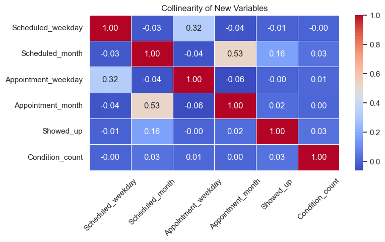
Correlation Insights
After checking correlations between the newly engineered features and the target variable (Showed_up), we observed the following:
Scheduled_month→ 0.16 correlation
Shows a small positive correlation, indicating a slight seasonal trend — attendance rates may vary across different months.Condition_count→ 0.03 correlation
Exhibits a weak but positive relationship, suggesting that patients with multiple health conditions tend to be slightly more consistent in attending appointments.Scheduled_weekday,Appointment_weekday, andAppointment_month→ near 0 correlation
These features show no meaningful relationship with attendance and may only add noise to the model.
Interpretation:
- We’ll keep
Scheduled_monthandCondition_countsince they provide potential predictive value. - Features with near-zero correlation will be dropped to maintain a cleaner, more efficient dataset.
5.3 Dropping Less Informative or Redundant Columns
To simplify the dataset and reduce multicollinearity, we removed:
- Categorical text columns (
Neighbourhood). - Raw date columns (
ScheduledDay,AppointmentDay). - Derived columns with negligible correlation (
Scheduled_weekday,Appointment_weekday,Appointment_month). - Redundant medical indicators already represented by
Condition_count(Hypertension,Diabetes,Handicap).
drop_cols = ['Neighbourhood', 'Scheduled_weekday', 'Appointment_weekday', 'Appointment_month', 'ScheduledDay', 'AppointmentDay', 'Hypertension', 'Diabetes', 'Handicap']
engineered_data = engineered_data.drop(columns=drop_cols)
engineered_data.head()
After feature engineering:
- All categorical and boolean variables were converted to numeric form.
- New temporal and health-related features were created to capture additional insights.
- Redundant and weakly correlated features were removed to reduce noise.
Our dataset is now clean, compact, and model-ready, forming a solid foundation for building the logistic regression models that follow.
6. Implement Logistic Regression with Scikit-Learn
After cleaning and engineering our dataset, it’s time to build a model that can predict whether a patient will show up for their scheduled medical appointment.
This stage involves:
- Splitting the dataset into training and testing subsets.
- Scaling the features for better model performance.
- Training multiple logistic regression variants (baseline, L1, and L2 regularized).
- Evaluating results using classification metrics such as accuracy, precision, recall, F1-score, and AUC-ROC.
6.1 Data Preparation
Before training, we separate the dataset into features (X) and the target variable (y):
X = engineered_data.drop(columns=['Showed_up'])
y = engineered_data['Showed_up']

X_train, X_test, y_train, y_test = train_test_split(
    X, y, test_size=0.3, shuffle=True, random_state=42
)To ensure all numerical features contribute equally to model training, we standardize them using StandardScaler:
scaler = StandardScaler()
X_train_scaled = scaler.fit_transform(X_train)
X_test_scaled = scaler.transform(X_test)Feature scaling is particularly important for models like logistic regression, which rely on gradient-based optimization; unscaled features can distort the learning process and slow convergence.
6.2 Model Training
We will train three logistic regression models:
- Baseline Logistic Regression – the default version without explicit regularization tuning.
- L1-Regularized Logistic Regression (Lasso) – encourages sparsity by shrinking less useful feature weights to zero.
- L2-Regularized Logistic Regression (Ridge) – penalizes large coefficients to prevent overfitting.
# Fit Models
models = {}

# Baseline Logistic Regression
models['LogisticRegression'] = LogisticRegression(max_iter=1000, solver='liblinear', class_weight='balanced')
models['LogisticRegression'].fit(X_train_scaled, y_train)

# Logistic Regression with CV and regularization L1
models['LogisticRegression_L1'] = LogisticRegressionCV(max_iter=1000, solver='liblinear', class_weight='balanced', Cs=10, cv=5, penalty='l1')
models['LogisticRegression_L1'].fit(X_train_scaled, y_train)

# Logistic Regression with CV and regularization L2
models['LogisticRegression_L2'] = LogisticRegressionCV(max_iter=1000, solver='liblinear', class_weight='balanced', Cs=10, cv=5, penalty='l2')
models['LogisticRegression_L2'].fit(X_train_scaled, y_train)We used the class_weight='balanced' parameter to handle the class imbalance in our target variable, ensuring the model gives appropriate importance to both show and no-show cases.
6.3 Model Evaluation
Each model was evaluated using Accuracy, Precision, Recall, F1-score, and AUC-ROC.
# Make Predictions and Evaluate
results = []

for name, model in models.items():
    # Prediction
    y_pred = model.predict(X_test_scaled)

    # Evaluate
    acc = accuracy_score(y_test, y_pred)
    pre = precision_score(y_test, y_pred)
    rec = recall_score(y_test, y_pred)
    f1 = f1_score(y_test, y_pred)
    auc = roc_auc_score(y_test, y_pred)

    results.append([name, acc, pre, rec, f1, auc])

results_df = pd.DataFrame(results, columns=['Name', 'Accuracy', 'Precision', 'Recall', 'F1', 'AUC-ROC Score'])
results_df
Results and Insights
- All three logistic regression models produced identical performance, confirming our preprocessing and feature selection were stable and consistent.
- The model achieved about 66% accuracy, with high precision (~0.85) and moderate recall (~0.69).
- This indicates that the model performs well at identifying patients who will attend, but has some difficulty capturing those who won’t.
- Regularization (L1 or L2) had no noticeable impact, suggesting the model did not suffer from overfitting.
The logistic regression model provides a strong baseline for predicting medical appointment attendance. However, future improvements could include feature interaction terms, class rebalancing strategies, or exploring non-linear models such as decision trees or ensemble methods.
Project Conclusion
This project demonstrated how logistic regression, one of the most fundamental classification algorithms in machine learning, can be applied to a real-world healthcare problem, predicting whether a patient will attend their scheduled medical appointment.
Through each stage, from data cleaning and exploratory analysis to feature engineering and model evaluation, we gained valuable insights into both the data and the modeling process.
Key Takeaways:
- The logistic regression model served as a reliable baseline, achieving around 66% accuracy with strong precision and balanced performance across classes.
- Careful feature engineering, especially the creation of the
Condition_countvariable, improved interpretability and provided meaningful context around a patient’s health profile. - Our analysis revealed that factors like age, waiting time, chronic conditions, and even SMS reminders influence attendance patterns, though some relationships were surprisingly counterintuitive.
- Despite solid predictive power, human behavior in healthcare remains complex and partly unpredictable, likely influenced by personal, social, and logistical factors not captured in the dataset.
Next Steps for Improvement:
- Experiment with tree-based algorithms (e.g., Random Forest, XGBoost) to capture non-linear relationships.
- Introduce behavioral or spatial features, such as prior attendance history or distance to the clinic.
- Apply hyperparameter tuning and cross-validation for optimal model configuration.
- Explore model interpretability tools (like SHAP or LIME) to better explain predictions in a healthcare context.
In summary, this project illustrates how combining data-driven insights with responsible modeling can offer practical support for healthcare operations, improving scheduling efficiency and patient engagement. Logistic regression may be simple, but when applied thoughtfully, it can uncover powerful patterns in real-world human behavior.

