Customer churn prediction: How to keep your customers from leaving, before it’s too late.
Imagine this: Your business is losing customers every month, and you don’t know why. Customer churn prediction, using machine learning to spot at-risk customers before they leave, could be your solution.
In this guide, we’ll show you exactly how it works. Using real telecom data, we’ll compare two powerful models (Random Forest and XGBoost) to predict who’s likely to churn. The best part? You’ll learn how to apply these insights to keep more customers and grow your business.
By the end, you’ll know:
- How to explore and clean customer data.
- How to train and tune machine learning models.
- Which features actually predict churn (spoiler: contracts matter a lot).
- How to evaluate models so they don’t just look good—they work in the real world.
To follow along with this article, you can find the code implementation in a Jupyter Notebook in this GitHub repo.
Ready? Let’s dive in.
Step 1: Setting Up the Tools
Before we touch any data, we need the right tools. Here’s what we’re using:
- Pandas & NumPy: For wrangling data.
- Matplotlib & Seaborn: For visualizing patterns.
- Scikit-learn: For splitting data, training models, and evaluating performance.
- XGBoost: A powerhouse algorithm for classification tasks.
Here’s how we import them:
# Basic data handling
import pandas as pd  # For dataframes (like Excel but in code)
import numpy as np   # For numerical operations

# Visualization
import matplotlib.pyplot as plt  # For basic plots
import seaborn as sns            # For prettier, easier plots

# Machine learning
from sklearn.model_selection import train_test_split  # Splits data into training/testing sets
from sklearn.ensemble import RandomForestClassifier   # Random Forest model
from sklearn.metrics import accuracy_score, classification_report, confusion_matrix  # Model evaluation

# XGBoost (a more advanced algorithm)
import xgboost as xgb

# Preprocessing
from sklearn.preprocessing import LabelEncoder  # Converts text categories (like "Yes"/"No") to numbers

# Suppress warnings (optional, just keeps the output clean)
import warnings
warnings.filterwarnings('ignore')

# Make plots look nice
sns.set(style='whitegrid')Why these libraries?
- Pandas lets us load, filter, and analyze data effortlessly.
- Seaborn makes it easy to spot trends (like “Do customers with higher bills churn more?”).
- Scikit-learn is the Swiss Army knife of machine learning—it has everything we need.
- XGBoost often outperforms other models, especially with structured data like this.
Step 2: Loading and Understanding the Data
We’re using the Telco Customer Churn dataset (from IBM), which includes:
- Customer demographics (age, gender, dependents).
- Account details (contract type, monthly charges).
- Services used (internet, phone, tech support).
- Churn status (did they leave? Yes/No).
Loading the Data
# Load the dataset
df = pd.read_csv('telco-customer-churn.csv')

# Check its shape (rows, columns)
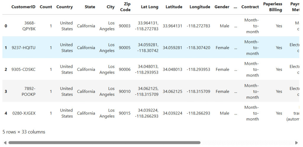
print(f"Dataset Shape: {df.shape}")  # Output: (7043, 33) → 7,043 customers, 33 features
df.head() # Show the first 5 rowsDataset Shape (rows, columns): (7043, 33)
What’s in the data?
Each row is a customer. Key columns:
Monthly Charges: How much they pay.Contract: Month-to-month, yearly, etc.Churn Label: “Yes” if they left, “No” if they stayed.
Step 3: Exploring the Data (EDA)
You wouldn’t build a house without checking the foundation, and EDA is exactly that for machine learning. It’s where you uncover hidden patterns, spot data errors, and ask critical questions like:
- “Are customers with higher monthly charges more likely to churn?”
- “Does contract type influence retention?”
EDA helps us avoid “garbage in, garbage out” by cleaning data and identifying predictive features early.
Checking for Missing Data
# Are there empty values?
df.isnull().sum()Output:
Most columns are complete, but Churn Reason has 5,174 missing values (because it’s only filled if the customer left).
Class Imbalance: How Many Customers Churn?
# Count values in the target column
churn_counts = df['Churn Label'].value_counts()

# Plot the distribution
plt.figure(figsize=(6, 4))
sns.barplot(x=churn_counts.index, y=churn_counts.values, palette='pastel')
plt.title('Customer Churn Distribution')
plt.ylabel('Number of Customers')
plt.xlabel('Churn Label')
plt.tight_layout()
plt.show()

# Print counts and percentages
print("Churn Counts:", churn_counts)
print("Churn Percentages:", round((churn_counts / len(df)) * 100, 2))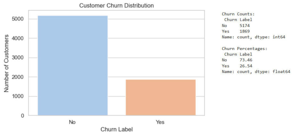
Key Insight:
73.5% stayed, 26.5% left. This imbalance means accuracy alone can be misleading—we’ll need precision/recall.
Step 4: Cleaning the Data
Some columns won’t help our model (like CustomerID, it’s just a random number). We’ll drop:
- Irrelevant columns: Location data (
Latitude,Zip Code). - Leakage features:
Churn Reason(only known after churn).
# List of columns to drop
columns_to_drop = ['CustomerID', 'Lat Long', 'Latitude', 'Longitude', 'Zip Code', 'City', 'State', 'Country', 'Churn Reason', 'Churn Score', 'CLTV', 'Count', 'Churn Value']

# Drop them from the dataset
df_cleaned = df.drop(columns=columns_to_drop)Why?
- Machine learning models can’t use IDs or future info (it’s cheating!).
- Keeping only relevant features makes the model faster and more accurate.
Step 5: Encoding Categorical Variables
Imagine trying to teach someone math using only words like “apple” and “orange.” That’s essentially what we’re asking our machine learning models to do when we feed them text data. Most algorithms speak only the language of numbers, while our dataset contains valuable categorical information like:
- “Yes”/”No” responses
- Gender (“Male”/”Female”)
- Service types (“DSL”/”Fiber optic”)
Our Solution: The Art of Encoding
We use two main techniques to bridge this communication gap:
- Label Encoding (Our Go-To Choice)
- Perfect for binary categories and ordinal data
- Converts:
- “No” → 0, “Yes” → 1
- “Female” → 0, “Male” → 1
- Contract types: “Month-to-month” → 0, “One year” → 1, “Two year” → 2
- Why we prefer it: Preserves the natural ordering where it exists (like contract lengths)
- One-Hot Encoding (When We Need It)
- Creates separate columns for each category
- Essential when there’s no meaningful order (like colors or cities)
- We didn’t use it here to avoid creating 20+ new columns
# Make a copy of the cleaned data so that we don't change the original cleaned data
df_encoded = df_cleaned.copy()

# Loop through all the columns and apply LabelEncoder if its a string (object)
label_encoders = {}

for col in df_encoded.columns:
    if df_encoded[col].dtype == 'object':
        le = LabelEncoder()
        df_encoded[col] = le.fit_transform(df_encoded[col])
        label_encoders[col] = le

# Confirm all columns are now numeric
print(df_encoded.dtypes.value_counts())
print("Encoded dataset preview:")
df_encoded.head()- int64: 19
- float64: 1

Step 6: Splitting Data into Training and Testing Sets
How do we know if our churn prediction model actually works? We could train it on all our data and get amazing accuracy… only to fail completely with real customers. This is where proper data splitting becomes our safety net.
We divide our dataset into two distinct groups:
- Training Set (80%): The model’s “textbook” where it learns patterns
- Test Set (20%): The model’s “final exam” to evaluate real-world performance
# Separate features (X) and target (y)
X = df_encoded.drop(columns=['Churn Label'])
y = df_encoded['Churn Label']

X_train, X_test, y_train, y_test = train_test_split(X, y, test_size=0.2, random_state=42, stratify=y)

# Show result
print("Training samples:", X_train.shape[0])
print("Testing samples:", X_test.shape[0])Why stratify?
Ensures both sets have the same 26.5% churn rate—no accidental skew.
Step 7: Training a Random Forest Model
A single decision tree can overfit (like memorizing answers instead of learning). Random Forest fixes this by combining many trees for a more reliable vote.
# Create and train the model.
rf_model = RandomForestClassifier(random_state=42)
rf_model.fit(X_train, y_train)

# Make predictions on the test set
rf_pred = rf_model.predict(X_test)

# Evaluate performance
print("Random Forest Performance")

print("Accuracy:", accuracy_score(y_test, rf_pred))
print("Classification Report:")
print(classification_report(y_test, rf_pred))

print("Confusion Matrix:")
print(confusion_matrix(y_test, rf_pred))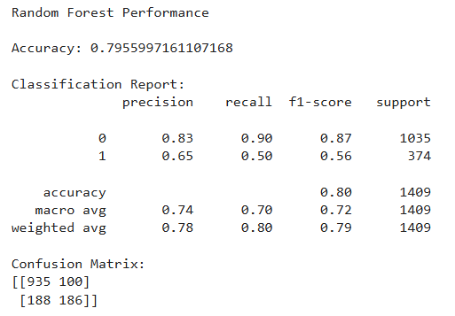
Interpretation
- The model is doing well on identifying customers who did not churn, but still struggles to catch many churners.
- That’s normal — churn is harder to predict due to its imbalanced nature and more complex patterns.
Step 8: Training XGBoost (and Tuning It)
If you could take all the strengths of Random Forest and supercharge them – that’s XGBoost in a nutshell. While Random Forest uses independent trees, XGBoost builds them sequentially, with each new tree learning from the mistakes of its predecessors.
Default XGBoost
# Create and train the XGBoost classifier with default settings
xgb_model = xgb.XGBClassifier(use_label_encoder=False, eval_metric='logloss', random_state=42)
xgb_model.fit(X_train, y_train)

# Make predictions using test data
xgb_pred = xgb_model.predict(X_test)

# Evaluate the model
print("XGBoost Classifier Performance (Default)")
print("Accuracy:", accuracy_score(y_test, xgb_pred))
print("Classification Report:")
print(classification_report(y_test, xgb_pred))
print("Confusion Matrix:")
print(confusion_matrix(y_test, xgb_pred))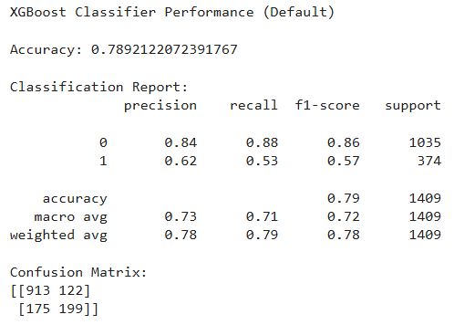
Interpretation:
- XGBoost performs similarly to Random Forest (slightly lower accuracy but slightly better on true churn detection — 199 vs 186).
- It’s still missing a fair number of churners (175 false negatives), which we may reduce through hyperparameter tuning.
Step 9: Feature Importance (What Actually Predicts Churn?)
Feature importance isn’t just a technical output – it’s the secret blueprint showing exactly what drives customers away. XGBoost doesn’t just predict churn; it reveals the why behind it through sophisticated pattern recognition.
How XGBoost Calculates Importance:
- Gain: Average improvement in accuracy when used
- Weight: How often a feature is used to make decisions
- Cover: Number of observations affected
# Get feature importance from XGBoost model
importance_scores = xgb_model.feature_importances_
feature_names = X.columns

# Create a DataFrame for sorting and visualization
importance_df = pd.DataFrame({
    'Feature': feature_names,
    'Importance': importance_scores
}).sort_values(by='Importance', ascending=False)

# Plot the top 10 important features
plt.figure(figsize=(10, 6))
sns.barplot(x='Importance', y='Feature', data=importance_df.head(10), palette='Blues_r')
plt.title('Top 10 Important Features (XGBoost)')
plt.xlabel('Importance Score')
plt.ylabel('Feature')
plt.tight_layout()
plt.show()

# Print top features
print("Top 10 Features:", importance_df.head(10))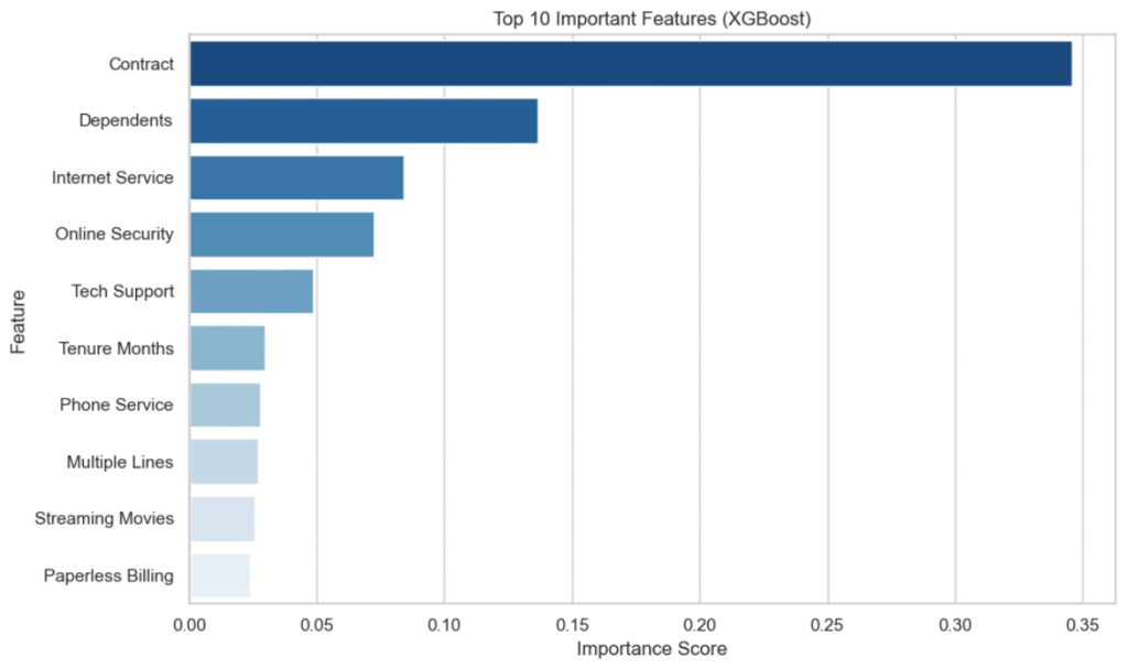
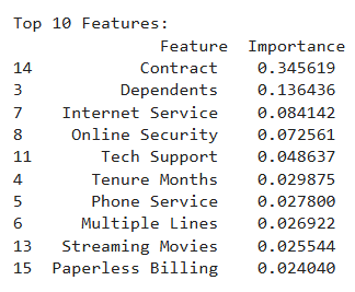
Summary of Feature Importance
The XGBoost model highlighted the top drivers of customer churn:
- Contract had the highest influence — customers on month-to-month plans are more likely to churn than those on long-term contracts.
- Dependents mattered — customers with dependents tend to be more stable and less likely to churn.
- Internet Service, Online Security, and Tech Support showed that customers using more services or support features are more engaged and likely to stay.
- Tenure and Multiple Lines reflected customer commitment — longer tenure or more lines suggest higher loyalty.
- Features like Streaming Movies and Paperless Billing had smaller impacts but still showed patterns of customer preferences and behaviors.
Understanding these features can help businesses reduce churn by improving contracts, services, and support.
Step 10: Hyperparameter Tuning – Tune XGBoost for Better Performance
We tweak settings (learning_rate, max_depth, etc.) to improve performance:
# Define hyperparameter space
param_dist = {
    'n_estimators': [100, 200, 300, 500],
    'max_depth': [3, 4, 5, 6, 8, 10],
    'learning_rate': [0.01, 0.05, 0.1, 0.2],
    'subsample': [0.6, 0.7, 0.8, 1.0],
    'colsample_bytree': [0.6, 0.7, 0.8, 1.0],
    'gamma': [0, 0.1, 0.3, 0.5],
    'reg_lambda': [0, 1, 5, 10]
}

# Initialize the classifier
xgb_clf = xgb.XGBClassifier(use_label_encoder=False, eval_metric='logloss', random_state=42)

# RandomizedSearchCV setup
random_search = RandomizedSearchCV(
    estimator=xgb_clf,
    param_distributions=param_dist,
    n_iter=50,
    cv=3,
    scoring='accuracy',
    verbose=1,
    random_state=42,
    n_jobs=-1
)

# Fit the randomized search
random_search.fit(X_train, y_train)

# Best parameters and model
print("Best Parameters Found:", random_search.best_params_)
best_xgb = random_search.best_estimator_Best Parameters Found:
subsample: 0.6reg_lambda: 10n_estimators: 500max_depth: 6learning_rate: 0.01gamma: 0colsample_bytree: 0.7
Step 11: Evaluate the Tuned Model
Time for the final showdown.
# Make predictions with the tuned model
xgb_best_preds = best_xgb.predict(X_test)

# Evaluate tuned XGBoost
print("Tuned XGBoost Performance\n")
print("Accuracy:", accuracy_score(y_test, xgb_best_preds))
print("\nClassification Report:")
print(classification_report(y_test, xgb_best_preds))
print("Confusion Matrix:")
print(confusion_matrix(y_test, xgb_best_preds))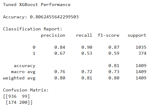
Performance:
- Accuracy: ~80.6%
- F1 Score (Churn): ~0.59
- Slightly fewer false positives and false negatives than before
Best performance so far.
Final Thoughts
We tried two popular tree-based models — Random Forest and XGBoost — and found that XGBoost, especially after tuning, performs best for predicting customer churn.
Key Learnings:
- Data cleaning and encoding matter. A lot.
- Always check feature importance — it can reveal business insights.
- Tuning takes time, but gives meaningful improvements.
- Accuracy isn’t everything. Use precision, recall, and F1-scores.
If you’ve made it this far, give yourself a pat on the back. You didn’t just run models — you understood them, from data wrangling all the way to tuning.
Let me know what you think in the comments.
Want to See the Full Code?
Check out the GitHub repository here: GitHub Repository Link

